You may have noticed the lack of regular updates in the past several months - this is due to a number of things that I really don't need to get into in detail (my health, family life, unemployment, starting a new contract job, etc.) - sufficent to say, though, I've not had nearly as much time and motivation to post regular updates on painting and such... because there hasn't been much going on in the way of painting and such!
1) I'm wondering if slightly tweaking things in terms of site layout or blog formatting or what-have-you might be the way to go? It was suggested (thanks, IntereoVivo!) that maybe I could/should take suggestions as to the topics and content I put up. Dunno why I hadn't thought of this before, but I think that might be an excellent way of keeping things alive and fresh. I've got a ton of projects (or potential projects) that I could use for "demonstration" purposes here - on-sprue minis, drawers full of 20+-year-old lead fantasy and sci-fi figures, stuck-together-but-not-glued gaming figures, many figures that would easily make for good display-quality pieces, and even scenery or "display base" odds 'n' ends that I could be posting about. Assuming the trend of limited time continues, short posting on my part of stuff like "This is how I'm pinning the 54mm resin soldier" or "Here's a few approaches in painting black I'm taking that could give you different 'finishes' as an end result" would probably be much easier (and less demoralizing) than having a whole blog to fill and very few finished things of late to post.
To that end, I think a "Contact Me" box or a "Make Suggestions Here" blurb highly visible on the site would be good. Any ideas on how best to approach the layout of the site? Maybe email me! This ties in with...
2) I've been using a newly-bought-and-self-assembled computer for several months now after some technical difficulties in operation and finally have things reinstalled again to the point where I can make worthwhile updates - for a good month there, the computer was in the shop and/or empty for all my web editing software, and with all my site images and templates and such backed up on a spare HD. That being said, I also moved to a format here not so long ago with the main Painting by Tinweasel site serving as sort of a stripped-down framework with all kinds of added content, and the Painting by Tinweasel Blog serving as sort of a central hub and news/update feed. The blog is self-sufficient, but the full website needs a lot of layout changes and behind-the-scenes tweaking now. Since I have to do that anyways to get everything looking neat and tidy and non-redundant (double header bars, etc. Yuck!), is there anything that people would like up on there?
What, if anything, might people like to see? Or, better yet, how could I get the most use out of a supporting website that statistically gets only about 1/3rd of the views of my Blog despite having a Gallery of painted figures, a section on painting Tips and Techniques, and even some (slightly older) Tutorials?
3) I've joined the local Michigan Historical Miniatures & Model Club at a store not too far from me here - The Michigan Toy Soldier Co. Essentially, the store encourages all sorts of figure painting (like my Games Workshop Chaos Space Marine army and my Golden Demon Competition pieces, some of my stuff being in their display case currently!) and even stocks a fair amount of tabletop gaming stuff at a great discount - their main focus, though, is historical miniatures and models, painting and modeling supplies, and toy soldiers and collectible figures. I'd highly recommend the store to any miniature painters, and the staff are all great! The Club I signed up for is kinda an informal thing meeting one night a month, and we've all decided to go in on a "club figure" that we can all paint, pose, convert, or whatever, with the end result being a group display at a show (or two).
The club figure is a 54mm Private of the 1st New Hampshire Regiment, 1870, put out by Michael Roberts, Ltd. - an excellent resin piece with very few mold problems (some bubbles on the base, a little bit of flash, and minor mold lines here and there) and a high level of accurate and realistic detailing. (Not that I know squat about post-Revolutionary War regimental troops, but still!) I haven't started prepping it and have virtually no experience painting historically accurate miniatures at all - but I'm really looking forwards to this, especially the opportunity to learn from some veteran painters in a "new" field. I'll be posting my progress... I'm also open to any and all suggestions at this point, as this is "a brave new world" I'm venturing into, so to speak.

10/22/2010
Hobby Tip - Night Lords' Lightning Effect
I haven't had time to do much in the way of hobby stuff lately, but I've been wanting to try painting this for weeks now and I'm curious what you all think:

Here's how I painted the Night Lords lightning effect:

Here's how I painted the Night Lords lightning effect:
- First I painted a thinned color for an overall appearance of "electrical haze" or "glow." I used GW Enchanted Blue thinned down to a 1:4 paint/thinner consistency and applied this with a 2/0 brush so as it have a "backdrop" color to paint everything else on. I didn't want this to look solid (hence the translucent paint) but I did want it to serve as an overall "outline" for the two subsequent colors.
- Secondly I went back with thinned Electric Blue (in a 1:4 paint/thinner ratio again) - it's an old, old color so a good substitute would be 1:1 Enchanted Blue/Ice Blue, I dare say. With this step I used a fine (#0000) point brush and more or less stippled a random, crackling line within the previous haze color. I intentionally kept it patchy and wavy while still trying to follow a more or less continuous arcing path - the next and last color I would say is the most important, as it's the "heart" of the electrical effect.
- Lastly, I applied fine stippling with thinned GW Ice Blue (1:4 paint/thinner ratio again) and just tried to make it look like crackling electricity - I didn't necessarily keep to the exact center of the previous two colors laid down, but I didn't stray outside of them. I made a few passes with just tiny dots of the brush, until I got to the point where it looked like a fine (if fuzzy) line with a few patchy gaps here and there. Done!
9/21/2010
A Little Night Lords Freehand
It's been a busy past month or so, what with colds, computer troubles, and a lot of other distractions. I had some free time the other day, though, and decided to do a little freehand on the inducted Night Lords Chaos Marine for my warband:

I wasn't really happy with the finished result at first, since I'm always noticing areas where I could touch things up or improve on mistakes. Barring a little tidying up of the teeth so things are a hair more centered, though, I think my first stab at freehand in a long while came out reasonably well.
The base color for the skull was P3 'Jack Bone and I added in some Vallejo Model Air Burnt Umber for shading around the edges, since I already had some on my palette from work on a historical 54mm Mexican War figure I'm taking a stab at. I went back and did extra shading and glazing with GW's Badab Black Wash, which I think makes an excellent color for tidying up once you wick away most of the liquid. Not really visible here is the left side of the Mk. VI Space Marine helmet, where I had to get a little creative with the bone color of the helmet since it intersected a number of vertical vents modeled on the helm.
I'm curious what people think of the overall look, between the now-painted skull and the decayed bat wings on the helmet that I took from a Grave Guard figure out of GW's Fantasy line - does he look sufficiently "Night Lords"-ish, barring missing shoulderpads and backpack, and the eventual obligatory painted lightning?
[Edit] I tidied up the freehand a bit, especially in the lower part of the skull design, because I just wasn't happy with the overall centering of it on the helmet. From feedback of it looking three-dimensional on the figure (I'm sure most of that was the angled front view, but still...) I figgered I'd run with that a little bit more, so I increased the contrast by adding extra highlights where they would naturally fall on a sculpted skull and deepening the false shading a bit moreso.
Here is a picture from a different angle to show off the design more as it sits on the helmet, and with hopefully a little bit less glare from my photo box lighting reflecting off the currently glossy finish of the paint:

The feedback (and views) are definitely appreciated - it's nice to know people are getting something out of my little corner of the internet here. [/Edit]
8/27/2010
A Bloodgor Packmaster (WIP?)
I've more or less finished my conversion of a 40K Chaos Beastman as the Packmaster for a herd of Bloodgor (read: Khorne-worshipping Beastmen) to be allied with my CSM army at some point down the line. This 40K guy is one that I want to paint up for competiton and eventually use as a "leader" in my 40K force, but I'll likely be subbing him for a Khorne Berzerker until such time as I can model up his friends - it might be years with the time I've got to do hobby stuff nowadays.


One thing I don't like is how far forward the stock figure pose itself leans, especially with swapping out the chest armor, but I can't really change that without changing the whole dynamic of the figure - it wasn't originally meant to be that involved a conversion. I tried to limit that some by leaning him back a little on the base, and I'll just fill in under his raised feet with rubble when it comes time to basing him. The chest armor itself is meant to look like the midsection was cut out roughly after it was taken from its original wearer, so as to allow this guy to put it on. The shoulder pad is theoretically strapped on - or however SM's mount them to their separate shoulder armor. I wanted both to look rugged, like this guy's been through years of fighting and doesn't much care about keeping his armor in top condition. (I generally do weathering and battle damage on my miniatures prior to painting, as I like the realistic texture.)
Any and all feedback would be great! I'm wondering whether he looks good enough now or whether I ought to be adding "more decoration" since he's ideally the Packmaster of a Bloodgor horde by dominance and skill at fighting - at least that's how I'd imagine they'd determine rank. There's a skull on a chain dangling from his waist in the back that isn't too visible in this picture - does he need more "trophies" or is the "appropriated" Space Marine armor and (Old School™) Imperial Guard gear sufficient? I'd considered putting studs on the back of the plate on his pistol hand, since it originally came from a SM - I filed down the finger ridges so it looks like it could be flesh, but do I need to differentiate the hand any more from its original source? (I'm going to paint it metallic rather than the same color as the SM gear, whatever that turns out to be.)
I'm also trying to figure out what color to paint the Marine armor, since I'd ideally like a good contrast between any blood and filth painted on it; Imperial Fists, maybe, or perhaps White Scars? Anyone have any Marine Chapters they really don't like and would want to see "defiled?"
8/19/2010
More (unpainted) Khorne Berzerkers?
Trying to take advantage of the "forced" motivation from a soon-to-start painting competition over at the Relicnews Painting & Modeling Forum, I'm putting up my long-untouched Berzerkers on the block as an entry to try and get them done. Most are glued and have the detail work finished (scars, scratches, chipped armor, etc.), but a few are just held together with putty for posing purposes and still need some love.
The rogue's gallery in question:

They are a mixed bunch, with one inducted former Space Wolf (wolf-head backpack not pictured) and the stand-in for my Skull Champ w/ Power Fist (he'll be demoted eventually, when I finish a planned conversion, but does nicely for right now) - the rest are more or less straight-up "vanilla" Berzerkers aside from some conversion and reposing. With these guys done, that'll be a full squad in play for my Disciples of the Four, with the Slanneshi Chaos Lord from the last update leading them at the front.
8/11/2010
Slaanesh Chaos Lord, leading the Disciples of the Four
Here's pictures of my finished GW Chaos Lord w/ Mark of Slaanesh and "Blissgiver" Daemon Weapon:


 For starters, I'm glad I was able to repair damage from my first attempt at using waterslide decals on a figure - his hood, specifically. It turned out a little wonky texture-wise from all the stripped paint, but I painted up the rough patches to look like more warts and scarring along the lines of the rest of the figure. (Guess this means I can now go and finish up a way-old tutorial on making custom decals/insignia, yay!)
I painted the Daemon Weapon with a slight purple tinge, with the metal going up to a white metallic color - same as the round decorative insignia pieces on his torso. I figgered since it's supposed to be a "Blissgiver," some exotic coloration was called for (outside of the grip, which I tried to paint up as being made from tanned human leather).
With the hood I had a hard time settling on a color scheme - I was originally going to paint it white/pale, but that was just too heavy with negative connotations in my mind (think Southeastern US white supremacist group-esque) and so I ended going with pale pink. That later changed with washes and such to more of an appropriate (in my mind) fleshy color, so I'm going with fluff that the hood is made also out of tanned human leather.
I painted the grip of his scourge and the holster of the bolter to look like tanned human leather as well, since the orangey-reddish base balances out the other colors in theory. I'm curious to hear how folks think they turned out.
I've been painting this guy up in fits and starts for a long while now in trying to drag my way out of a depression and a whole lot of being overwhelmed with life in general. I'm not quite there yet, but at least I've got a finished figure to show for it!
Overall, I'd say I put the most difference in contrast in this figure compared to anything else I've yet painted - a lot of areas go from near-white (or even pure white) for highlights to near-black colors for shading. Again, I'm curious as to how folks think that turned out. He's going to be the (current) centerpiece of my tabletop CSM army-in-progress, so I figgered I'd give him some extra attention over the rank 'n' file - probably make him one big shooting magnet, but c'est la vie! (Props to Secret Weapon Miniatures, too, since I think the converted base from the older Urban Streets line turned out nicely.)
Feedback - the more detailed the better - would be appreciated!
8/10/2010
Hobby Tip - "Making" Basing Material, Pt. 3

So far as any rough areas around the slottabase where there were inadvertent extra patches of texture from all the poking and prodding into final position, if you want a smooth finish to the sides of your bases (which I generally do, just for appearance's sake), then a quick touch up with an emery board or finishing stick (800+ grit wet-dry sandpaper would be a quick substitute) around the perimeter is all that's needed.
Here are some examples of the basing material used on figures, both the fine grit "ant dirt" and the to-scale rocks and gravel. Some of these painted figures are newer and some are (literally) almost 20 years old. (See if you can guess which are which - hee hee!):


[Edit] I'll add the finished figure and base used as an example in the rest of the tutorial to the photo group when it's finished in a day or so. [/Edit]
You can find the first part of this Hobby Tip here: Hobby Tip - "Making" Basing Material, Pt. 1
8/05/2010
Hobby Tip - "Making" Basing Material, Pt. 2

The liquid I'm using is watered-down Future Floor Finish. I prefer this for applying texture to bases because it lets me play around with the positioning for a longer time than what glue does, but still dries to a rock-hard finish. My mixture is more or less 1:1, but I also added some flow improver to make sure that it seeps into all the crevices in the basing material that I'm brushing on. A good alternative is watered-down PVA glue, which I would otherwise use if not for the very fine texture of the "ant dirt" - your mileage may vary.
If I were using any added fine scale rocks and gravel on the figure's base, what I'd probably do is set those down first using CA glue and a pair of fine tweezers for positioning, and then blend in the edges once dry with some additional brushed-on basing material around them - it really depends on the appearance you're after, and in this case I want to play up the cracked concrete underneath the feet of the Chaos Lord.
If you're wanting to use the finer grit of "ant dirt" strictly as texture material, for rust or dust effects on base debris, say, then I would suggest likewise applying the fine grit after you're assembled and put everything else down on your base - you get maximum "realism" that way and can push and prod the soaked texture material into crevices and depressions where things like rust and dust would naturally settle. (Again, I prefer thinned-down Future Floor Finish over PVA glue just because of the longer drying time that allows me to keep moving the basing material around with a brush until I'm satisfied with the appearance.)
You can find the third part of this Hobby Tip here: Hobby Tip - "Making" Basing Material, Pt. 3
8/03/2010
Hobby Tip - "Making" Basing Material, Pt. 1

The above picture is the first step in the process of "making" custom basing material - or texture material, if you prefer that name. It might actually be the second step or so, but I don't think the prior processes (read: me scraping up ant mounds from the gaps in my driveway and picking out bits of vegetation) rate a picture. What you see on the paper plate in the image is a loose pile of collected dirt and gravel from an ant mound.
Using the mesh sifter in the above picture, I essentially folded the paper plate into a "funnel" of sorts and sifted the dirt and gravel through the mesh. I found the best results were to pour a thin stream of the dirt and gravel from the plate down through the angled sides of the sifter, which generally allowed the finer grit to pour right through and shifted the larger pieces towards the middle. Keeping the mesh over the larger container and lightly shaking, I finished separating out all the fine grit; I can later use it for a variety of effects - rust texture, moss, fine grit, loose rubble/sand, and 28mm scale dirt. What ended up left in the mesh filter were the larger (reasonably speaking) rocks and gravel, which I dumped into a separate container for later use as, well... fine scale rocks and gravel.
You can find the second part of this Hobby Tip here: Hobby Tip - "Making" Basing Material, Pt. 2
7/29/2010
De Profundis Clamavi!
Some of you may have noticed the silence from this end of the universe (and there's apparently more Followers than when I took an unofficial "leave," which is pleasant and boggling both at the same time) - safe to say I've not been doing much in the way of working on miniatures.
There's been a lot of stress and distraction going on since about May, what with allergies this year being so bad that my vision was blurry most days right on through June. There's also been my daughter's first year of schooling ending and the subsequent change in available time, especially since I'm still unemployed and looking for work, so we've needed to cut back on the amount of paid child care for both our kids. The worst part of all this would be that with all the changes and unexpected stress, I've been rather depressed, and having to deal with a lack of energy and motivation to do much of anything on top of everything else. I think things are starting to turn around, though.
I thoroughly apologize to those few whose commissions I took on - I don't think I have the time or means to work on any commissions for the foreseeable future. I hope I've made amends for missed expectations, and the thing that upsets me most is that with everything going on, I just wasn't able to follow through on work I promised - there were some great projects and I hope they see their way to completion elsewhere, since I'd definitely like to see them done justice.
As to the name of the post, I figgered it was appropriate - a phrase in Latin which more or less means (with some slack for my minimal familiarity with the language), "From the Depths I Cry Out." I used it as the engraving on the display plaque for an Old School™ GW Genestealer Patriarch that I entered in the 2007 Chicago Golden Demon Competition. I thought it was appropriate in relation to the Patriarchs' old role as the leaders of Genestealer infestations that themselves served as harbingers and living signals for a full-on Hive Fleet invasion. The beastie in question with an updated picture:

6/01/2010
Material Reference Photos
Whenever I've embarked on most of my painting or modeling projects in the past few years, if the subject is something that has reference to anything in the real world or if there's materials or patterns or any other specifics that I'm not outright familiar with, I've generally done research or image searching online to get a bit more comfortable with things before I start the actual work. This was especially true when I modeled and painted my 2007 Chicago GW Golden Demon Painting Competition entry, Gandalf at the Bridge of Khazad-Dûm. I must've watched The Fellowship of the Ring film itself about 10 times for general inspiration, the combat sequence between Gandalf and the Balrog alone at least twice that many times for details on posing and atmosphere, and looked up a ton of reference images online in preparation. I covered a lot of relevant subject material in researching online, even down to the particular weaving of Gandalf's robes; granted, the movie watching was much more enjoyable than the apparel writeups, but it's all good. (I must have done something right, because the finished figure went over much better than I expected at the Golden Demons!)
At any rate, one of the things that I think helped me win an award was the specific attention to detail - this isn't anything that I was told by the judges, or anything that I've read or referenced elsewhere, simply personal opinion. Things like the particular color of the robes illuminated in the scene, or the angle of his arm holding the staff, or the color of the rocklight in the background of the scene; details that if they weren't there, the scene would've still been complete, but would've been missing out on its authenticity or "realism". It's with this same idea in mind that I've since been researching particulars about different materials that I might paint or model up in fine scale on a miniature figure or display base, things like aged brass or chipping paint, the colors and plants found in a generic near-tropical swamp or the ground texture of a washed-out ash wasteland at the edges of a desert - places or things I might not necessarily have been to or seen firsthand, or have readily available for reference, but am trying to replicate on a small scale through paint or modeled appearance.
Now some of these materials and images might be a little more disturbing or graphic than the pictures of weathering I posted some time ago, so if anyone is sensitive or squeamish, consider yourself warned (I've left the somewhat more unsettling subject matter until towards the end):

Expanse of ash waste, with the ocean in the background - taken from the Internet, used without permission

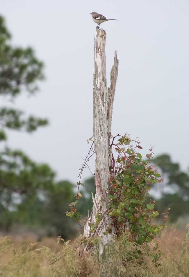
Weathered and sunbleached tree - taken from the Internet, used without permission

Waterlogged dead willow tree - taken from the Internet, used without permission

Generic swamp with brackish water, presumably southeastern United States - image originally from iStockphoto.com, used without permission

Brass pipes and fittings with patina - unnamed southeastern Michigan restaurant

Interestingly shaped new-fallen snow "spikes" on a stainless steel gate - casa Tinweasel, Feb. 2010

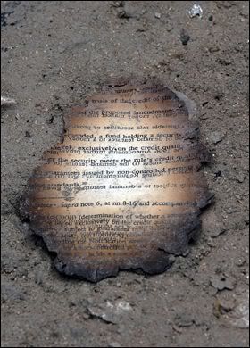
Fire-charred paper - World Trade Center Ground Zero, taken from the Internet, used without permission

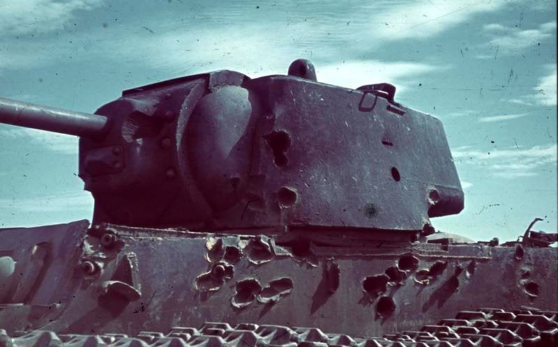
Tank with battle damage - taken from the Internet, used without permission

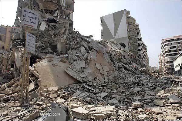
Destroyed apartment buildings in downtown Beiruit - taken from the Internet, used without permission

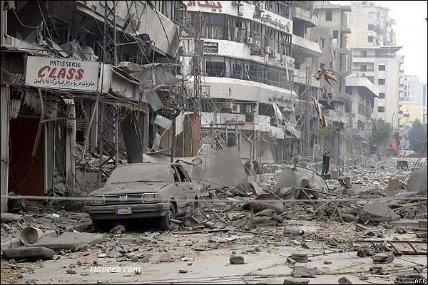
Destroyed city street in downtown Beiruit - taken from the Internet, used without permission
This would be the point where the pictures start to get a little unsettling in subject matter so, again, consider yourself warned.

A cooked turkey wishbone with dried blood - casa Tinweasel

A burned corpse in a military vehicle - taken from the Internet, used without permission

A live human brain infested with housefly maggots - taken from Snopes.com, used without permission
If the owners/original photographers of any of these "material reference" images would prefer me not to have a particular picture posted, let me know and I will certainly take it down.
At any rate, one of the things that I think helped me win an award was the specific attention to detail - this isn't anything that I was told by the judges, or anything that I've read or referenced elsewhere, simply personal opinion. Things like the particular color of the robes illuminated in the scene, or the angle of his arm holding the staff, or the color of the rocklight in the background of the scene; details that if they weren't there, the scene would've still been complete, but would've been missing out on its authenticity or "realism". It's with this same idea in mind that I've since been researching particulars about different materials that I might paint or model up in fine scale on a miniature figure or display base, things like aged brass or chipping paint, the colors and plants found in a generic near-tropical swamp or the ground texture of a washed-out ash wasteland at the edges of a desert - places or things I might not necessarily have been to or seen firsthand, or have readily available for reference, but am trying to replicate on a small scale through paint or modeled appearance.
Now some of these materials and images might be a little more disturbing or graphic than the pictures of weathering I posted some time ago, so if anyone is sensitive or squeamish, consider yourself warned (I've left the somewhat more unsettling subject matter until towards the end):

Expanse of ash waste, with the ocean in the background - taken from the Internet, used without permission
Weathered and sunbleached tree - taken from the Internet, used without permission

Waterlogged dead willow tree - taken from the Internet, used without permission
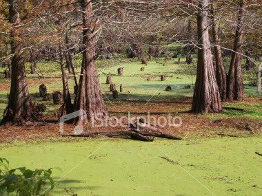
Generic swamp with brackish water, presumably southeastern United States - image originally from iStockphoto.com, used without permission

Brass pipes and fittings with patina - unnamed southeastern Michigan restaurant

Interestingly shaped new-fallen snow "spikes" on a stainless steel gate - casa Tinweasel, Feb. 2010
Fire-charred paper - World Trade Center Ground Zero, taken from the Internet, used without permission
Tank with battle damage - taken from the Internet, used without permission
Destroyed apartment buildings in downtown Beiruit - taken from the Internet, used without permission
Destroyed city street in downtown Beiruit - taken from the Internet, used without permission
This would be the point where the pictures start to get a little unsettling in subject matter so, again, consider yourself warned.
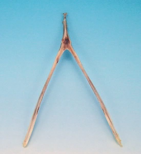
A cooked turkey wishbone with dried blood - casa Tinweasel
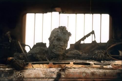
A burned corpse in a military vehicle - taken from the Internet, used without permission
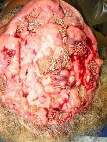
A live human brain infested with housefly maggots - taken from Snopes.com, used without permission
If the owners/original photographers of any of these "material reference" images would prefer me not to have a particular picture posted, let me know and I will certainly take it down.
5/24/2010
My First Finished Berzerkers
I finished these last night to serve as part of the advance guard of my Chaos Space Marine Warband (I also finished a "vanilla" Ultramarine Missile Launcher trooper from the Macragge set, but he was taken out back by these guys and shot or something).
The first one is an inducted Ultramarine, and so I'm using a split scheme where he still has defiled Ultramarine colors, gear in the accent color of my Disciples of the Four Warband, and red armor that's been overpainted on his original coloration so as to signify his role as a Berzerker.
The second is an outright Khorne Berzerker, but I decided I wanted to go with a darker blood-red coloration than the brighter red that many seem fond of using. Posing-wise, there's no conversion - about the main difference between this and any other trooper (aside from the stock Berzerker signifiers) is the shoulder pad panels painted with a background in the accent color of my Warband.
I'd appreciate any feedback or suggestions on these guys, as I'm making a definite attempt to paint to more of a "tabletop" painting standard than a "display" standard as is my usual:
5/21/2010
Commission Giveaway Contest, Revisited
One slight downside is that despite creative packaging and a lot of well-wishing, the figure arrived tipped over on its side inside the box - that essentially means it shimmied loose from being bound upright through holes drilled in a piece of hardboard that itself was hot glued to the bottom of the box. So much for marking the box "fragile" and labeling all four sides with which direction was "up" - it could've been worse, though, as I'm to understand all the only problem in transit was a somewhat bent monofilament blade (that was easily bent back to shape.)
The great news I got today - well, for me and doom_of_the_people, anyway - is that "It looks awesome and definitely lived up to [his] expectations." (I was especially leery of the commission getting there in one piece because the figure itself was pretty fragile in sculpt, had a separate wrist join that was flimsy from the start, and was a decent amount of good faith on both ends. I'm very glad it worked out nicely!)
Hobby Tip - Painting Aged Parchment
Step 1:
 Apply a basecoat of 1 part Vallejo Model Color Russian Uniform (although Games Workshop Catachan Green might do in a pinch) and 3 parts GW Bleached Bone at a 1:1 paint/thinner concentration
Step 2:
 Layer on 1:4 GW Bleached Bone/thinner, leaving the shaded areas and deepest depressions uncovered
Step 3:
 Apply a wash (or two) of GW Devlan Mud over the whole of the area to be painted as parchment, paying extra attention to the depressions and shaded areas
Step 4:
 Layer on a first step of highlighting with 1:4 GW Bleached Bone/thinner, making sure to only brighten up the most raised and/or light-facing areas
Step 5:
 Apply extreme highlights to the edges and most raised areas as finely as possible, paying close attention to sharp edges and corners
Step 6:
 Using a mixture of 1:1 Scorched Brown and Black Ink (or Chaos Black and Badab Black, by preference) thinned down to at least a 1:4 paint/thinner ratio, carefully paint the lines of your letters on the parchment. You might want to practice on some scratch paper beforehand, as it really comes down to getting a feel for the hand movements when putting the brush to figure. It would be a good idea to do the first, last, and middle letters all in the same relative size to get the spacing correct, and then fill in the rest of your lettering as you can subtly adjust the sizing of your letters to accommodate how much room you have left.
It might sound like an oxymoron, but the thinner you have your paints when doing fine detail like this, the more control you will have.
Step 7 (The All-Important One):
 Inevitably, you may need to go back and touch up things a little. Again, thin your paints by a decent margin so as to be able to get it to flow easily. You want to have as sharp a point on the tip of your brush as possible and be applying little to no pressure, simply letting the brush do all the work and allowing the paint to wick off onto your figure.
In this case, I wanted to neaten up the letters a little bit, and add a slightly lighter "highlighted" black to the right-most lettering. I increased the size of the image, too, so that you can see it's not all smoke-and-mirrors, but generally a case of "if it looks about right in close detail then it'll look very close to right at regular scale."
Happy painting!

Step 2:

Step 3:

Step 4:

Step 5:

Step 6:

It might sound like an oxymoron, but the thinner you have your paints when doing fine detail like this, the more control you will have.
Step 7 (The All-Important One):

In this case, I wanted to neaten up the letters a little bit, and add a slightly lighter "highlighted" black to the right-most lettering. I increased the size of the image, too, so that you can see it's not all smoke-and-mirrors, but generally a case of "if it looks about right in close detail then it'll look very close to right at regular scale."
Happy painting!
5/20/2010
Chainsword or Power Weapon?
I'm not going to lie and say it's a deep moral quandary keeping me up at night - although technically it's 3am and I've woken up for no good reason, so I figgered I'd make it worthwhile.
I'm also curious what people think of the weathering on the chain blade "housing" (the formerly white part of his, er, former hand) - I'm trying out a new technique of sorts that I previously only used for bone.
The "moral dilemma," then: Chainsword or Power Weapon? You decide!


I'm also curious what people think of the weathering on the chain blade "housing" (the formerly white part of his, er, former hand) - I'm trying out a new technique of sorts that I previously only used for bone.
5/18/2010
Fun With Shipping, AKA Getting the Commission Giveaway Contest Piece In The Mail
This is the transport method I'm thinking about running with - the bottom disk is an old 60mm base I made from MDF hardboard:

I'm thinking that if I hot glue the underside of the disk to the bottom of a sufficiently roomy box, then it should be golden and not shift around at all. The brass beading wire restricts movement but isn't so tight as to chip paint (I hope) and the foam there is for an added barrier to "insulate" the wire I've got wrapped around it. Something like this, I'm sure, would set off the "bomb squad" at an airport even though being completely harmless, no? Good thing it'll likely go overland, since it's being sent to a neighboring state...
I'm thinking that if I hot glue the underside of the disk to the bottom of a sufficiently roomy box, then it should be golden and not shift around at all. The brass beading wire restricts movement but isn't so tight as to chip paint (I hope) and the foam there is for an added barrier to "insulate" the wire I've got wrapped around it. Something like this, I'm sure, would set off the "bomb squad" at an airport even though being completely harmless, no? Good thing it'll likely go overland, since it's being sent to a neighboring state...
5/17/2010
Revenge of the Lonely Khorne Berzerker!
Well, I'm essentially done with the painting of the figure - I'm still considering what to do for basing, other than that it will likely comprise some sort of urban debris theme - and all that's left is a few touchups of the darkest pueple of my Warband color on the shoulder pads where I got a little slap-happy with the brass color.


For what it's worth, I jotted down his color scheme for reference on all the other figures, so I thought I might post it here if anyone's interested in a darker, blood-colored Berzerker appearance:
Armor:
Ribbed Armor Jointing/Black Areas:
Is the darker scheme decent-looking, as compared to the typical GW Blood Red-painted Berzerker?
For what it's worth, I jotted down his color scheme for reference on all the other figures, so I thought I might post it here if anyone's interested in a darker, blood-colored Berzerker appearance:
Armor:
- Basecoat 1:2:1 GW Mechrite Red/GW Red Gore/GW Scorched Brown at a 1:1 paint/thinner consistency
- Wash in crevices and shading with 1:1 Red Gore/Glack at a 1:6 paint/thinner consistency
- Highlight with 1:4 Red Gore/thinner
- Edge highlight with 1:1 P3 Khador Red Highlight/Red Gore at 1:4 paint/thinner consistency
- Extreme edge highlight with 1:1 Khador Red Highlight/GW Blood Red at a 1:4 paint/thinner consistency
Ribbed Armor Jointing/Black Areas:
- Basecoat 1:1 GW Adeptus Battlegrey/VGC Black Ink at a 1:1 paint/thinner consistency
- Basecoat 1:1:1 P3 Brass Balls/GW Scorched Brown/VGC Sepia Ink at a 1:1 paint/thinner consistency
- Highlight with 1:4 Brass Balls/thinner
- Extreme edge highlight 1:4 GW Shining Gold/thinner
- Over a pure white undercoat, basecoat 1:1 VGC Livery Green/VMC White at a 1:1 paint/thinner consistency
- Wash with 1:8 GW Green Ink/thinner brushed toward depressions and shade areas
- Basecoat 1:1:1 P3 Pig Iron/GW Scorched Brown/VGC Sepia Ink at a 1:1 paint/thinner consistency
- Highlight with 1:1 Pig Iron/Scorched Brown at a 1:4 paint/thinner consistency
- Extreme edge highlight 1:4 GW Chainmail/thinner
Is the darker scheme decent-looking, as compared to the typical GW Blood Red-painted Berzerker?
5/16/2010
Hobby Tip - Painting 40K Shoulder Pads
Now I'm not sure about anyone else (mainly because I don't know many other painters), but I prefer to paint and prime the shoulder pads (and backpacks) separate from the figure, primarily because I like to make sure the figure itself gets as much paint and primer coverage right from the get go. Maybe I'm finicky, but it kind of bothers me if I know that I don't have at least a shade coat in the areas that aren't very visible - since I don't use black primer, this is maybe more relevant, because white primer glinting out brightly from crevices is a little jarring.
Anyways, I paint shoulder pads separately, and a while back I settled on a good way to paint the pads after priming without them touching or resting on anything and thus not getting good coverage themselves. When priming, I use two-sided masking tape and stick them to a paper plate on an angle. It lets me turn the plate 360° and get the pads from all sides, and get both bottom and back edges after a quick flip over once the first coat's dry.
For applying actual paint, I use the following method:

I attach the back of the pads to a coffee stirrer or something similar with poster putty (in the case of the image, they're stuck to the end of plungers from the 1mL syringes I use for measuring out paint ratios, using UHU-Tac reuseable putty) so that way I get 360° access to them when I'm painting, and can simply set the whole thing down to dry - post, pad, and all, when I'm done applying a color. I can do a bunch of 'em assembly-line style, as they don't take up a lot of room, and by the time I get done applying color to the end of the row, the ones from the beginning of the row will be dry. Two of these will be going on the Berzerker from my Disciples of the Four warband, as seen in the top-right of the picture, while the other two are saved for his friend, the inducted Ultramarine Berzerker I showed some while back - they're both nearly done, and should be getting pictures posted "soonish".
5/14/2010
Infinity Speculo Killer Commission, AKA Giveaway Contest Winner [Completed 5/13/2010]
Well, I got word back from doom_of_the_people on the last set of "inches away from finished" pics I passed along to him regarding his Commission Giveaway Contest figure, and I got the "thumb's up" to go ahead and call her done. She is now sealed in several layers of spray acrylic varnish and fully dry, essentially ready to wing her way towards wherever she'll be winging her way towards - as soon as I can figure out a way to box her for mailing in a manner that won't bend the "flimsy" monofilament blade or cause her wrist to snap off at the glued join (yet again). I think I have an idea, though, involving epoxy glue, a small hex nut and bolt, and a small box-end-sized square of MDF hardboard. It might set off metal detectors at the USPS, but it should have enough airspace inside the box to avoid nasty bumps and jarring impacts.
Here's the final set of pictures (post-varnish):


In making the sludge/ooze on the base, I snuck in a few bubbles(?) and some extra rust on the outpouring pipe, too. Hopefully they're easily visible in the last few pictures, since I took those especially for the guy running Secret Weapon Miniatures, figgering he might be able to use them for posterity so as to show off his handiwork. The majority of the decorative stuff that the Speculo Killer is posed on is one of Secret Weapon's resin bases that I hacked up and converted in order to offset it on the Infinity slottabase that the figure came with - who knew cast resin bases were so versatile?
Subscribe to:
Posts (Atom)
LinkWithin
