This is actually a dual-purpose post: one part is that ++From the Warp++ was looking for members of its Blogger group to forward along "one painting tip that we think is very important," the other is that in the Techniques section on my site I haven't yet wrote anything about colory theory as it relates to coloration on a miniature figure. I can metaphorically kill two birds with one stone here, which is nice - especially since my aim is usually bad.
To state things simply, my one painting tip that I think is very important is that every painter should have access to (or memorize, get tattooed on themselves, etc.) a color wheel. If you want to own your own for physical reference, I'd highly recommend any of the standard ones from The Color Wheel Company (available at pretty much any arts 'n' crafts or dedicated art supply store on the face of the globe, I'd wager). One thing to remember, however, is that most color wheels show additive color: Red, Green and Blue colors of light when added together form white light. In mini painting, we are actually more concerned with subtractive color (a color wheel based on Cyan, Magenta, and Yellow) - and conveniently enough, there are also versions of this style color wheel available in art stores.
Unlike additive color based on visible light, in painting and printing and other physical mixtures of pigments, when you add colors together you actually subtract lightness until ideally you would obtain pure black. Unfortunately, pigments are not as pure as wavelengths of light, and so instead of black, the best we can usually hope for is a muddy dark brown. In paints and in printing, in order to combat this, black is usually added to the overall palette of pigments used, among other reasons, but I'll rein in my tendency to ramble and stop here.
So what's the point of a color wheel, you might be asking yourself? It essentially shows the relationships between colors. Assuming you're using a color wheel with three main colors (and there are others, one fairly well-known being the Real Color Wheel by Don Jusko), then the essential idea is that from these three Primary colors, you can derive all the other colors of the visible spectrum. Each one is placed 1/3rd of the distance from each other around the color wheel. Secondary colors are created by mixing each of the Primary colors equally, and thus end up spaced midway around the wheel between each of the Primary colors - on your standard Red-Yellow-Blue Color Wheel, these would be the colors Orange (red + yellow), Green (yellow + blue) and Violet (blue + red). Using combinations of Primary and Secondary colors, you end up with Tertiary colors: Yellow-Green, Blue-Violet, Red-Orange, etc. - this basically fills up all 12 "slots" around the outer edge of a standard color wheel.
So we've got 12 hues (or more, depending on your wheel) around the outside - now what? And how does this relate to miniature painting, exactly? Again, the whole idea of a color wheel is about the relationships between colors. Colors on the outside edge of the wheel facing exactly across from each other are called complementary colors - they are polar opposites and when combined, in theory "cancel each other out." They also look good and provide high contrast in a color scheme when paired together. If pigments combined the same as colors in the visual spectrum, an equal mixture of complementary colors would result in a dark neutral color (say, grey, for example) - as it is, with the impurity of pigments, in most cases you get a shade of brown darker in intensity (relative "vibrancy") than either of your two original complementary colors. This does work well in shading colors, though, for example if you've reached the end of a progression of red hues and don't want to forcibly darken things with the addition of black, a slight amount of dark green added to a dark red will result in what appears to be an even darker reddish hue.
Analogous colors are those which lie adjacent to each other on a color wheel, so Violet, Blue-Violet, and Red-Violet would all be analogous with each other - Violet being the "key" or dominant color tying them all together. Analogous colors look good together in a color scheme as well, but without the same "kick" that you would get visually from pairing complementary colors next to each other. By varying the relative vibrancy of a group of analogous colors through the addition of neutral colors like black, grey, or white, you could have colors in a scheme that would all tie together sitting near each other but without necessarily seeming bland, and then set those off with a complementary spot color in small amounts.
There's more ideas I could go into, but to save this from falling into the "thesis paper" category of blog entries (and to maybe give me more to write about in future if this is interesting to anyone), I'll wrap things up here for now.

6/30/2009
6/28/2009
Hey, look! He's standing on a base! (Forge World Renegade Psyker WIP)
It's taken a while to get to this point, only being able to work in fits and starts. This is one of the Forge World Renegade Psykers I picked up at the Games Workshop Chicago Games Day in 2007. It's taken me a while to get around to work my way over to these guys, partly because there's been a certain "apprehension" in approaching this and the other Psyker - mostly the "it's made of resin!" thing. He is completely cleaned up so far as mold lines, excess material in a few spots, and tidying up things like the leveling of the soles of his boots, so he would properly fit on the pre-cast base from Secret Weapon Miniatures. He's soaking in a jar full of Simple Green along with extra broken chunks of hard resin from another source.

This is actually the first Forge World piece I've worked on, although I've got a few others still in their packaging squirreled away at my painting desk. I've heard stories, both good and bad (and some really bad) about the quality of Forge World's figure casting and the ease to work with of their figures. I must say that although I was initially tentative in handling it, the resin isn't nearly as brittle as I thought it would be - nor as malleable. It was a pretty even mixture of the two in that I could deform some areas to shape by gentle pressure (trying to shape crevices, like the line around both shins where the boots meet his pants, for example) as well as by outright filing/sanding/Dremeling - the latter being important because it would've otherwise taken me forever to get rid of all traces of his now-unneeded slottabase tab. The expected mold lines were very light and none of the casting was mismatched. The only real complaints I have about the figure (and again, I don't really have a standard to compare it to) is that there appear to be multiple mold lines around the figure instead of just the one on a typical GW white metal or plastic figure. There was also some slight excess material in a few areas (front of his right shin, around the sides of the multiple tanks on his back), but nothing on a scale where it was unmanageable or covered details.
Overall, I'd have to say I was quite pleased (and impressed) in prepping this Renegade Psyker figure. The level of detail on the guy is just amazing - I'm wishing I could sculpt even half as well - with things like 1/8" inset areas actually having crisp details at the bottom. He also cleaned up much easier than a comparable GW plastic piece, although a fair amount of this might be due to some tools I just started using in working on this guy - I'll be posting about these at a later time, but sufficent to say I was surprised at how apparently something unassuming such as a few new scraping tools can make such a big change (for the better) in my prepping of figures.
6/23/2009
Bases, Demons, and Renegade Psykers
What do they all have in common? Why, an unhealthy taint of the Fell Powers of Chaos, of course!
First off, a big congratulations to Mathieu Fontaine, AKA akaranseth, and the rest of Team Montreal with their Golden Demon entries at Games Day Toronto! Mathieu's got pictures of his entries posted on his blog - two Silver Demons in the 40K Single Figure and Vehicle categories and a very much-deserved Gold in the 40K Monster category for his Khornate Terminator Lord on a Juggernaut. I've been following the progress on the Terminator Lord and Juggernaut for some time over in the Bolter & Chainsword's Works in Progress Forum (and to a lesser extent on the Team Canada forum site) and it's a beautiful piece. As an aside, that's actually the first time I've seen (or noticed in color) the back end of the fairly new Forge World Nurgle Blight Drone, and I have to say I'm much more impressed with the model now than I was initially - of course, it no doubt helps that Mathieu painted his excellently.
For nigh the past 4 months, there's been a 40K-centered painting competition going on over at the RelicNews Painting & Modeling Forum. I'm entered in several categories - squad, single figure, and vehicle - and all in the upper level painting tier. (Well, don't tell any of them... but due to being out of work coupled with financial worries, the birth of our son with gastric reflux in February, and me now being a stay-at-home dad out of necessity's sake - although that's not bad in and of itself - I've had very little time for painting and there's likely a snowball's chance of my completing any of my projects in time for the upcoming deadline of the 27th here. Did I mention they're all essentially converted, some extensively?)
Ah well... I do plan on following through with all the stuff I was going to enter, and I figger the quickest piece to work on is one of the Forge World Vraksian Renegade Psykers:

I'm not adjusting the figure any - I like him just fine. I ideally plan on using the color scheme I worked out for a corrupted Imperial Guard force based on "The Shriven," from Dan Abnett's first Gaunt's Ghosts novel. The IG force didn't quite pan out (yet), but this psyker's going to see completion if I have to explode people's heads with my mind to do it. Oh yeah, and his base is in the process of conversion with a concept I'm not quite sure if I'll be able to pull off - those are the most fun, though, aren't they? It also involves "explosions!" (This sort of thing happens fairly often when I get a sudden inspiration. I couldn't just stop with the original "simple" plan of painting up Gandalf with object source lighting from his staff, for example, when I decided to enter the Golden Demons for the first time in Chicago in 2007 - I ended up with him converted and standing with staff held aloft and on an angle at the end of a counterbalanced 15" bridge span so as to resemble the "confronting the Balrog" scene from The Fellowship of the Ring.)
So far as bases go, I recently received some test resin bases for "review" as it were, from a friend. (He's in the end stages of developing a line of self-cast custom basing for sale, but it's not "official" yet, so I'll just say that the stuff I received is all good, well-detailed, and that I would be perfectly happy using them for some of my display pieces.) Now, until this point I'd never actually used pre-sculpted decorative bases standalone as I'm generally used to adding my own texture and scenery, but I have to say I was definitely impressed with the crispness in appearance of the details and the overall busy-but-minimalist style - 2 different styles, actually.
I did a bit of customization to it, at least from the standpoint of fitting it to a 25mm GW slottabase slightly offset, but the original resin basing is exactly the theme I'm aiming for with a Chaos Warband I've got in progress, The Disciples of the Four - I'm aiming for urban ruins and debris with the occasional odd patch of cracked asphalt and broken, cratered ground. Eventually I'd like a full scenic army display tray with metal insets for magnetized bases and all the fixin's... but my (short term) goal, at least with these guys, is to actually finish a legitimate 500 point playable force. In the 3-odd years since getting back into painting, I've done a lot of army "test" figures, but always seem to end up going overboard and putting more work and detail into them than I really should if I want to actually end up with a playable force some time in the next century. Anyways, the long and the short of it is that I am now a definite fan of these resin bases and can't wait to put the rest of my sample ones to use! Here's a picture of the base so far:

First off, a big congratulations to Mathieu Fontaine, AKA akaranseth, and the rest of Team Montreal with their Golden Demon entries at Games Day Toronto! Mathieu's got pictures of his entries posted on his blog - two Silver Demons in the 40K Single Figure and Vehicle categories and a very much-deserved Gold in the 40K Monster category for his Khornate Terminator Lord on a Juggernaut. I've been following the progress on the Terminator Lord and Juggernaut for some time over in the Bolter & Chainsword's Works in Progress Forum (and to a lesser extent on the Team Canada forum site) and it's a beautiful piece. As an aside, that's actually the first time I've seen (or noticed in color) the back end of the fairly new Forge World Nurgle Blight Drone, and I have to say I'm much more impressed with the model now than I was initially - of course, it no doubt helps that Mathieu painted his excellently.
For nigh the past 4 months, there's been a 40K-centered painting competition going on over at the RelicNews Painting & Modeling Forum. I'm entered in several categories - squad, single figure, and vehicle - and all in the upper level painting tier. (Well, don't tell any of them... but due to being out of work coupled with financial worries, the birth of our son with gastric reflux in February, and me now being a stay-at-home dad out of necessity's sake - although that's not bad in and of itself - I've had very little time for painting and there's likely a snowball's chance of my completing any of my projects in time for the upcoming deadline of the 27th here. Did I mention they're all essentially converted, some extensively?)
Ah well... I do plan on following through with all the stuff I was going to enter, and I figger the quickest piece to work on is one of the Forge World Vraksian Renegade Psykers:
I'm not adjusting the figure any - I like him just fine. I ideally plan on using the color scheme I worked out for a corrupted Imperial Guard force based on "The Shriven," from Dan Abnett's first Gaunt's Ghosts novel. The IG force didn't quite pan out (yet), but this psyker's going to see completion if I have to explode people's heads with my mind to do it. Oh yeah, and his base is in the process of conversion with a concept I'm not quite sure if I'll be able to pull off - those are the most fun, though, aren't they? It also involves "explosions!" (This sort of thing happens fairly often when I get a sudden inspiration. I couldn't just stop with the original "simple" plan of painting up Gandalf with object source lighting from his staff, for example, when I decided to enter the Golden Demons for the first time in Chicago in 2007 - I ended up with him converted and standing with staff held aloft and on an angle at the end of a counterbalanced 15" bridge span so as to resemble the "confronting the Balrog" scene from The Fellowship of the Ring.)
So far as bases go, I recently received some test resin bases for "review" as it were, from a friend. (He's in the end stages of developing a line of self-cast custom basing for sale, but it's not "official" yet, so I'll just say that the stuff I received is all good, well-detailed, and that I would be perfectly happy using them for some of my display pieces.) Now, until this point I'd never actually used pre-sculpted decorative bases standalone as I'm generally used to adding my own texture and scenery, but I have to say I was definitely impressed with the crispness in appearance of the details and the overall busy-but-minimalist style - 2 different styles, actually.
I did a bit of customization to it, at least from the standpoint of fitting it to a 25mm GW slottabase slightly offset, but the original resin basing is exactly the theme I'm aiming for with a Chaos Warband I've got in progress, The Disciples of the Four - I'm aiming for urban ruins and debris with the occasional odd patch of cracked asphalt and broken, cratered ground. Eventually I'd like a full scenic army display tray with metal insets for magnetized bases and all the fixin's... but my (short term) goal, at least with these guys, is to actually finish a legitimate 500 point playable force. In the 3-odd years since getting back into painting, I've done a lot of army "test" figures, but always seem to end up going overboard and putting more work and detail into them than I really should if I want to actually end up with a playable force some time in the next century. Anyways, the long and the short of it is that I am now a definite fan of these resin bases and can't wait to put the rest of my sample ones to use! Here's a picture of the base so far:
6/20/2009
General Editing in Progress
Not much in the way of amazing news, I know, but I think I'm starting to get the layout of this Blogspot page knocked into shape. It would be greatly appreciated if anyone could leave feedback or suggestions, especially if anything looks out of place and is potentially correctable from a code/layout standpoint - I don't have ready access to browsers other than IE at this point.
I am also trying to integrate parts of this blog - at least the news feed if I can swing it - into my "official" Painting by Tinweasel website, where I maintain my gallery, tutorials, images, etc. I am completely news to this RSS feed thing and on conversational terms (but not much more) with XML - I've done a lot of personal coding in HTML and CSS, however. If anyone could make any suggestions or offer any advice to make for a smooth integration, well, I'm all ears!
I'm also curious as to what sorts of things people might like to see, especially anyone stopping by that might be familiar with my work and/or painting style. Granted, this is kinda putting the cart before the horse and all, but the main reason my painting website has suffered from a lack of updates (outside of "real life" stuff) is that revising the main Painting by Tinweasel static website index file is more awkwards than it needs to be in order to add any news. This blog looks to be ideal for that - but again, I'd like to integrate it into my static website if at all possible. Thanks in advance, hopefully!
6/15/2009
How to Make Your Own Iconography and Put It On... Stuff, Part 1
This is the start of a series on making iconography for use with fine-scale miniatures - in this case, I'm specifically creating iconography for use with my Warhammer 40K Chaos Space Marine Warband, the Disciples of the Four. Ideally, I'll be covering a number of things:
For the sake of starting somewhere, I'll assume that anyone reading this is at least computer-savvy (it's posted online, after all) and has access to some sort of image/photo editing/creation software. There's a number of programs out there, from the oft-overlooked MS Paint that comes with Windows, to image editing software available for download from the internet for free/shareware use (GIMP springs to mind, for one), to full-blown (and generally) expensive professional-grade image editing/illustration programs such as Adobe Photoshop and Corel Painter. In the example pics, I'm using Paint Shop Pro 7 - it's quite a few years old now but was more or less comparable to Adobe Photoshop at the time, and the rights are currently owned by Corel with the recent iteration emasculated and stripped down into strictly a photo editing suite. (I'm guessing all the good stuff ended up getting ported over to CorelDRAW or Painter, but that's neither here nor there.) In other words, it doesn't necessarily matter what software you use (old or new), but there's certain things I'm going to be demonstrating and if your own program can't do them you're going to have to either get creative or find some other workaround. If there's any questions about any of my steps, by all means feel free to ask me!
This is what your own image editing/illustration program ought to be able to do in order to replicate what I'm going to show: use image resolution of higher than 300 pixels per inch, save your images in a higher resolution format, and be able to save your image with actual transparency as opposed to dithering (if you want your final insignia to have uneven shapes w/ crisp edges, that is). Ideally, you'd be able to draw using vectors, multiple layers, and both background and layer transparency (whether via alpha channel or by default) as it makes things much easier and allows for many more options in what you can put in your iconography.
Here is the example I will be using for the remainder of the tutorial:
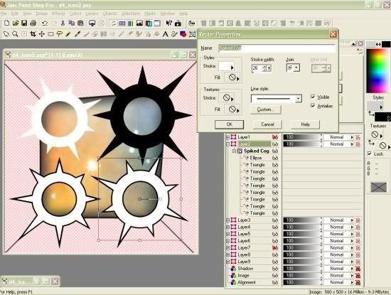
The entire image was drawn on a transparent background, as I wanted to use 4 spiked cog shapes to represent the 4 Chaos Powers in 40K that my Chaos Marines worship. I went through quite a few test designs - adjusting the length of the spikes, the shape of the spikes, the size of the circles, their relationship to each other, etc. before finally settling on at least the design of the 4 cogs. My version of Paint Shop Pro allows you to draw images formed out of multiple vector "parts," group them, and then save them altogether as a reuseable "preset shape." Since the shoulder pad color for my Chaos Marine Warband is purple, I wanted to have white iconography - but for the sake of printing on white decal paper, also went with a thin black outline for all the shapes.
What you can see here is one of the spiked cog shape layers "opened up," showing the component vector parts of the design - a hollow circle and eight evenly spaced triangles. As the "spiked cog" preset shape, though, it's an easy thing to rotate and resize things - so what the rest of the picture shows is that the overall spiked cog design is actually made up of two sets of 4 cogs: one white, which is the actual insignia design; one black, which has each of its spiked cogs centered under a white one and at a slightly larger size. The 45° angled lines in the background on the underlying "Alignment" layer are there for the sake of having the iconography itself aligned evenly, to a certain extent, even though the spikes on the cogs themselves are of different widths, lengths, and overall "balance" - that's how I'm hoping to get across the sense of "chaos" in the imagery although the icon itself is proportionately spaced so as to be "aesthetically pleasing." That's the idea, anyhow.
It wasn't until I printed out the design and tried cutting it out that I realized that although trimming around all the individual spikes was manageable (for me, anyways, although I'm told I have a higher tolerance for mindless tedium than some), it was going to take so long across an entire army's worth of shoulder pad insignia that it was more trouble than it was worth. Rather than scrap the entire design, as I rather liked it after all the work I put in, I decided instead to add a colored background to fill in some of the space and cut down on the overall "pointiness" of things. I actually was inspired by an image of the Omega/Swan Nebula (M17) that I found on the official Hubble Space Telescope site, which is the "Image" layer after some trimming and tweaking. To put a black edge around the colored area and blend everything together, I used a hollowed-out partially transparent color gradient - the "Shadow" layer.
- How to create an icon in a paint program
- How to transfer a saved icon image from your computer via an inkjet printer
- How to transfer a saved icon via a Laser copier/printer
- How to transfer a saved icon onto other mediums
- And, last but not least, how to translate your custom-made iconography into insignia decals - in this case for use on the shoulder pads of my Chaos Marines
For the sake of starting somewhere, I'll assume that anyone reading this is at least computer-savvy (it's posted online, after all) and has access to some sort of image/photo editing/creation software. There's a number of programs out there, from the oft-overlooked MS Paint that comes with Windows, to image editing software available for download from the internet for free/shareware use (GIMP springs to mind, for one), to full-blown (and generally) expensive professional-grade image editing/illustration programs such as Adobe Photoshop and Corel Painter. In the example pics, I'm using Paint Shop Pro 7 - it's quite a few years old now but was more or less comparable to Adobe Photoshop at the time, and the rights are currently owned by Corel with the recent iteration emasculated and stripped down into strictly a photo editing suite. (I'm guessing all the good stuff ended up getting ported over to CorelDRAW or Painter, but that's neither here nor there.) In other words, it doesn't necessarily matter what software you use (old or new), but there's certain things I'm going to be demonstrating and if your own program can't do them you're going to have to either get creative or find some other workaround. If there's any questions about any of my steps, by all means feel free to ask me!
This is what your own image editing/illustration program ought to be able to do in order to replicate what I'm going to show: use image resolution of higher than 300 pixels per inch, save your images in a higher resolution format, and be able to save your image with actual transparency as opposed to dithering (if you want your final insignia to have uneven shapes w/ crisp edges, that is). Ideally, you'd be able to draw using vectors, multiple layers, and both background and layer transparency (whether via alpha channel or by default) as it makes things much easier and allows for many more options in what you can put in your iconography.
Here is the example I will be using for the remainder of the tutorial:
The entire image was drawn on a transparent background, as I wanted to use 4 spiked cog shapes to represent the 4 Chaos Powers in 40K that my Chaos Marines worship. I went through quite a few test designs - adjusting the length of the spikes, the shape of the spikes, the size of the circles, their relationship to each other, etc. before finally settling on at least the design of the 4 cogs. My version of Paint Shop Pro allows you to draw images formed out of multiple vector "parts," group them, and then save them altogether as a reuseable "preset shape." Since the shoulder pad color for my Chaos Marine Warband is purple, I wanted to have white iconography - but for the sake of printing on white decal paper, also went with a thin black outline for all the shapes.
What you can see here is one of the spiked cog shape layers "opened up," showing the component vector parts of the design - a hollow circle and eight evenly spaced triangles. As the "spiked cog" preset shape, though, it's an easy thing to rotate and resize things - so what the rest of the picture shows is that the overall spiked cog design is actually made up of two sets of 4 cogs: one white, which is the actual insignia design; one black, which has each of its spiked cogs centered under a white one and at a slightly larger size. The 45° angled lines in the background on the underlying "Alignment" layer are there for the sake of having the iconography itself aligned evenly, to a certain extent, even though the spikes on the cogs themselves are of different widths, lengths, and overall "balance" - that's how I'm hoping to get across the sense of "chaos" in the imagery although the icon itself is proportionately spaced so as to be "aesthetically pleasing." That's the idea, anyhow.
It wasn't until I printed out the design and tried cutting it out that I realized that although trimming around all the individual spikes was manageable (for me, anyways, although I'm told I have a higher tolerance for mindless tedium than some), it was going to take so long across an entire army's worth of shoulder pad insignia that it was more trouble than it was worth. Rather than scrap the entire design, as I rather liked it after all the work I put in, I decided instead to add a colored background to fill in some of the space and cut down on the overall "pointiness" of things. I actually was inspired by an image of the Omega/Swan Nebula (M17) that I found on the official Hubble Space Telescope site, which is the "Image" layer after some trimming and tweaking. To put a black edge around the colored area and blend everything together, I used a hollowed-out partially transparent color gradient - the "Shadow" layer.
6/13/2009
Brave New World
No, not the novel - although I'm prone to rambling both in print and in person and could probably fill the pages of a thick book if left unchecked. No, essentially this marks my attempt to move into the modern modern era and run a (ideally) regularly updated blog, as opposed to a somewhat-more-tricky-to-create-and-publish central news page on a website proper.
With fingers crossed, here I go!
With fingers crossed, here I go!
Subscribe to:
Posts (Atom)