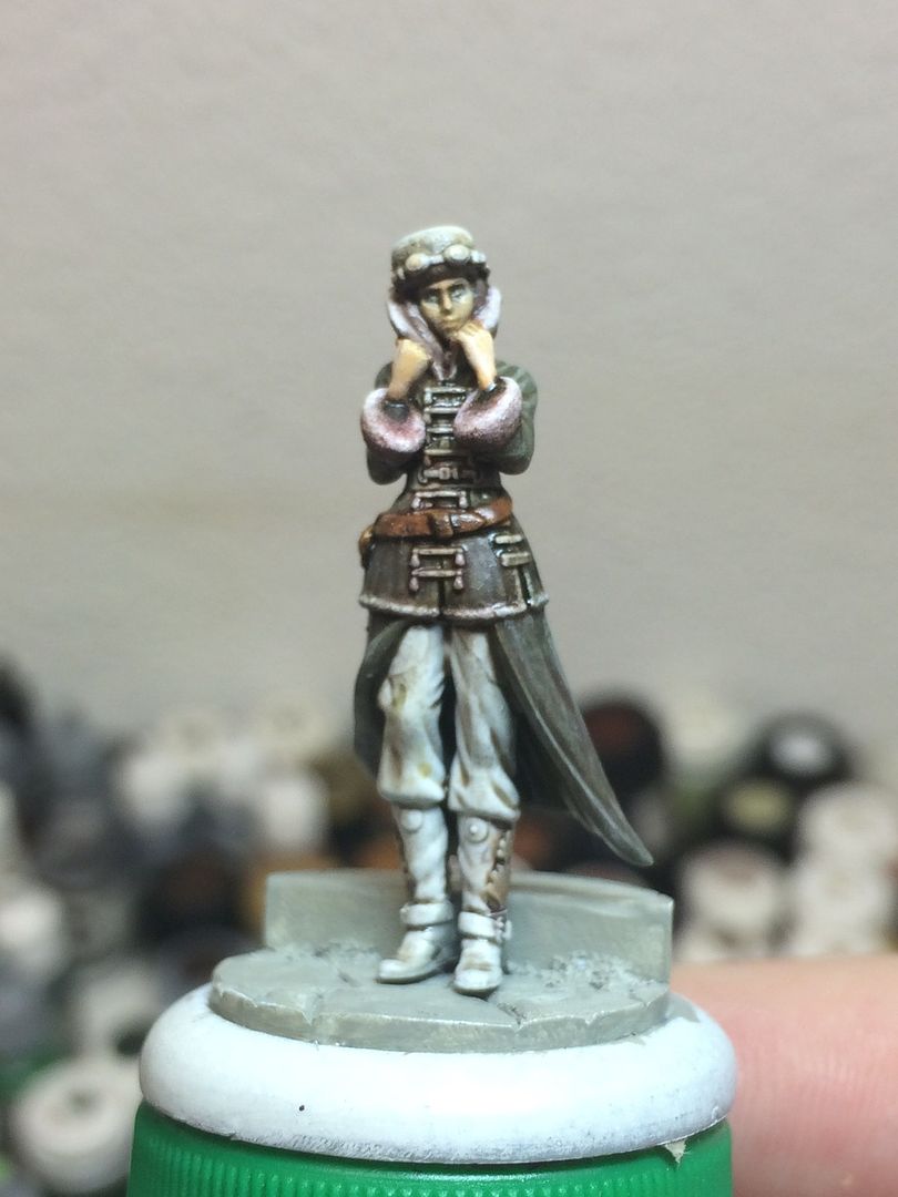
I managed to get a fair bit of work done on Rasputina yesterday and took pictures to see if anything looked out of place. I've given up on the face, it is what it is (one of my recent setbacks was painting her face and feeling like I'd ruined it) - gotten it to where it's "acceptable" to me and that'll do.
I think the back of her coat - around the belt, small of her back, etc. - needs a bit more shading (I'm going to add in purple in deeper shadows across the figure to tie her in with the rest of the crew) but otherwise I'm fairly happy with how things have turned out so far.
I'm still trying to come to grips with using a wet palette while also trying to play up her "cannibal" aspect with staining down her front (fur trim, front of coat, patches on the knees) without being over the top. I think the blending's turned out well with her skirt, coat, and pants (painted with a wet palette), while everything else was painted in my previous style.
Feedback would be appreciated!
Showing posts with label work in progress. Show all posts
11/02/2015
9/13/2015
A Wild Update Appears!
My first attempt at painting since getting my cast off my wrist. I was trying to tidy up what I think was a horribly-painted face from a few months ago (prompting me to surrender), and I think it's not so bad now. I also added some stains and highlights to the fur trim. Going to get the rest of Rasputina done next.
I'm aiming for a Russian Uniform green coat that will be shaded to blue, blood-stained fur trim/clothes, and a halfway-decent pale skin tone.
I'm essentially trying to get an end result similar to Rasputina from the Wyrd Children of December box art, plus blood stains.
Feedback appreciated!
I'm aiming for a Russian Uniform green coat that will be shaded to blue, blood-stained fur trim/clothes, and a halfway-decent pale skin tone.
I'm essentially trying to get an end result similar to Rasputina from the Wyrd Children of December box art, plus blood stains.
Feedback appreciated!
4/04/2015
Rasputina Work-In-Progress
Here's two work-in-progress pics of my Rasputina. I got tired of her sitting around getting no love, she's been at a standstill for at least a month due to a whole lot of Real Life(tm) stuff going on - not the least of which was the death of my wife's father, a great man who I loved very much.
1) I have no clue how these pictures are coming across since I'm still trying to figure out the best photo setup after our move to the new house - I would appreciate feedback on the clarity of the pics (the front picture is slightly different camera options than the back)
2) I'm not really happy with how the face is turning out. I had to redo most of it after a painting accident (again, is detail even visible, or do I need to refine my picture-taking?)
1) I have no clue how these pictures are coming across since I'm still trying to figure out the best photo setup after our move to the new house - I would appreciate feedback on the clarity of the pics (the front picture is slightly different camera options than the back)
2) I'm not really happy with how the face is turning out. I had to redo most of it after a painting accident (again, is detail even visible, or do I need to refine my picture-taking?)
Oh, and there's not really much near completion outside of the face and fur trim(s) - the VMC Russian Green is pre-highlighted and I'm going for a look mostly like the Wyrd box art, just because I like it. Except there'll be more blood stains because, well, it's Rasputina and she's presumably a cannibal.
Feedback greatly appreciated!
1/10/2015
Translucent Pink Daydreams
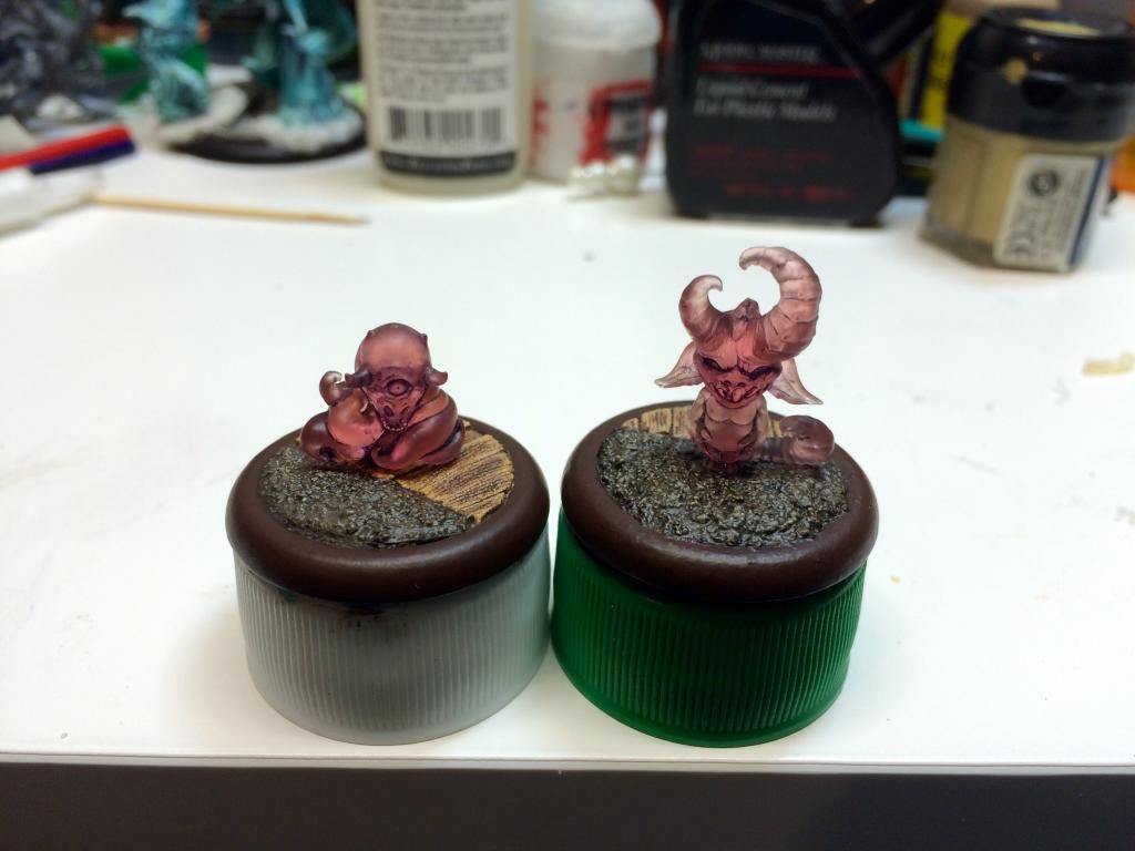
I just wanted to show off a work-in-progress picture of the two Translucent Pink Daydreams I've been working on for the past little while. I got the Translucent Pink "Hide and Seek" set during Wyrd Games' Black Friday sale.
The figures are shaded, the bases are painted, and everything's sealed in several coats of different sealants so as to be safe on the table. I still need to finish decorating the bases to represent woodlands and a 19th Century orphanage/nursery split between worlds, but this is straight from my iPhone to the world.
Critique and suggestions appreciated!
The figures are shaded, the bases are painted, and everything's sealed in several coats of different sealants so as to be safe on the table. I still need to finish decorating the bases to represent woodlands and a 19th Century orphanage/nursery split between worlds, but this is straight from my iPhone to the world.
Critique and suggestions appreciated!
8/09/2014
Frustration!
I was trying to paint some more on the Malifaux Ice Golem and mixed in one of Games Workshop's new paints for a highlight and some color transitions.
This is the first I've used this Ceramite White since I bought it about a year ago - turns out this generically-labeled white paint is essentially a brush-on primer. I've used thick white paints before - VMC White, for one, and Ceramite is something completely different. It even separates differently w/ my thinner mixtures and everything. Wishing I had never bought the crap.
Unfortunately, I used it as the white base I added light blue into, and then spread to a few other palette wheels. If I wanted to paint with, say Elmer's Glue, it would've been nice to know I was about to do that before I did it. Oh well, it is what it is.
Guess who's relegated his wannabe Gen Con MHE Painting Competition entry back down to a regular tabletop figure?
Pfft.
This is the first I've used this Ceramite White since I bought it about a year ago - turns out this generically-labeled white paint is essentially a brush-on primer. I've used thick white paints before - VMC White, for one, and Ceramite is something completely different. It even separates differently w/ my thinner mixtures and everything. Wishing I had never bought the crap.
Unfortunately, I used it as the white base I added light blue into, and then spread to a few other palette wheels. If I wanted to paint with, say Elmer's Glue, it would've been nice to know I was about to do that before I did it. Oh well, it is what it is.
Guess who's relegated his wannabe Gen Con MHE Painting Competition entry back down to a regular tabletop figure?
Pfft.
8/02/2014
Malifaux "Children of December" Ice Golem II
Here's phase two, after adding in more color to the Ice Golem. The photos don't do it justice IMO (do they ever?) in that it's actually more of a teal-ish blue than an outright green.
Comments and suggestions much appreciated! I'm painting him up for tabletop use, but since the Malifaux crews are so small and the figures are so awesome, I'm painting them up to as high a standard as I can manage and then I'll just seal the heck out of 'em. (Ought to be easy, as I plan on leaving the Ice constructs semi-glossy anyhow - not sure if that'd the be whole figure or if I go in and add gloss to just the flat ice parts, I'm still undecided.)
7/30/2014
Malifaux "Children of December" Ice Golem
I'm making a serious effort to get the 'Children of December' gang for Malifaux painted up, ideally all of them before GenCon 2014, but I'll take what I can get. I'm starting on the big Ice Golem first, and I've finally got a color progression that I like and hope will work out nicely in the end.
That said, does anyone have any suggestions on painting something to look like translucent ice (or how to get the dark and sinister vibe of the crew box set cover, which I love)?
Two colors in from white primer on the Ice Golem, suggestions/comments appreciated! ( I haven't painted anything serious in a good six months or so, so be gentle...)
That said, does anyone have any suggestions on painting something to look like translucent ice (or how to get the dark and sinister vibe of the crew box set cover, which I love)?
Two colors in from white primer on the Ice Golem, suggestions/comments appreciated! ( I haven't painted anything serious in a good six months or so, so be gentle...)
12/05/2013
Call of Cthulhu Figures WIP #1
I mentioned starting work on some Call of Cthulhu figures for a customer but haven't had a chance to make a proper painting blog post since I received the first batch. Let me remedy that:
Above are the first two investigators I'm working on: the first one I'm picturing as some sort of 1920's playboy in a boldly colored shirt and tie, and the second as a doctor who may or may not be menacing. I've basically been given free rein by the client to paint them up however I like, and so I've been working on the doctor off and on this past week (would've started sooner, but a bad case of conjunctivitis last week made my vision blurry and the rest of me miserable)... and he's definitely leaning towards the sinister.
Aside from basecoating and shading the skin areas a few days ago, I think the skin areas are done with highlights worked up 3 steps, the eyes painted in and eyelids cut in to shape, the dress shirt highlighted up to pure white, the vest a pale greyish-blue, and the tie (cravat?) a darker greyish-blue. From here I plan on putting him in a black suit and hat with leather accessories.
I'm mostly following a recipe that Keith Robertson (of Games Workshop/Forgeworld fame) gave me ages ago for the skin tones he used on a 40K Ratling sniper, mixed half-and half with a skin tone progression Mike McVey posted on his blog ages and ages ago - it's not my usual selection of skin tone paint colors, but I like the results! (And thank you also, gentlemen...)
Above are the first two investigators I'm working on: the first one I'm picturing as some sort of 1920's playboy in a boldly colored shirt and tie, and the second as a doctor who may or may not be menacing. I've basically been given free rein by the client to paint them up however I like, and so I've been working on the doctor off and on this past week (would've started sooner, but a bad case of conjunctivitis last week made my vision blurry and the rest of me miserable)... and he's definitely leaning towards the sinister.
Aside from basecoating and shading the skin areas a few days ago, I think the skin areas are done with highlights worked up 3 steps, the eyes painted in and eyelids cut in to shape, the dress shirt highlighted up to pure white, the vest a pale greyish-blue, and the tie (cravat?) a darker greyish-blue. From here I plan on putting him in a black suit and hat with leather accessories.
I'm mostly following a recipe that Keith Robertson (of Games Workshop/Forgeworld fame) gave me ages ago for the skin tones he used on a 40K Ratling sniper, mixed half-and half with a skin tone progression Mike McVey posted on his blog ages and ages ago - it's not my usual selection of skin tone paint colors, but I like the results! (And thank you also, gentlemen...)
9/28/2013
Tsathogga, Part 2
I've been painting away in fits and starts on Tsathogga, The Frog God - today was the first weekend day I've not had to work at all in roughly a month-and-a-half and moreso, I actually had an opportunity to get some decent work in on this guy's underbelly. (Not complaining about working per se, more about the lack of free time...) There's been a few other pics I've taken of various color stages on his underbelly and neck, but when it came right down to editing pics tonight to post something, I don't really think they showed anything worthwhile compared to this last one - essentially I went through a number of color changes, from greyish-green to pale grey to fleshy and finally, to this point which ends up being a combination of all of them!
While I think I probably should go back and add another layer of highlighting, between how this looks photographed and the feedback I received at this season's first meeting of the Michigan Historical Miniatures Club earlier this week, I really think I ought to just push on and start adding coloration to the rest of the figure. In case my as-yet-untried airbrush masking skills crash and burn I won't have so much to redo, or more optimistically, when I get the rest of his skin tone and blotches and stripes and things blocked out I can decide how exactly to lighten up the underside a bit more - cool colors, warmer colors, more grey, and so forth.
Feedback, as usual, is always appreciated - especially any suggestions on how to approach realistic contrast of a figure at this size (again, he's almost a good foot long from tip of his front hand to back of his hindmost foot). I'm guessing the easy answer would be to "exaggerate the highlighting and shading even moreso," but that's something I consistently struggle with, even on much smaller figures.
While I think I probably should go back and add another layer of highlighting, between how this looks photographed and the feedback I received at this season's first meeting of the Michigan Historical Miniatures Club earlier this week, I really think I ought to just push on and start adding coloration to the rest of the figure. In case my as-yet-untried airbrush masking skills crash and burn I won't have so much to redo, or more optimistically, when I get the rest of his skin tone and blotches and stripes and things blocked out I can decide how exactly to lighten up the underside a bit more - cool colors, warmer colors, more grey, and so forth.
Feedback, as usual, is always appreciated - especially any suggestions on how to approach realistic contrast of a figure at this size (again, he's almost a good foot long from tip of his front hand to back of his hindmost foot). I'm guessing the easy answer would be to "exaggerate the highlighting and shading even moreso," but that's something I consistently struggle with, even on much smaller figures.
5/22/2012
Last WFB Empire Amethyst Wizard WIP
At this point, I think I can safely say that I've put as much work as I'd like into this Empire Amethyst Wizard without going too over the top, being totally nitpicky and fiddling with things to the point that I've done with previous competition painting figures.
The base is finished with texture added, now painted, and a "spot color" element to tie the green areas together in a "triad" of sorts so the color looks balanced with the majority purple/violet in the rest of the figure's coloring. With input from Brandt over at Toadkiller Miniatures and my wife, the back of the figure now looks much less bland and "boring" that in previous postings.
I think the liquid appearance effect I attempted in the flask turned out nicely, and while I'm not completely sold on the glass appearance effect I tried on the upper part of the flask (mostly due to the wonky bottle shape, or at least that's the official reason), I think that turned out reasonably well also.
Here's a pic of the wizard prior to spray sealing (a little fuzzy due to the image being taken on my iPhone):
Feedback, suggestions and comments would all be greatly appreciated. As per my intent with this guy to paint him up specifically for sale (as opposed to "for keeps"), I'll post details of the auction and such when I get that aspect of things together - haven't sold any painted figures of mine online yet (outside of commissions) so I'm looking forward to this!
The base is finished with texture added, now painted, and a "spot color" element to tie the green areas together in a "triad" of sorts so the color looks balanced with the majority purple/violet in the rest of the figure's coloring. With input from Brandt over at Toadkiller Miniatures and my wife, the back of the figure now looks much less bland and "boring" that in previous postings.
I think the liquid appearance effect I attempted in the flask turned out nicely, and while I'm not completely sold on the glass appearance effect I tried on the upper part of the flask (mostly due to the wonky bottle shape, or at least that's the official reason), I think that turned out reasonably well also.
Here's a pic of the wizard prior to spray sealing (a little fuzzy due to the image being taken on my iPhone):
Feedback, suggestions and comments would all be greatly appreciated. As per my intent with this guy to paint him up specifically for sale (as opposed to "for keeps"), I'll post details of the auction and such when I get that aspect of things together - haven't sold any painted figures of mine online yet (outside of commissions) so I'm looking forward to this!
5/17/2012
Nearly-Finished WFB Empire Amethyst Wizard
Awright - a roundup of changes/additions since the last posting about this guy: I added another slight highlight to a few select skin areas - bridge/tip of nose, knuckles, etc. I added shading to the gold skull at the top of his scythe and used the same sepia/burnt umber wash color to add a little more definition to his skin tones, especially depressions like his mouth, between his fingers, sides of his face, arm areas where they blend back into his sleeves, etc. I used the same dirty/rusty color on the blade and back end of his scythe on both sides, although why it shows up darker on the right side pic versus the left I have no idea. A light drybrushing/wetbrushing of Mithril Silver on the top edges and in striations down the scythe blade.
I worked up smooth transitional highlights on his outer cloak with a thinned-down 1:1:1 GW Space Wolf Grey/VGC Hexed Lichen/GW Black Ink mixture, and then glazed the whole thing several times once dry with GW Badab Black - it's a nice paint when you balance the figure so it can dry evenly into depressions w/o tide pools. I also added striations on his beard with the original purple/grey highlight color I worked up to on his outer cloak.
I worked up the wood grain on the wood of his scythe with fine lines of GW Graveyard Earth, 1:2 Graveyard Earth/Bleached Bone, VGC Sepia Ink, and then a slight glaze of thinned down VGC Sepia Ink to tie it all together more.
As for the bottle, the highlights and interior "glass" color are painted on (minus a little glossiness from my paint thinners) - never tried anything like this before (it's quite a bit different from painting simple gemstones, I tell ya) and I'm really curious what you guys think of the finished bottle. I added more of a color fade from light to dark on the vivid green of the liquid in the bottle, too, as a part of tidying up the darker glass areas. If anyone wants more detail on the painting or colors used, just ask!
I've got a little something decorative planned for the base so as to balance out the other greens with a "triad" of spot color. Aside from that, I'm thinking just plain muddy dirt appearance and a few patches of burnt-colored static grass. I had been considering some freehand to make it more saleable, but I think I've already put in more time and effort than I'm likely to get back in an auction for him so I don't think I'll do any of that, but I think the base decoration will be pure win... and who knows, I might actually get some decent bids out of it with a long enough auction.
Would and of you readers familiar with selling figures online recommend a Buy Price or some such on eBay (or are there better mini auction sites, even?) - I still haven't sold any mini-related stuff via that route in all this time, so this guy will likely be my first. I was thinking a minimum price of at least $19.95 US - I don't consider that to be excessive considering he's a high-end tabletop character model, I put a fair amount of time and work into him... and I've no idea what to expect.
4/30/2012
WFB Empire Amethyst Wizard
Lately I've been painting with and helping out Brandt of Toadkiller Miniatures. Looking through my collection of figures I could work on in a similar manner to sell online or locally, it put me in mind of a way-old GW Empire Wizard I basecoated 'round about 2007 along with a way-old plan to work on this guy, sell him, and post the results as I went along. He's painted as a member of the Amethyst College of Magic, according to Warhammer Fantasy background.
Without further ado, here's my current progress:
I can't really write up what I've done because in the past few days I've had a flurry of activity working on it. I can say that I have tried the recently-released GW color range, and that the roses have benefited from highlights with GW Emperor's Children layer paint and glazes/washes/lining in with GW Druchii Violet shade color in addition to the old GW Baal Red Wash.
The skin was highlighted up with a mixture of 1:1:1 Reaper MS Bright Skin Highlight/Vallejo Model Color Deck Tan/Vallejo Game Color Skin Wash ink thinned to a 1:4 paint/thinner consistency, and then having a few drops of GW Skull White added and then suitably thinned - I went up a few steps in color on the skin, adding more skull white until I got to the final highlights on tip of nose, knuckles, etc.
The cloth strips and hood had previously been colored and shaded a dirty cream color, and overall just weren't working in terms of the overall scheme. I went back over them with a mixture of thinned Vallejo GC Hexed Lichen, Hexed Lichen with a few drops of GW Bleached Bone as a next layer, and then with Emperor's Children added to the mix in a separate palette well with additional drops of Bleached Bone. I went back and forth with these three thinned colors for a while until I had gotten shaded areas darker purple, mid-tone areas the second color set, and highlights a combination of the 2nd/3rd color sets with pure Emperor's Children/Bleached Bone as sparse edge highlighting.
The next biggest change was switching the color of the liquid in the vial from my original purple to an unhealthy green - I actually had the liquid fully painted using similar colors to what I used on the cloth and hood, but all the purple on the figure seemed all too close together and too similar in shade. I decided (well, mostly my wife suggested and I agreed) to go with a poisonous green color for the liquid so as to not have things too monochromatic, as well as balance out the green of the vines on the scythe and a presumed green something-or-other on the base when all's said and done to have a spot color "triad."
Oh, and since my painting skill has improved over the past while, I'm going to try for a "glass" appearance on the non-liquidy part of the flask. I'd also like to put some minimal freehand work on him somewhere, but am undecided as to exactly where and exactly what - I'm not really as familiar with GW's Warhammer Fantasy game as I am with Warhammer 40K.
Feedback would be greatly appreciated! Moreso, since I'd ideally like to sell/auction this guy off without a specific commission for him, which is something I've not actually done for any of my painted figures yet, surprisingly enough.
Without further ado, here's my current progress:
I can't really write up what I've done because in the past few days I've had a flurry of activity working on it. I can say that I have tried the recently-released GW color range, and that the roses have benefited from highlights with GW Emperor's Children layer paint and glazes/washes/lining in with GW Druchii Violet shade color in addition to the old GW Baal Red Wash.
The skin was highlighted up with a mixture of 1:1:1 Reaper MS Bright Skin Highlight/Vallejo Model Color Deck Tan/Vallejo Game Color Skin Wash ink thinned to a 1:4 paint/thinner consistency, and then having a few drops of GW Skull White added and then suitably thinned - I went up a few steps in color on the skin, adding more skull white until I got to the final highlights on tip of nose, knuckles, etc.
The cloth strips and hood had previously been colored and shaded a dirty cream color, and overall just weren't working in terms of the overall scheme. I went back over them with a mixture of thinned Vallejo GC Hexed Lichen, Hexed Lichen with a few drops of GW Bleached Bone as a next layer, and then with Emperor's Children added to the mix in a separate palette well with additional drops of Bleached Bone. I went back and forth with these three thinned colors for a while until I had gotten shaded areas darker purple, mid-tone areas the second color set, and highlights a combination of the 2nd/3rd color sets with pure Emperor's Children/Bleached Bone as sparse edge highlighting.
The next biggest change was switching the color of the liquid in the vial from my original purple to an unhealthy green - I actually had the liquid fully painted using similar colors to what I used on the cloth and hood, but all the purple on the figure seemed all too close together and too similar in shade. I decided (well, mostly my wife suggested and I agreed) to go with a poisonous green color for the liquid so as to not have things too monochromatic, as well as balance out the green of the vines on the scythe and a presumed green something-or-other on the base when all's said and done to have a spot color "triad."
Oh, and since my painting skill has improved over the past while, I'm going to try for a "glass" appearance on the non-liquidy part of the flask. I'd also like to put some minimal freehand work on him somewhere, but am undecided as to exactly where and exactly what - I'm not really as familiar with GW's Warhammer Fantasy game as I am with Warhammer 40K.
Feedback would be greatly appreciated! Moreso, since I'd ideally like to sell/auction this guy off without a specific commission for him, which is something I've not actually done for any of my painted figures yet, surprisingly enough.
4/17/2012
Something Wicked This Way Comes
I've gotten back into painting again after another absence (been working a 60hr up-at-4am-every-morning job since last September, but am now laid off) and am motivated to get some sort of 40K army painted, even if a small one, that I can game with. I came to the realization that out of all the half-finished projects, a Necron force I've had shelved since 2008 was the furthest along and, more importantly, the easiest to really get cracking with in terms of cutting corners and just getting them done! I've not really done "army style" painting before, but with these Warriors I did one step at a time on each figure on the batch of 5 until I got 'em done to move on to the next step.
This current batch of Warriors have now all been painted over the base color with shading, several layers of highlight, and the glow effects more or less fleshed out. I'm normally better at writing down color recipes so I can go back to things after the fact, but for some reason I never jotted notes on doing the glow color or the greenish physical corrosion on these guys. I've had to reinvent a painting recipe and color progression for both of those, and made a few other tweaks besides since I've picked up new colors - and, um, additional painting skills - since I last set brush to these guys almost 4 years ago. I'm planning a replacement for the one hand of the guy with the spiky growths from his upper left body - I decided I just wasn't happy with the closed fist made from the hand sawn off from a gauss glayer stock - I just need to figger out what would look good in its place, since the other arm is angled out slightly.
Although painted in advance of the rest of the troops, the Necron Lord pretty much follows the same scheme but has had a bit more conversion. I'm aiming to have the wrappings on his staff and his cloak painted to resemble flayed skin. Oh, and he's also magnetized, so I can swap out the Ressurection Orb in his hand and both ends of his staff in case I want to change his equipment for a 40K game. He has has had some revisions recently, primarily since the magnetized hand holding the Resurrection Orb wouldn't stay pinned/glued on and kept snapping off. I drilled deeper/thinner pin holes, swapped out the metal forearm for a plastic Necron one, and then drilled/pinned the other end with the hand as well. I like the end result, because his arm is now slightly exaggerated in length in addition to having the corrupted claws.
I did pick up the new GW Necron Codex, but haven't really read through it much or done much research on quality/competitive units with which to game. At this point, I'm just going for the basic Lord w/ Res. Orb, Staff of Light and two(?) squads of Warriors. I'd ideally like to hit 500 points, so I can at least start with small games. I'm also working on accompanying Scarabs, but need 3 more finished bases before I can field those as a valid unit under the newest rules.
I'd greatly appreciate feedback, in that I'm thinking the (unfinished) Lord looks a little bland - maybe I need to do something more with the claw arm to play it up a bit? The Orb and Staff of Light are going to get a green glowy effect so I'm not so worried about those, but he otherwise just seems kinda "flat" to me and I don't know what to do about it.
This current batch of Warriors have now all been painted over the base color with shading, several layers of highlight, and the glow effects more or less fleshed out. I'm normally better at writing down color recipes so I can go back to things after the fact, but for some reason I never jotted notes on doing the glow color or the greenish physical corrosion on these guys. I've had to reinvent a painting recipe and color progression for both of those, and made a few other tweaks besides since I've picked up new colors - and, um, additional painting skills - since I last set brush to these guys almost 4 years ago. I'm planning a replacement for the one hand of the guy with the spiky growths from his upper left body - I decided I just wasn't happy with the closed fist made from the hand sawn off from a gauss glayer stock - I just need to figger out what would look good in its place, since the other arm is angled out slightly.
Although painted in advance of the rest of the troops, the Necron Lord pretty much follows the same scheme but has had a bit more conversion. I'm aiming to have the wrappings on his staff and his cloak painted to resemble flayed skin. Oh, and he's also magnetized, so I can swap out the Ressurection Orb in his hand and both ends of his staff in case I want to change his equipment for a 40K game. He has has had some revisions recently, primarily since the magnetized hand holding the Resurrection Orb wouldn't stay pinned/glued on and kept snapping off. I drilled deeper/thinner pin holes, swapped out the metal forearm for a plastic Necron one, and then drilled/pinned the other end with the hand as well. I like the end result, because his arm is now slightly exaggerated in length in addition to having the corrupted claws.
I did pick up the new GW Necron Codex, but haven't really read through it much or done much research on quality/competitive units with which to game. At this point, I'm just going for the basic Lord w/ Res. Orb, Staff of Light and two(?) squads of Warriors. I'd ideally like to hit 500 points, so I can at least start with small games. I'm also working on accompanying Scarabs, but need 3 more finished bases before I can field those as a valid unit under the newest rules.
I'd greatly appreciate feedback, in that I'm thinking the (unfinished) Lord looks a little bland - maybe I need to do something more with the claw arm to play it up a bit? The Orb and Staff of Light are going to get a green glowy effect so I'm not so worried about those, but he otherwise just seems kinda "flat" to me and I don't know what to do about it.
3/12/2012
Verlinden Carabinier General Bust
I've been working fairly consistently on the Verlinden Carabinier General bust that I posted about in my last wntry. There's actually a number of reasons I haven't yet posted a progress update for a few reasons, and none of them have to do with me not painting - quite the opposite!
Any and all feedback is greatly appreciated! The remaining (obvious) metal details of the helmet will be done as steel, but I'm going slowly so as to keep pace with the rest of the MHMC guys. I was about 2-3 months behind, caught up in the space of a week of frantic painting, and now I think I'm slightly ahead. I think I'm done with the face and eyes, though...
- Although (near as I can tell) the masking off of the painted areas in preparation for airbrushing went excellently - as in, the Tamiya thin yellow masking tape was neatly applied and any remaining gaps covered over with tiny amounts of UHU Tac - I decided not to airbrush the metallics and just tore all the masking stuff off. The reason being that I figgered any "texture" which accidentally showed up as a result of brush painting the helmet would make any weathering all the more believable/easier.
- Getting the colors "right" took a while. I started painting the non-steel-colored areas of the helmet a nice copper color, which sounded good based on a respectable color guide I found online - the problem is that I didn't read the guide quite carefully enough, and his helmet was "supposed" to be a "yellow copper" (i.e., brass?) instead of a thorough red-based copper with verdigris and all. I also had to come up with a copper paint recipe, since I conveniently don't have any copper paint and I was too cheap to go buy some. Turns out I found a great color mixture for copper in combining GW Dwarf Bronze and OOP GW Shining Gold... the upside to all this color tomfoolery is that his breastplate is supposed to be plated in copper as a Carabinier officer, and I figgered out the right color glazes to turn copper into more of a brass/bronze (yellow ink, sepia, GW Swooping Hawk Turquoise, GW Devlan Mud, and a bunch of other stuff I played by ear highlight-wise).
- I didn't want to post pictures until both sides were done. After I converted the whole helmet over to a more brassy color, I went and grunged up half of it as a test. It now looks like what I'm told is bronze, but in comparing it to samples online I'd be willing to go out on a limb and say it's rilly rilly rilly dirty brass. Whatever. When I went back to get the right side of his helmet to match the left, I didn't have the color quite right - I think I've fixed that now. Oh, and I wanted to add trompe l'oeil denting and scratch effects to his helmet, which at this scale were a little more involved than what I'm used to in painting 25mm and 28mm figs.
Any and all feedback is greatly appreciated! The remaining (obvious) metal details of the helmet will be done as steel, but I'm going slowly so as to keep pace with the rest of the MHMC guys. I was about 2-3 months behind, caught up in the space of a week of frantic painting, and now I think I'm slightly ahead. I think I'm done with the face and eyes, though...
3/04/2012
Recent Painting Stuff
Firstly, I'd like to thank Brandt of Toadkiller Miniatures for support and encouragement recently. We met through the Michigan Historical Miniatures Club at Michigan Toy Soldier Co., and while it took me quite a while to catch up to the rest of the Club, spending some time hanging out and painting with Brandt has been very motivational.
Secondly, I'd like to thank Dave Youngquist of Michigan Toy Soldier Co. He has been unfailingly professional, patient, and knowledgeable in answering my questions, offering critique and suggestions regarding my recent work, and just in general being a helluva painter and overall resource in terms of historical miniatures and display painting - he also organizes the MHMC.
Third, I'd like to offer up some of my own painting! The figure that the aforementioned Club is painting is a 200mm Verlinden figure - a Napoleonic Carabinier General bust. What's nice is that it's a good mix of materials and detail; a reasonably realistic-looking face, both smooth and decorative metal areas, and several different types of fabrics. I've not worked on anything at this scale before, so my plan is to paint it up as accurately as possible and just have fun with it.
What I've done so far (out of potentially something sorta resembling the "official" paintjob and assembly here):
It was sort of an off-the-cuff suggestion that I paint him to resemble a "zombie," but that struck my fancy as a great idea, and so that's what I'm going to run with. I don't really want to convert up my first larger-scale bust to a great extent so I'm not planning on doing any major resculpting or anything to make him more "dead"-looking. I'd also like to keep him within the bounds of what an actual French Carabinier of the Napoleonic period would've worn in terms of the color scheme, but I'm going to try and push the paintjob, the overall coloration, and the weathering effects in the direction of an "undead" theme.
Secondly, I'd like to thank Dave Youngquist of Michigan Toy Soldier Co. He has been unfailingly professional, patient, and knowledgeable in answering my questions, offering critique and suggestions regarding my recent work, and just in general being a helluva painter and overall resource in terms of historical miniatures and display painting - he also organizes the MHMC.
Third, I'd like to offer up some of my own painting! The figure that the aforementioned Club is painting is a 200mm Verlinden figure - a Napoleonic Carabinier General bust. What's nice is that it's a good mix of materials and detail; a reasonably realistic-looking face, both smooth and decorative metal areas, and several different types of fabrics. I've not worked on anything at this scale before, so my plan is to paint it up as accurately as possible and just have fun with it.
What I've done so far (out of potentially something sorta resembling the "official" paintjob and assembly here):
It was sort of an off-the-cuff suggestion that I paint him to resemble a "zombie," but that struck my fancy as a great idea, and so that's what I'm going to run with. I don't really want to convert up my first larger-scale bust to a great extent so I'm not planning on doing any major resculpting or anything to make him more "dead"-looking. I'd also like to keep him within the bounds of what an actual French Carabinier of the Napoleonic period would've worn in terms of the color scheme, but I'm going to try and push the paintjob, the overall coloration, and the weathering effects in the direction of an "undead" theme.
4/11/2011
Inducted Space Wolves Berzerker (and a Friend)
I kicked around a couple of ideas for the Aquila color on the inducted Space Wolves Berzerker, and in the end decided I'd see what would happen with taking one of my usual bone basecoat color and adding metallic medium to it. A little bit of highlighting, a wash or two of the same blood colors I'm using for the Berzerker armor, basecoating the brass trim, and some tidying/clarifying of the beard brings things to this point:
Specifically, I used 1:1 GW Vomit Brown/VMC Metallic Medium as a basecoat for the SW chest decoration, shaded a bit with GW Gryphonne Sepia, and then brushed on a few shading washes of the dried blood color I'm using on the non-grey parts of his armor.
The other Berzerker has his armor painted (not highlighted) and the basecoat applied on the brass trim. I'd ideally like to do something for the clawed hand along the color of this guy's face: http://www.coolminiornot.com/202765
I'm having a hard time trying to figure out the actual colors of the face on the Bloodletter CMON link I posted - it's an older paintjob, so I'm assuming some sort of grey/Bleached Bone mixture highlighted up to white. If I were to replicate it, maybe GW Dheneb Stone/grey highlighted up through Bleached Bone > Skull White, or do you all suppose that would that look a little wonky?
Specifically, I used 1:1 GW Vomit Brown/VMC Metallic Medium as a basecoat for the SW chest decoration, shaded a bit with GW Gryphonne Sepia, and then brushed on a few shading washes of the dried blood color I'm using on the non-grey parts of his armor.
The other Berzerker has his armor painted (not highlighted) and the basecoat applied on the brass trim. I'd ideally like to do something for the clawed hand along the color of this guy's face: http://www.coolminiornot.com/202765
I'm having a hard time trying to figure out the actual colors of the face on the Bloodletter CMON link I posted - it's an older paintjob, so I'm assuming some sort of grey/Bleached Bone mixture highlighted up to white. If I were to replicate it, maybe GW Dheneb Stone/grey highlighted up through Bleached Bone > Skull White, or do you all suppose that would that look a little wonky?
3/27/2011
Wow... A Work-In-Progress Converted Khorne Berzerker
Well, I've been out of the hobby awhile. Lack of motivation, poor mental outlook, a lot of personal stuff going on, etc. I've not painted any figures from my Chaos Warband since, oh, October? One big thing contributing to my general lack of motivation was my belief that I had my Kroot Hound (the one that won Honorable Mention at the 2008 Chicago GD) stolen from a Military & Historical Collectible show in November of last year that I took some figures to when I went along with a local painting club - turns out I found it last week buried in an underlying area of my figure case... restored some of my faith in painting/humanity.
I put brush to figure last night with one Khorne Berzerker conversion I had the sudden urge to paint - my painting area's been in disarray since a basement renovation but I decided to ignore the clutter and take a stab at painting again. Man, I feel rusty and out of practice!
The color looks quite a bit off compared to the figure on my end, unfortunately, because my photo setup is dismantled and I need to get things back together. I also forgot how I used to edit and balance my photos, it's been so long... I was aiming for a lighter Space Wolves Chapter color scheme, like the near-white they used to use way back when (1992 or so?). I settled on a halfway point between the current primarily GW Shadow Grey scheme and a mixture of GW Space Wolves Grey and GW Skull White.
I'm not sure what color to paint the decoration on the chest armor - gold? copper? bronze? Suggestions would be appreciated, because I'm not sure what the current standard is (this is a 3rd Ed. chest piece and I don't see any of this style in the recent Codex). Thanks!
I put brush to figure last night with one Khorne Berzerker conversion I had the sudden urge to paint - my painting area's been in disarray since a basement renovation but I decided to ignore the clutter and take a stab at painting again. Man, I feel rusty and out of practice!
The color looks quite a bit off compared to the figure on my end, unfortunately, because my photo setup is dismantled and I need to get things back together. I also forgot how I used to edit and balance my photos, it's been so long... I was aiming for a lighter Space Wolves Chapter color scheme, like the near-white they used to use way back when (1992 or so?). I settled on a halfway point between the current primarily GW Shadow Grey scheme and a mixture of GW Space Wolves Grey and GW Skull White.
I'm not sure what color to paint the decoration on the chest armor - gold? copper? bronze? Suggestions would be appreciated, because I'm not sure what the current standard is (this is a 3rd Ed. chest piece and I don't see any of this style in the recent Codex). Thanks!
10/22/2010
Hobby Tip - Night Lords' Lightning Effect
I haven't had time to do much in the way of hobby stuff lately, but I've been wanting to try painting this for weeks now and I'm curious what you all think:
Here's how I painted the Night Lords lightning effect:
- First I painted a thinned color for an overall appearance of "electrical haze" or "glow." I used GW Enchanted Blue thinned down to a 1:4 paint/thinner consistency and applied this with a 2/0 brush so as it have a "backdrop" color to paint everything else on. I didn't want this to look solid (hence the translucent paint) but I did want it to serve as an overall "outline" for the two subsequent colors.
- Secondly I went back with thinned Electric Blue (in a 1:4 paint/thinner ratio again) - it's an old, old color so a good substitute would be 1:1 Enchanted Blue/Ice Blue, I dare say. With this step I used a fine (#0000) point brush and more or less stippled a random, crackling line within the previous haze color. I intentionally kept it patchy and wavy while still trying to follow a more or less continuous arcing path - the next and last color I would say is the most important, as it's the "heart" of the electrical effect.
- Lastly, I applied fine stippling with thinned GW Ice Blue (1:4 paint/thinner ratio again) and just tried to make it look like crackling electricity - I didn't necessarily keep to the exact center of the previous two colors laid down, but I didn't stray outside of them. I made a few passes with just tiny dots of the brush, until I got to the point where it looked like a fine (if fuzzy) line with a few patchy gaps here and there. Done!
9/21/2010
A Little Night Lords Freehand
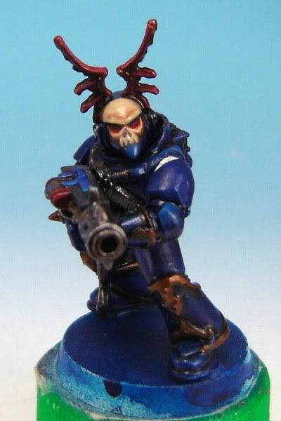
It's been a busy past month or so, what with colds, computer troubles, and a lot of other distractions. I had some free time the other day, though, and decided to do a little freehand on the inducted Night Lords Chaos Marine for my warband:
I wasn't really happy with the finished result at first, since I'm always noticing areas where I could touch things up or improve on mistakes. Barring a little tidying up of the teeth so things are a hair more centered, though, I think my first stab at freehand in a long while came out reasonably well.
The base color for the skull was P3 'Jack Bone and I added in some Vallejo Model Air Burnt Umber for shading around the edges, since I already had some on my palette from work on a historical 54mm Mexican War figure I'm taking a stab at. I went back and did extra shading and glazing with GW's Badab Black Wash, which I think makes an excellent color for tidying up once you wick away most of the liquid. Not really visible here is the left side of the Mk. VI Space Marine helmet, where I had to get a little creative with the bone color of the helmet since it intersected a number of vertical vents modeled on the helm.
I'm curious what people think of the overall look, between the now-painted skull and the decayed bat wings on the helmet that I took from a Grave Guard figure out of GW's Fantasy line - does he look sufficiently "Night Lords"-ish, barring missing shoulderpads and backpack, and the eventual obligatory painted lightning?
[Edit] I tidied up the freehand a bit, especially in the lower part of the skull design, because I just wasn't happy with the overall centering of it on the helmet. From feedback of it looking three-dimensional on the figure (I'm sure most of that was the angled front view, but still...) I figgered I'd run with that a little bit more, so I increased the contrast by adding extra highlights where they would naturally fall on a sculpted skull and deepening the false shading a bit moreso.
Here is a picture from a different angle to show off the design more as it sits on the helmet, and with hopefully a little bit less glare from my photo box lighting reflecting off the currently glossy finish of the paint:
The feedback (and views) are definitely appreciated - it's nice to know people are getting something out of my little corner of the internet here. [/Edit]
I wasn't really happy with the finished result at first, since I'm always noticing areas where I could touch things up or improve on mistakes. Barring a little tidying up of the teeth so things are a hair more centered, though, I think my first stab at freehand in a long while came out reasonably well.
The base color for the skull was P3 'Jack Bone and I added in some Vallejo Model Air Burnt Umber for shading around the edges, since I already had some on my palette from work on a historical 54mm Mexican War figure I'm taking a stab at. I went back and did extra shading and glazing with GW's Badab Black Wash, which I think makes an excellent color for tidying up once you wick away most of the liquid. Not really visible here is the left side of the Mk. VI Space Marine helmet, where I had to get a little creative with the bone color of the helmet since it intersected a number of vertical vents modeled on the helm.
I'm curious what people think of the overall look, between the now-painted skull and the decayed bat wings on the helmet that I took from a Grave Guard figure out of GW's Fantasy line - does he look sufficiently "Night Lords"-ish, barring missing shoulderpads and backpack, and the eventual obligatory painted lightning?
[Edit] I tidied up the freehand a bit, especially in the lower part of the skull design, because I just wasn't happy with the overall centering of it on the helmet. From feedback of it looking three-dimensional on the figure (I'm sure most of that was the angled front view, but still...) I figgered I'd run with that a little bit more, so I increased the contrast by adding extra highlights where they would naturally fall on a sculpted skull and deepening the false shading a bit moreso.
Here is a picture from a different angle to show off the design more as it sits on the helmet, and with hopefully a little bit less glare from my photo box lighting reflecting off the currently glossy finish of the paint:
The feedback (and views) are definitely appreciated - it's nice to know people are getting something out of my little corner of the internet here. [/Edit]
8/27/2010
A Bloodgor Packmaster (WIP?)
I've more or less finished my conversion of a 40K Chaos Beastman as the Packmaster for a herd of Bloodgor (read: Khorne-worshipping Beastmen) to be allied with my CSM army at some point down the line. This 40K guy is one that I want to paint up for competiton and eventually use as a "leader" in my 40K force, but I'll likely be subbing him for a Khorne Berzerker until such time as I can model up his friends - it might be years with the time I've got to do hobby stuff nowadays.
One thing I don't like is how far forward the stock figure pose itself leans, especially with swapping out the chest armor, but I can't really change that without changing the whole dynamic of the figure - it wasn't originally meant to be that involved a conversion. I tried to limit that some by leaning him back a little on the base, and I'll just fill in under his raised feet with rubble when it comes time to basing him. The chest armor itself is meant to look like the midsection was cut out roughly after it was taken from its original wearer, so as to allow this guy to put it on. The shoulder pad is theoretically strapped on - or however SM's mount them to their separate shoulder armor. I wanted both to look rugged, like this guy's been through years of fighting and doesn't much care about keeping his armor in top condition. (I generally do weathering and battle damage on my miniatures prior to painting, as I like the realistic texture.)
Any and all feedback would be great! I'm wondering whether he looks good enough now or whether I ought to be adding "more decoration" since he's ideally the Packmaster of a Bloodgor horde by dominance and skill at fighting - at least that's how I'd imagine they'd determine rank. There's a skull on a chain dangling from his waist in the back that isn't too visible in this picture - does he need more "trophies" or is the "appropriated" Space Marine armor and (Old School™) Imperial Guard gear sufficient? I'd considered putting studs on the back of the plate on his pistol hand, since it originally came from a SM - I filed down the finger ridges so it looks like it could be flesh, but do I need to differentiate the hand any more from its original source? (I'm going to paint it metallic rather than the same color as the SM gear, whatever that turns out to be.)
I'm also trying to figure out what color to paint the Marine armor, since I'd ideally like a good contrast between any blood and filth painted on it; Imperial Fists, maybe, or perhaps White Scars? Anyone have any Marine Chapters they really don't like and would want to see "defiled?"
One thing I don't like is how far forward the stock figure pose itself leans, especially with swapping out the chest armor, but I can't really change that without changing the whole dynamic of the figure - it wasn't originally meant to be that involved a conversion. I tried to limit that some by leaning him back a little on the base, and I'll just fill in under his raised feet with rubble when it comes time to basing him. The chest armor itself is meant to look like the midsection was cut out roughly after it was taken from its original wearer, so as to allow this guy to put it on. The shoulder pad is theoretically strapped on - or however SM's mount them to their separate shoulder armor. I wanted both to look rugged, like this guy's been through years of fighting and doesn't much care about keeping his armor in top condition. (I generally do weathering and battle damage on my miniatures prior to painting, as I like the realistic texture.)
Any and all feedback would be great! I'm wondering whether he looks good enough now or whether I ought to be adding "more decoration" since he's ideally the Packmaster of a Bloodgor horde by dominance and skill at fighting - at least that's how I'd imagine they'd determine rank. There's a skull on a chain dangling from his waist in the back that isn't too visible in this picture - does he need more "trophies" or is the "appropriated" Space Marine armor and (Old School™) Imperial Guard gear sufficient? I'd considered putting studs on the back of the plate on his pistol hand, since it originally came from a SM - I filed down the finger ridges so it looks like it could be flesh, but do I need to differentiate the hand any more from its original source? (I'm going to paint it metallic rather than the same color as the SM gear, whatever that turns out to be.)
I'm also trying to figure out what color to paint the Marine armor, since I'd ideally like a good contrast between any blood and filth painted on it; Imperial Fists, maybe, or perhaps White Scars? Anyone have any Marine Chapters they really don't like and would want to see "defiled?"
Subscribe to:
Posts (Atom)