5/24/2010

My First Finished Berzerkers

 I finished these last night to serve as part of the advance guard of my Chaos Space Marine Warband (I also finished a "vanilla" Ultramarine Missile Launcher trooper from the Macragge set, but he was taken out back by these guys and shot or something).

 The first one is an inducted Ultramarine, and so I'm using a split scheme where he still has defiled Ultramarine colors, gear in the accent color of my Disciples of the Four Warband, and red armor that's been overpainted on his original coloration so as to signify his role as a Berzerker.

 The second is an outright Khorne Berzerker, but I decided I wanted to go with a darker blood-red coloration than the brighter red that many seem fond of using. Posing-wise, there's no conversion - about the main difference between this and any other trooper (aside from the stock Berzerker signifiers) is the shoulder pad panels painted with a background in the accent color of my Warband.


 I'd appreciate any feedback or suggestions on these guys, as I'm making a definite attempt to paint to more of a "tabletop" painting standard than a "display" standard as is my usual:


5/21/2010

Commission Giveaway Contest, Revisited

 Well, some good news I got today is that the Speculo Killer figure painted for doom_of_the_people (after he won the Commission Giveaway Contest) is now safely in his hands after delivery by USPS.

 One slight downside is that despite creative packaging and a lot of well-wishing, the figure arrived tipped over on its side inside the box - that essentially means it shimmied loose from being bound upright through holes drilled in a piece of hardboard that itself was hot glued to the bottom of the box. So much for marking the box "fragile" and labeling all four sides with which direction was "up" - it could've been worse, though, as I'm to understand all the only problem in transit was a somewhat bent monofilament blade (that was easily bent back to shape.)

 The great news I got today - well, for me and doom_of_the_people, anyway - is that "It looks awesome and definitely lived up to [his] expectations." (I was especially leery of the commission getting there in one piece because the figure itself was pretty fragile in sculpt, had a separate wrist join that was flimsy from the start, and was a decent amount of good faith on both ends. I'm very glad it worked out nicely!)

Hobby Tip - Painting Aged Parchment

Step 1:
 Apply a basecoat of 1 part Vallejo Model Color Russian Uniform (although Games Workshop Catachan Green might do in a pinch) and 3 parts GW Bleached Bone at a 1:1 paint/thinner concentration


Step 2:
 Layer on 1:4 GW Bleached Bone/thinner, leaving the shaded areas and deepest depressions uncovered


Step 3:
 Apply a wash (or two) of GW Devlan Mud over the whole of the area to be painted as parchment, paying extra attention to the depressions and shaded areas


Step 4:
 Layer on a first step of highlighting with 1:4 GW Bleached Bone/thinner, making sure to only brighten up the most raised and/or light-facing areas


Step 5:
 Apply extreme highlights to the edges and most raised areas as finely as possible, paying close attention to sharp edges and corners


Step 6:
 Using a mixture of 1:1 Scorched Brown and Black Ink (or Chaos Black and Badab Black, by preference) thinned down to at least a 1:4 paint/thinner ratio, carefully paint the lines of your letters on the parchment. You might want to practice on some scratch paper beforehand, as it really comes down to getting a feel for the hand movements when putting the brush to figure. It would be a good idea to do the first, last, and middle letters all in the same relative size to get the spacing correct, and then fill in the rest of your lettering as you can subtly adjust the sizing of your letters to accommodate how much room you have left.

 It might sound like an oxymoron, but the thinner you have your paints when doing fine detail like this, the more control you will have.


Step 7 (The All-Important One):
 Inevitably, you may need to go back and touch up things a little. Again, thin your paints by a decent margin so as to be able to get it to flow easily. You want to have as sharp a point on the tip of your brush as possible and be applying little to no pressure, simply letting the brush do all the work and allowing the paint to wick off onto your figure.

 In this case, I wanted to neaten up the letters a little bit, and add a slightly lighter "highlighted" black to the right-most lettering. I increased the size of the image, too, so that you can see it's not all smoke-and-mirrors, but generally a case of "if it looks about right in close detail then it'll look very close to right at regular scale."

Happy painting!

5/20/2010

Chainsword or Power Weapon?

I'm not going to lie and say it's a deep moral quandary keeping me up at night - although technically it's 3am and I've woken up for no good reason, so I figgered I'd make it worthwhile.

The "moral dilemma," then: Chainsword or Power Weapon? You decide!

I'm also curious what people think of the weathering on the chain blade "housing" (the formerly white part of his, er, former hand) - I'm trying out a new technique of sorts that I previously only used for bone.

5/18/2010

Fun With Shipping, AKA Getting the Commission Giveaway Contest Piece In The Mail

 This is the transport method I'm thinking about running with - the bottom disk is an old 60mm base I made from MDF hardboard:


 I'm thinking that if I hot glue the underside of the disk to the bottom of a sufficiently roomy box, then it should be golden and not shift around at all. The brass beading wire restricts movement but isn't so tight as to chip paint (I hope) and the foam there is for an added barrier to "insulate" the wire I've got wrapped around it. Something like this, I'm sure, would set off the "bomb squad" at an airport even though being completely harmless, no? Good thing it'll likely go overland, since it's being sent to a neighboring state...

5/17/2010

Revenge of the Lonely Khorne Berzerker!

 Well, I'm essentially done with the painting of the figure - I'm still considering what to do for basing, other than that it will likely comprise some sort of urban debris theme - and all that's left is a few touchups of the darkest pueple of my Warband color on the shoulder pads where I got a little slap-happy with the brass color.

For what it's worth, I jotted down his color scheme for reference on all the other figures, so I thought I might post it here if anyone's interested in a darker, blood-colored Berzerker appearance:

Armor:
  • Basecoat 1:2:1 GW Mechrite Red/GW Red Gore/GW Scorched Brown at a 1:1 paint/thinner consistency
  • Wash in crevices and shading with 1:1 Red Gore/Glack at a 1:6 paint/thinner consistency
  • Highlight with 1:4 Red Gore/thinner
  • Edge highlight with 1:1 P3 Khador Red Highlight/Red Gore at 1:4 paint/thinner consistency
  • Extreme edge highlight with 1:1 Khador Red Highlight/GW Blood Red at a 1:4 paint/thinner consistency

Ribbed Armor Jointing/Black Areas:
  • Basecoat 1:1 GW Adeptus Battlegrey/VGC Black Ink at a 1:1 paint/thinner consistency
Brass Trim/Metal:
  • Basecoat 1:1:1 P3 Brass Balls/GW Scorched Brown/VGC Sepia Ink at a 1:1 paint/thinner consistency
  • Highlight with 1:4 Brass Balls/thinner
  • Extreme edge highlight 1:4 GW Shining Gold/thinner
Green Glowing Eyes:
  • Over a pure white undercoat, basecoat 1:1 VGC Livery Green/VMC White at a 1:1 paint/thinner consistency
  • Wash with 1:8 GW Green Ink/thinner brushed toward depressions and shade areas
Dark Metal:
  • Basecoat 1:1:1 P3 Pig Iron/GW Scorched Brown/VGC Sepia Ink at a 1:1 paint/thinner consistency
  • Highlight with 1:1 Pig Iron/Scorched Brown at a 1:4 paint/thinner consistency
  • Extreme edge highlight 1:4 GW Chainmail/thinner

Is the darker scheme decent-looking, as compared to the typical GW Blood Red-painted Berzerker?

5/16/2010

Hobby Tip - Painting 40K Shoulder Pads

 Now I'm not sure about anyone else (mainly because I don't know many other painters), but I prefer to paint and prime the shoulder pads (and backpacks) separate from the figure, primarily because I like to make sure the figure itself gets as much paint and primer coverage right from the get go. Maybe I'm finicky, but it kind of bothers me if I know that I don't have at least a shade coat in the areas that aren't very visible - since I don't use black primer, this is maybe more relevant, because white primer glinting out brightly from crevices is a little jarring.

 Anyways, I paint shoulder pads separately, and a while back I settled on a good way to paint the pads after priming without them touching or resting on anything and thus not getting good coverage themselves. When priming, I use two-sided masking tape and stick them to a paper plate on an angle. It lets me turn the plate 360° and get the pads from all sides, and get both bottom and back edges after a quick flip over once the first coat's dry.

For applying actual paint, I use the following method:


 I attach the back of the pads to a coffee stirrer or something similar with poster putty (in the case of the image, they're stuck to the end of plungers from the 1mL syringes I use for measuring out paint ratios, using UHU-Tac reuseable putty) so that way I get 360° access to them when I'm painting, and can simply set the whole thing down to dry - post, pad, and all, when I'm done applying a color. I can do a bunch of 'em assembly-line style, as they don't take up a lot of room, and by the time I get done applying color to the end of the row, the ones from the beginning of the row will be dry. Two of these will be going on the Berzerker from my Disciples of the Four warband, as seen in the top-right of the picture, while the other two are saved for his friend, the inducted Ultramarine Berzerker I showed some while back - they're both nearly done, and should be getting pictures posted "soonish".

5/14/2010

Infinity Speculo Killer Commission, AKA Giveaway Contest Winner [Completed 5/13/2010]

 Well, I got word back from doom_of_the_people on the last set of "inches away from finished" pics I passed along to him regarding his Commission Giveaway Contest figure, and I got the "thumb's up" to go ahead and call her done. She is now sealed in several layers of spray acrylic varnish and fully dry, essentially ready to wing her way towards wherever she'll be winging her way towards - as soon as I can figure out a way to box her for mailing in a manner that won't bend the "flimsy" monofilament blade or cause her wrist to snap off at the glued join (yet again). I think I have an idea, though, involving epoxy glue, a small hex nut and bolt, and a small box-end-sized square of MDF hardboard. It might set off metal detectors at the USPS, but it should have enough airspace inside the box to avoid nasty bumps and jarring impacts.

Here's the final set of pictures (post-varnish):


 In making the sludge/ooze on the base, I snuck in a few bubbles(?) and some extra rust on the outpouring pipe, too. Hopefully they're easily visible in the last few pictures, since I took those especially for the guy running Secret Weapon Miniatures, figgering he might be able to use them for posterity so as to show off his handiwork. The majority of the decorative stuff that the Speculo Killer is posed on is one of Secret Weapon's resin bases that I hacked up and converted in order to offset it on the Infinity slottabase that the figure came with - who knew cast resin bases were so versatile?

5/13/2010

A Genestealer And A Rogue Psyker Walk Into A Bar...

"Ouch!"

(Man, that one never gets old.)


So what do a Genestealer and a Renegade Psyker actually have in common? Well, not much, but I added pages for the both of them to my painting website and there's now links in the Gallery. That is all the bad humor for the moment. Carry on.

5/12/2010

Infinity Speculo KIller WIP [Update 5/12/2010]

 I think I'm about close to done with the Speculo Killer, especially after this morning's pleasantly surprising work of tying things together - it seemed like my brush was on fire (not literally, of course, I've plenty of water on hand) and there's the nice fact that I was actually able to see without blurriness, as has been the case for the past several weeks. (Allergies? Need new glasses? Remnants of pink eye/styes? Dunno, but I've got a referral to an opthalmologist I will most certainly be following up on...)

Anyway, enough about the blessings of Nurgle, here's the latest update:


 I'm thinking all that I need now is to sort out with the Commission Giveaway Contest winner, doom_of_the_people, what color he wants the ooze coming out of the rusty pipe (although I'm still entertaining suggestions/comments/critiques, because it's "not quite" finished).

5/11/2010

Colors, Pt. II!

Key: GW = Games Workshop/Citadel Colour paint, P3 = Privateer Press P3 paint, VMC = Vallejo Model Color paint, VGC= Vallejo Game Color paint

 In a follow-up of sorts to the first Colors! post a long while back, here's some unique colors I've found that work fairly well for specific effects and painted objects (your own mileage may vary):


Verdigris:
  • Wash 1:1 VMC Verdigris/GW Hawk Turquoise at 1:8 paint/thinner consistency
  • When dry, wash 1:8 VMC Verdigris/thinner into the deeper light-facing depressions

Dirty, Weathered Verdigris:
  • Paint 1:1:1 GW Shadow Grey/GW SCorched Brown/VGC Sepia Ink into the crevices and depressions at a 1:4 paint/thinner consistency
  • When dry, carefully brush the same mixture at a 1:8 paint/thinner consistency over everything in several passes except areas that you want to retain brighter highlights - only use a single pass with these parts

Concrete:
  • Basecoat GW Dheneb Stone at 1:2 paint/thinner consistency
  • Wash/glaze several times with 1:1 GW Scorched Brown/GW CHaos Black at a 1:8 paint/thinner consistency
  • Stipple over highlighted areas with 1:4 VMC Deck Tan/thinner
  • Edge highlight with 1:1 VMC Deck Tan/GW Skull White at a 1:4 paint/thinner consistency

Browned Metal:
  • Basecoat 1:1 GW Tin Bitz/GW Scorched Brown at a 1:1 paint/thinner consistency
  • Highlight 1:1 Tin Bitz/GW Chainmail at a 1:4 paint/thinner consistency
  • Extreme edge highlight 1:4 Chainmail/thinner

Dark Metal:
  • Basecoat 1:1 GW Boltgun Metal/thinner (or best yet, use P3 Pig Iron slightly thinned)
  • Wash with 1:1 GW Chaos Black/GW Scorched Brown at a 1:8 paint/thinner consistency
  • Extreme edge highlight 1:4GW Mithril Silver/thinner

Blue Glow:
  • Basecoat 1:1 P3 Arcane Blue/thinner
  • Wash with 1:12 GW Regal Blue/thinner brushed toward depressions and shade areas
  • Highlight 1:4 Arcane Blue/thinner
  • Highlight 1:1 Arcane Blue/GW Space Wolf Grey at a 1:4 paint/thinner consistency
  • Blend up to pure 1:4 Space Wolf Grey/thinner
  • Highlight 1:1 Space Wolf Grey/GW Skull White
  • Blend up to 1:4 Space Wolf Grey/Skull White at a 1:4 paint/thinner consistency
  • Extreme edge highlight 1:4 Skull White/thinner, making sure any large areas transition from a white inner glow to darker blue at the edges

Green Glow:
  • Over a pure white undercoat, basecoat 1:4 P3 Necrotite Green/thinner
  • Wash with 1:8 GW Dark Angels Green/thinner brushed toward depressions and shade areas
  • Highlight 1:1 Necrotite Green/GW Scorpion Green at a 1:4 paint/thinner consistency
  • Highlight 1:4 Scorpion Green/thinner
  • Highlight 1:1 Scorpion Green/VGC Livery Green at a 1:4 paint/thinner consistency
  • Highlight 1:4 Livery Green/thinner
  • Blend up to 1:4 Livery Green/GW Skull White at a 1:4 paint/thinner consistency
  • Extreme edge highlight 1:4 Skull White/thinner, making sure any large areas transition from a white inner glow to darker green at the edges

 This is a selection of some of the color progression recipes I've used on some of my figures. If anyone has a good color recipe that they wouldn't mind passing along and having posted for posterity, by all means leave a comment on the blog or send me an email!

5/07/2010

Infinity Speculo Killer WIP

Work continues on doom_of_the_people's Commission Giveaway Contest figure, albeit with another commission I'm prepping in fits and starts in the background and a few other things going on (we adopted a puppy last week, for instance, to "replace" the one that died of parvovirus a few months ago - I never realized how much adjustment it takes bringing a new animal into the house!)

At his request, I've done a fair amount of weathering and sun-bleaching effects on an "autumn"-style color scheme. The underlying armor panels are brownish-yellow and orange-yellow, alternating in parts, and the whole figure has been lightly airbrushed with an off-white - I'm still getting the hang of it, but it's a fun thing to play with. It was a lot paler until tonight, when I had the inspiration to add some additional cool coloration that ought to tie the warmer (if muted) browns and autumn colors in with the soon-to-be-glowing monofilament weapon and a few other (surprise!) Object Source Lighting effects. I used an initial glaze of GW Shadow Grey brushed towards the crevices across the figure, followed by a Shadow Grey/VGC Sepia Ink mixture to delineate the panel lines and such a bit more - I'm aiming for a look of grime deep-set in the crevices of the armor, or possibly dust mixed with oil.

Anyhow, here's the figure as of this evening:

I've already started with basecoating the Secret Weapon Miniatures base on which she stands, which ideally will end up looking like broken concrete - I plan for the pipe to be oozing something vile (with continued approval, of course).

5/06/2010

The Seductively Aggressive Berzerker of Khorne

 Apparently there was some problem with the HTML coding in my painting website which caused everyone viewing it with MS Internet Explorer to see the news blog on the main page in only a 2-inch band or so. I trimmed out a few things and it seems to be working properly now. On that happy note, here's a figure I prepped and glued together last night who has a personal inquiry:


"Do you want some candy?"

5/04/2010

One Lonely Khorne Berzerker Revisited

 I first posted a picture of the solid-color Berzerker in a post last week. Well, I've started in on outright painting, mostly because I'm using this guy as a color test for another commission figure. The red armor is partially shaded at this point, and the brass is simply basecoated with a shade color. (Man, I wish metallics covered better, but I guess I can't complain with only two thinned coats of a brass-brown mixture doing the job.)

Here he is in all his blood red Berzerker glory:


 I'm aiming for more of a dried blood color with the Berzerkers in my warband, just because everything else is likely going to be bright colors (like inducted Loyalists) or faded and/or pastel colored (like any generic "Lesser Daemons," maybe, one of which my recently-posted Plaguebearer might eventually become).

5/02/2010

Hobby Tip - I Remembered How To Paint Highlighting

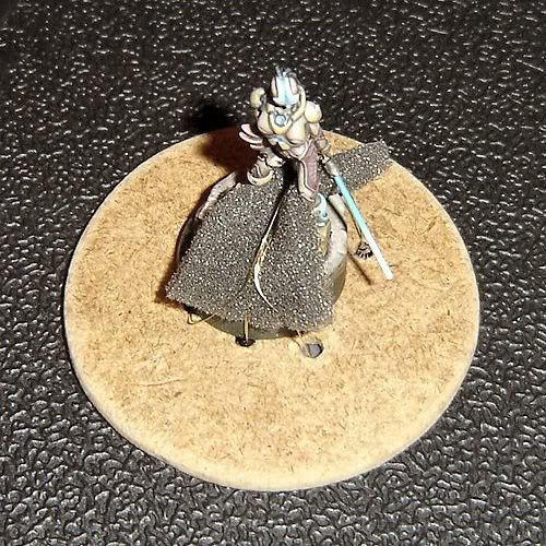
 Like the title says, I literally had to think about it because I'd forgotten, and suddenly remembered the method I used to use to paint highlights. By way of explanation, I've only gotten back to painting again after about a year off, which started shortly before the birth of our son in 2/2009. I've painted a few miniatures in the past few months, but when doing touch-ups on the Plaguebearer I've posted pictures of recently, I ran into a problem - all my highlights (especially edge highlights) turned out looking a little "off." I'd forgotten what technique I used exactly to highlight and get nice, neat lines and couldn't for the life of me get any of them to come out looking the way I wanted them to.

 I realized what the problem was in a sudden flash of insight - I was applying to much pressure and needed to slacken up a bit. Trying my "newly remember" old method, I was back to painting highlights properly on that figure and the commission I'm also working on simultaneously. (Not exactly like riding a bike, but more like getting back into an old "groove.") I figgered since it had "come back to me" pretty clearly as to how I should be approaching highlighting, and in a way that I can (relatively) easily explain in words, and I've taken a picture of my painting in the past to explain a related concept, I figgered that I'd dig up my old tutorial picture and write something up for the site. Enjoy!

 The problem I realized I was having was that I was applying too much pressure on the brush. Ideally what you want to have is thinned paint - something along the lines of a 1:3 or 1:4 paint-to-thinner ratio, or to throw the phrase out that everybody seems fond of, about the consistency of "skim milk." The reason for this is that you want your brush doing most of the work - it's a tool like any other, and if you're working harder than your artist's tool, then you're doing something wrong. The biggest thing to painting highlights (other than thinned paint) is the amount of pressure you apply on your brush. What you ideally want to do is practice applying as little pressure as possible - if you can, try applying so little pressure that barely even the tip of the brush would touch. Do this without paint if you like to get the feel for it, but practice just barely skimming the surface of something with a feather touch and nothing but the very tip of your brush. Got that down after endless repetition? Good! (Realistically speaking, a skilled painter has had lots of practice doing light brush strokes and with a lot of not-so-good painted miniatures back in the past as trial and error - if you're lucky, you can skip all the bad parts and cut straight to painting good highlights!)

 Now to apply some paint - dip the brush into your thinned paint no more than halfway. Any more than that and you risk getting thinned paint up into the metal ferrule holding your brush hairs in place (and we all know that's a good way to ruin a perfectly good brush). If you're comfortable with this paint consistency and you're painting on a broad area, that's fine, but it's generally a good idea just to lay the brush point flat on a paper towel (or give it a quick swipe along a fingernail, by preference) just to wick some of the excess liquid away - what you're doing is loading up with diffused color due to the added thinner and then taking some of the excess liquid off - you're still going to have the same diffusion of color but just not as runny. Now with as light a touch as you can, draw the brush back towards you slowly - it's the slowness here that matters, by the way. The longer you keep the very point of the brush in contact, the more of your color will unload onto the figure, and by keeping a bare minimum of contact you're letting the brush and the thinned paint do the work. Applying pressure won't do anything to help lay down a highlight, all that will do is make it thicker by bringing more of the brush hairs in contact with your painting surface by force.

Here's the final light purple highlight on a broad span of purple, drawn up towards the top of the shoulder pad:


 If you've done it right and let minimal pressure on the brush do all the work, you should ideally end up with a nice, narrow line. Straightness comes with practice, as does the ability to know how "far away" to hold the brush so that you're not pressing on the surface of the figure at all, but simply letting the bristles touch it with their built-in "springiness." If you approach highlights obliquely - that is, head-on - you're going to end up with fine lines. If you approach them with a slight twist to your brush, so that instead of drawing the very tip along you're drawing more of the side of the tip slightly sideways back toward you, you're going to end up with a slightly more diffuse highlight. I prefer the latter, but it's all a matter of style.


 If you've got highlights down, how's about something a little more tricky? Sharp edge highlights? Sure! Essentially, what you want to be doing now with the same consistency paint and the same wicking off of excess moisture, is drawing the side of the brush along a hard edge instead of using more of the tip. If a picture's worth a thousand words, this might help:

 Using thinned paint, drag the side of the brush along the sharp edge of the surface you want to have a crisp narrow highlight at roughly a 45° angle. Rather than the bristles of the tip splaying and making a fuzzy highlight, the side of the brush which doesn't splay (well, at least not so that it affects the highlight overly much) is what you want to be making all the contact. Between the thinned concentration of your color and the positioning of your brush, with a couple careful passes you'll end up with a nice, crisp edge highlight. Same technique as regular highlights and with the same light touch, it's just applied to the hard edges of things rather than straight and with the (side of) the tip.

 Any more questions? Feel free to ask! Now that I've remembered how to highlight again, I'll do my best to answer. This actually helped someone? I'd love to hear that, too!

5/01/2010

Former Heresy-Era Rhino

It's still a work-in-progress, but I'm far enough along that I figgered I'd post pictures. I've been working on it for a long while in fits and starts, but it's at a point where my plans for the thing are finally starting to pan out (or so I think!) Ideally, I'd like to get some feedback on the overall appearance, battle damage, and hammered metal alternate paneling on the right vehicle side.

I didn't want to go with strictly a Mark I Rhino conversion, because I do like the Mark II style doors and design. I wanted it to look like it's been around a long, long while - like 10,000 years in and out of the Eye of Terror on various campaigns with my Disciples of the Four warband. I'm keeping with the design theme that this has seen long use and has "mutated" over time in service to all of the Chaos Gods - as such, it's not specific to any one Chaos Power, and I'm going to use it as the command Rhino for my warband. I'm going to use the same color scheme as for the majority of my troops - a dark, fleshy red with dark purple accents and semi-quartering (although maybe not on the Rhino, painting schemes being what they are). In any case, the insignia of my warband is going to be prominently displayed on the front panel of the vehicle and likely on the top (so it can be seen "from the air" by any Shriven-related support vehicles).

Many thanks to DeSnifter over at Warseer for his Rhino conversion templates, which prompted the initial turning of gears in my thinking! One big change is that I wanted a bit more "depth" for the side venting panels, so I've used fine gauge chicken wire inset over a thin styrene backing - well, that, and I've liked the design style of the Vindicator ever since it came out, so I wanted more of a reinforced armor front facing for my command Rhino.

LinkWithin

Related Posts with Thumbnails

Followers:

Archive: