Showing posts with label tutorial. Show all posts

5/26/2015

How to Make Your Own Iconography and Put It On... Stuff, Pt. 2

 Here's Part Two of my "How to Make Your Own Iconography and Put It On... Stuff" tutorial series and you can refer to Part One here. Ideally at this point, you've got iconography that you can use on something and are able to get it into a printable sheet format - the question is what to do now.

 Fortunately, there's a number of answers. With printed or copied graphics, you can transfer them onto a great number of mediums. For this particular section, however, I'm going to focus on the more frequently used output - water slide decals. Essentially, anything that you can make into a printable format you can theoretically make into a water slide decal - with some limitations, primarily being size.

 As of my last attempt at creating decals, I've found four different types of water slide decal paper available and in a variety of sizes ranging from quarter sheet all the way up to full letter-size paper sheets. I went physically to places like hobby stores, craft/scrapbooking stores, and RC/scale modeling shops because I wanted to set eyes on the decal paper firsthand - but out of all the different sizes I found, I eventually settled on A5 size (5"x8") which I tried first and then Letter (8 1/2"x11") when I decided I wanted more decals with a different appearance. I'd imagine even more custom decal paper sizes might be available online, but I stuck with these two straightforward sizes of water slide transfer paper from both Testor's and Micro-Mark as they were pre-existing paper size settings in Word document and Adobe PDF format for creating sheets and I thought therefore would be easiest for printing at home or at a copy shop.

 The different types of water slide decal paper are all essentially the same in form and function - a face-up sheet (possibly with an underlying layer of adhesive) over a layer of dextrose allowing for both adhesion and release from a colored backing sheet. For fine scale models/miniatures I'd recommend against using paper with the additional layer of adhesive as it makes for thicker decals and really isn't necessary if you use additional products like Micro-Mark's MicroSet and MicroSol (to be discussed later). The differences are simple - recommended printer type and sheet color. There are different papers for both inkjet or laser printers as well as clear decal sheets and white colored decal sheets. The A5 paper I tried first was clear and meant for inkjet printers - this was my first run with strictly black decals and a potentially maddening time cutting out all the little spikes from my original iconography design. I used Letter sized paper for laser printer (or copier!) in white for my second attempt with a filled-in design and this was much easier. The bottom line is that if you just want black lettering or something non-fancy, clear paper will show up just fine. If you want iconography or decals in any sort of color, I'd recommend using white decal paper to print to as the end result will show up much brighter over anything you apply a decal onto, regardless of how dark the surface is, even if that means you need to trim your decals more closely to avoid any white showing around the edges. Now there are very rare printers that print in white ink and cost thousands of dollars (ALPS printers) - barring those, the best you can do to get the color "white" in a decal is to use white decal paper and trim back to the edge of your design.

 I'll admit - I personally didn't notice a significant difference in the output quality between the sheets I printed using my home inkjet printer onto inkjet water slide decal paper versus my second attempt with a different design printed out on a laser copy shop machine onto laser-variety water slide paper. Hypothetically, though, I'd have to imagine that the laser-variety output is a little more precise as there is no spreading of wet ink and the design is heat-bonded to the paper as a part of the printing process, but then the inkjet paper itself is designed to accomodate wet inkjet color and a slower drying time. The one thing I did notice, at least to start, was smearing - handling an inkjet decal sheet before it is fully dry is very messy, and I'd highly recommend only handling printed sheets by the edges whenever possible.

 As near as I can tell, the sole difference between professionally-printed or store-bought water slide decals and those homemade is a permanent sealing layer over the top of the decal to prevent the design from dissolving or smearing during the application process. No problem!

From here on out, I'll be using the following picture to refer to in the way of tools to use:

 After printing out your graphics onto a water slide decal sheet, it is simply a matter of sealing it once it has dried. I've seen reference to people using strong hold hairspray, but personally I've found a thorough spraying of gloss sealant (I used Krylon UV-Resistant Clear Gloss to prevent yellowing) to do the job of sealing the decal sheet excellent to prevent the printed graphics (both inkjet- and laser-printer-based) from smearing. In the case of my last set of printed decals, I used a second light coat of Krylon Matte Finish spray to tone down the glossiness. Once cut out from the decal sheet and applied to the model, I feel the matte surface helped the decal to blend in with the background a little better.

 In researching water slide decals and how to apply them, it seems there are a lot of approaches. I'm going to describe mine - primarily to save other people reading the time and effort of looking elsewhere, but secondarily... because it works! To start with, I'd recommend trimming as close to the design on your intended decal as possible - this is especially necessary if you've printed on a white decal sheet as any white visible around the edges of your design will look awkward or possibly need to be painted over.

Recommended materials:
  • A shallow dish or saucer with room-temperature distilled water
  • A pair of tweezers and/or sharp hobby knife
  • Brush-on gloss acrylic/Future Floor Finish/etc.
  • MicroSet and MicroSol
 I recommend distilled or filtered water so as to avoid impurities which can cause your decals to settle unevenly or with bubbles underneath. The brush-on gloss is to smooth out the surface where you plan on applying your decal so as to make for a nice, even finish - in the materials picture, my "Wash" mixture for thinning has acrylic medium mixed with water in it and does the job nicely. The MicroSet and MicroSol are optional, but work excellently and make the job of applying decals infinitely easier than water alone.

 So to apply homemade decals, what I do is the following:
  1. Brush on gloss acrylic medium/Future Floor Finish/something similar in the area where you want to apply your decal. This will smooth out the surface, allowing for easy transfer and minimizing the likelihood of bubbles beneath your decal. Allow to dry.
  2. Neatly cut out your decal - as mentioned before, when printing on white water slide decal paper you want to cut as close to your design as possible to avoid stray white space around the edges. For clear paper the less overhang you've got, the less chance for bubbles or wrinkles forming at the edges and the better your decal will conform to curved or uneven shapes.
  3. Allow the cut-out decal to soak in a very shallow saucer (even a small plate will do - the shallowed the water, the easier to wrangle wayward decals) for about 10 seconds or until it starts to slide easily on the backing material - take care not to let the decal slip off the backing material entirely!
  4. Brush on a quick coating of MicroSet in the area you want the decal to sit on your figure or model - this prepares the area and allows for better decal adherence.
  5. Pick up the backing material with decal on it (tweezers make this infinitely easier) and align an edge of the decal and the backing with where you want the final location to be.
  6. Gently and carefully slide the decal off the edge of the backing on your model, holding the edge where you want the decal to sit with the point of a hobby knife or toothpick while carefully sliding the backing out from underneath - one needs to be very careful at this stage, because any quick motions can cause the decal to tear or move out of alignment.
  7. Before all the water dries or is absorbed by the decal, quickly (but carefully) slide your decal to its final placement location.
  8. Apply a thin brush-on coat of MicroSol over your decal - this aids with adherence because it softens the decal somewhat. Perfect if you're trying to get it to conform to panel lines, curved shapes, rivets beneath and the like.
  9. If there are any small air bubbles trapped beneath your decal, you can use the point of a hobby knife or scalpel to piece the decal and release the trapped air - just be careful not to cut or move your decal, otherwise it may tear.
  10. Once fully dry, you may want to brush a little more gloss acrylic medium/Future Floor Finish/something similar around the edge of the decal and the surface its adhered on, depending on the thickness of your water slide decal - if you need to blend the edges into the background surface a little more smoothly.
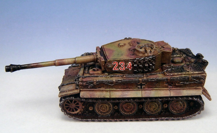
 Once your decal is applied, you can use the same techniques on it as you would over a regular painted surface - washes, highlights, and even weathering powders. Here's examples of some decals I put on a Flames of War Tiger I tank several years ago (given washes, minor highlights, tidied up with paint to match over the battle-damaged area, sealed, and with added weathering powders - all over uneven surfaces):


5/12/2015

How to Make Your Own Iconography and Put It On... Stuff, Pt. 1

This is the start of a series on making iconography for use with fine-scale miniatures - in this case, I'm specifically creating iconography for use with my Warhammer 40K Chaos Space Marine Warband, the Disciples of the Four. Ideally, I'll be covering a number of things:
  • How to create an icon in a paint program
  • How to transfer a saved icon via a Laser copier/printer
  • How to transfer a saved icon image from your computer via an inkjet printer
  • How to transfer a saved icon onto other mediums
 For the sake of starting somewhere, I'll assume that anyone reading this is at least computer-savvy (it's posted online, after all) and has access to some sort of image/photo editing/creation software. There's a number of programs out there, from the oft-overlooked MS Paint that comes with Windows, to image editing software available for download from the internet for free/shareware use (GIMP springs to mind, for one), to full-blown (and generally) expensive professional-grade image editing/illustration programs such as Adobe Photoshop and Corel Painter. In the example pics, I'm using Paint Shop Pro 7 - it's quite a few years old now but was more or less comparable to Adobe Photoshop at the time, and the rights are currently owned by Corel with the recent iteration emasculated and stripped down into strictly a photo editing suite. In other words, it doesn't necessarily matter what software you use (old or new), but there's certain things I'm going to be demonstrating and if your own program can't do them you're going to have to either get creative or find some other workaround. If there's any questions about any of my steps, by all means feel free to ask me!

 This is what your own image editing/illustration program ought to be able to do in order to replicate what I'm going to show: use image resolution of higher than 300 pixels per inch, save your images in a higher resolution format, and be able to save your image with actual transparency as opposed to dithering (if you want your final insignia to have uneven shapes w/ crisp edges, that is). Ideally, you'd be able to draw using vectors, multiple layers, and both background and layer transparency (whether via alpha channel or by default) as it makes things much easier and allows for many more options in what you can put in your iconography.


Here is the example I will be using for the remainder of the tutorial:

 The entire image was drawn on a transparent background, as I wanted to use 4 spiked cog shapes to represent the 4 Chaos Powers in 40K that my Chaos Marines worship. I went through quite a few test designs - adjusting the length of the spikes, the shape of the spikes, the size of the circles, their relationship to each other, etc. before finally settling on at least the design of the 4 cogs. My version of Paint Shop Pro allows you to draw images formed out of multiple vector "parts," group them, and then save them altogether as a reuseable "preset shape." Since the shoulder pad color for my Chaos Marine Warband is purple, I wanted to have white iconography - but for the sake of printing on white decal paper, also went with a thin black outline for all the shapes.

 What you can see here is one of the spiked cog shape layers "opened up," showing the component vector parts of the design - a hollow circle and eight evenly spaced triangles. As the "spiked cog" preset shape, though, it's an easy thing to rotate and resize things - so what the rest of the picture shows is that the overall spiked cog design is actually made up of two sets of 4 cogs: one white, which is the actual insignia design; one black, which has each of its spiked cogs centered under a white one and at a slightly larger size. The 45° angled lines in the background on the underlying "Alignment" layer are there for the sake of having the iconography itself aligned evenly, to a certain extent, even though the spikes on the cogs themselves are of different widths, lengths, and overall "balance" - that's how I'm hoping to get across the sense of "chaos" in the imagery although the icon itself is proportionately spaced so as to be "aesthetically pleasing." That's the idea, anyhow.

 It wasn't until I printed out the design and tried cutting it out that I realized that although trimming around all the individual spikes was manageable (for me, anyways, although I'm told I have a higher tolerance for mindless tedium than some), it was going to take so long across an entire army's worth of shoulder pad insignia that it was more trouble than it was worth. Rather than scrap the entire design, as I rather liked it after all the work I put in, I decided instead to add a colored background to fill in some of the space and cut down on the overall "pointiness" of things. I actually was inspired by an image of the Omega/Swan Nebula (M17) that I found on the official Hubble Space Telescope site, which is the "Image" layer after some trimming and tweaking. To put a black edge around the colored area and blend everything together, I used a hollowed-out partially transparent color gradient - the "Shadow" layer.

 This is where problems started to crop up. Although I had created everything as vector graphics for transparency and accuracy across multiple formats, when I went to flatten my design to a standard image in normal resolution so as to make it printable on a decal sheet (or other medium) it ended up pixellating things so horribly as to make the end result ugly and useless for anything.
In effect, I went from this:
To this:

 Not so good, obviously. I figured out an easy enough workaround, though, which was simply to save the original 600 pixels/inch resolution vector image at the actual size I created it in (2.117cm x 2.117cm) and then import that into another program where I could not only create a sheet format suitable for decal printing but also resize images as vectors without losing resolution or image quality. For reference's sake, the image format I used to keep layers/transparency and resolution intact was Portable Network Graphics (.png) format and the program I was able to use for accurate resizing and layout was MS Word - I've created an Adobe format for my decal sheet since, but I didn't have access to a .pdf editor at the time. In any case, the important thing when I imported the graphics into Word was to set the Measurement units of the particular document into Millimeters - as seen below, but File Options may vary depending on version and program used:

 At this point, it was just simply a matter of importing in multiple copies of different icon styles I wanted to print out in multiple - some with background, some without, some with a single spiked "cog," etc. - and lay them out as needed, and then use Word itself to adjust the image size to what I needed. As can be seen in the below picture, I settled on a height of slightly larger than 7mm (or 4% the height of my original image) for my particular icon - a perfect fit for the available space on my Chaos Space Marine shoulder pads:

 In the image before, the careful observer will note that I have the sheet labeled "Print as A5" - that was the original size of the white-background decal paper I was able to lay hands on. Ideally, you can lay out the format of your Word (or Adobe) document to suit whatever size you'd be printing to. I ended up moving everything to a "Letter" size 8 1/2" x 11" format for the final version. I saved my finished document file on a flash drive, took it to a copy center, and had it printed in color laser format onto a "Letter" size white-background decal sheet.

 It was several years before I made it to the point where I actually used one of my decals on a finished figure, but this is how the "single spiked cog" variety turned out:

 I hope this was some help to anyone trying to make printable insignia or other items for fine-scale models. As always, comments and feedback are appreciated!

3/08/2015

Tutorial: A Cheap 'n' Easy Light Diffusion Box

 So it occurred to me that in all the time I've had my blog, I haven't made a post about the light diffusion box I use for taking photos of miniatures. While I've wanted to make a fancy upgraded version, or possibly even buy a "real" one, I can honestly say that I haven't really seen the need and any issues I've had with my cheap and easy home-made one have been easily rectified.

 So what is a light diffusion box, you ask? By way of a disclaimer, I am by no means an expert on the subject nor a professional photographer. That said, the idea of having a light diffusion box for taking photographs of objects inside it is that rather than directly lighting your miniature subject, thus causing glare or uneven lighting and shading in the final image, you illuminate your photo subject indirectly (via ambient lighting) which results in a much better final photograph.

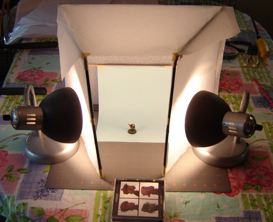
 Mine was really cheap and really easy to make. Not having any lengths regular wood to work with that wouldn't involve heavy cutting and making this a project that couldn't be finished in the space of one night, I went out to the garage and took a bag of thin, tall (3') bamboo stakes to which you can tie vines/tomato plants. I also had a thick roll of narrow (3/4" wide) masking tape and a pair of shears, too. And a hacksaw. Oh, and some large sheets of white translucent tissue paper for gift wrapping. All the materials together? Good to go!


 To start, I decided on four uprights and 6 crossbeams. Choosing the straightest bamboo stakes out of the bag, I got enough straight pieces to cover the length of materials I needed. I cut them all down to size and then wrapped all the ends of the cut pieces with tape to keep the stakes from splitting.

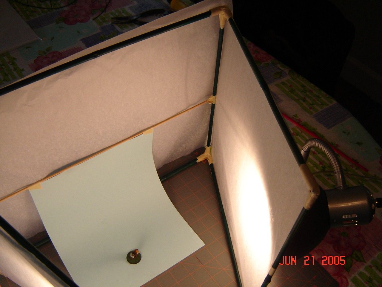
 In order to join the lengths of bamboo together I put a piece of tape on each joint to hold the pieces at a right angle, then wrapped both lengths first diagonally across each 90 deg. corner and then with a band around each bamboo length just to each side of joint to flatten out the diagonally-wrapped tape. I made 3 rectangles of the same height - two to serve as side panels and one to serve as a backing.

 Compared to wrapping bamboo lengths with tape to fasten 'em together, taping the tissue wrapping paper sheets to the frame was much easier. I simply cut them to size and fastened them to each panel of the frame at regular intervals. I used a length of wooden dowel fastened across the backing frame because couldn't be bothered cutting another piece of bamboo stake down to size - this serves as something to hang photo backdrops from.


 From a technical standpoint, the paper-covered frame serves as a barrier between external light sources and the photographic subject, i.e., the miniature. The tissue paper, while translucent, is not sheer enough to allow all the light through thus acting as a diffusing filter. This light diffusion box allows light to pass through onto the subject but refracts the light, so rather than direct illumination of the miniature inside causing glare or reflections that would show up in the final photograph, instead you end up with muted, comfortable, and non-directional ambient lighting of the figure inside.
 
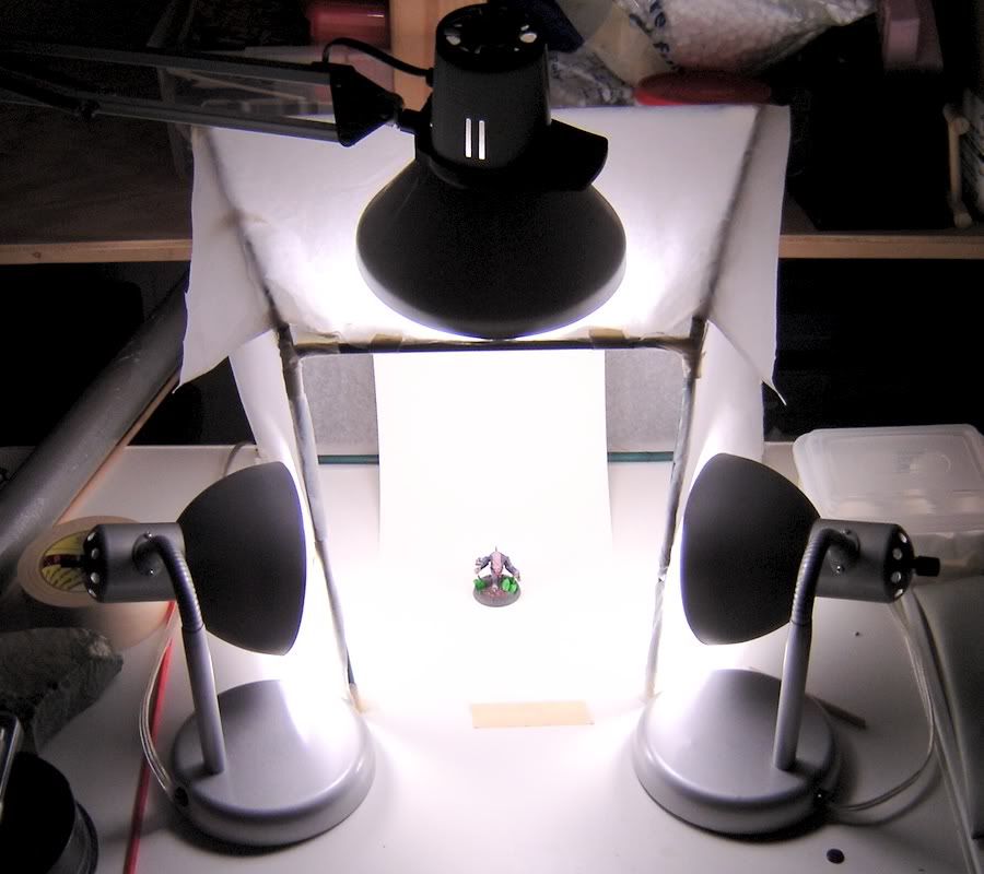
 Currently I'm using 3 lamps with 100-watt GE Reveal "daylight" bulbs for taking pictures (I stocked up on them before incandescent bulbs stopped being produced): one is a cheap swing-arm overhead lamp clamped to the table that the light diffusion box sits, and the other two are figure-level $6 desk lamps angled inwards. These three equally bright lamps diffusing from both the front sides as well as angled down toward the miniature from the top make for very even "ambient" lighting to get good photographs. The current setup allows me to swap out backdrops as needed, and the only real problem I've run into is with figures or displays too large to fit inside my light diffusion box - everything has been fixed with additional tape or replacements of new white tissue sheets cut to shape. My light diffusion box has been going strong for roughly 10 years as of this writeup.
 
 Lastly, here's a picture I took recently using the above lamp setup, the above light diffusion box, a neutral greyish randomly-patterned backdrop I printed from the Internet and a white sheet of paper in the opening of the box to further bounce light back toward the figure:


7/26/2014

Painting Aged Parchment

 I'm in the middle of a slow-but-steady process of migrating all the pages and images from my old hosting to a new custom domain for my painting page. I thought I'd post a slightly-revised tutorial - it feels very odd referring to paints that no longer exist in terms of step-by-step directions, but such is life.

Painting Aged Parchment

2/26/2012

Letters From Readers!

  I received emails from two readers recently (I'm pleased people still visit the site, given my lack of time to post anything at all in almost a year - thanks!) - I'm going to address those on the blog as opposed to individual responses back via email, since I think other people might get something out of it, too!

Michel M. writes:
I really like your painting and I was wondering what colours did you use for the night goblin on this page: http://home.wowway.com/~tinweasel/gw_cleaved_gobbo.html
In particular i'm looking for the olive green colour. What brand/colour is it ?

Thanks,
Michel Melis

  Well, as requested, here's a more-or-less accurate summary of the colors and steps I used in painting that Games Workshop Night Goblin's skin tones:
  • Basecoat 1:1 GW Catachan Green / GW Camo Green
  • Layer on 1:3 Catachan Green / Camo Green with mixture at 1:4 paint/thinner consistency
  • Highlight with 1:1 GW Bleached Bone / Camo Green with mixture at 1:4 paint/thinner consistency
  • Upper-facing highlights of 3:1 Bleached Bone / Camo Green with mixture at 1:4 paint/thinner consistency
  • Add minimal spot highlighting of 1:4 Bleached Bone / thinner 
Michael S. writes:
I just thought you should add a note to your rust tutorial stating that the bleach and vinegar solution from your rust tutorial creates chlorine gas, which is dangerous and possibly even deadly if inhaled. I tried your rust tutorial and I hope it works. I've always wanted real rust.

Sincerely,
Michael Smith

  I'd say that's definitely worth emphasizing - when I made the rust mixture originally, per my posted tutorial, I let the ingredients sit down in the basement by themselves for several days. There was noticeable bubbling, and I left the cap of the dropper bottle in which I mixed the materials open in order to vent. While I don't think it produces a significant amount of gas - only as a by-product in proportion to the amount of ingredients used in the Rust Mixture recipe - combining any chemicals or household materials should always be approached carefully and with every precaution possible!

  As an aside, though, I've still got that bottle of "Rust" in with the rest of my paints and I use it to add color and texture to items I want to look rusty. The original figure in the tutorial, a Privateer Press Cryx Deathripper, is still holding up fine with no degradation of appearance or other ill effects even after several years at this point. In applying the Rust Mixture to a figure, you likely will still want to add a little bit of highlighting and shading to any painted-on rust patches, otherwise it looks a little bit flat, but I essentially use it much like any of my other paints. (Coincidentally enough, I used the rust mixture on the metallic pieces on the base of the Ork Nob above as part of the weathering process - likewise still holding up after several years!)

EDIT: I've updated the original Rust Mixture tutorial page with a warning as well (and cleaned up the web code a bit, too!)

10/22/2010

Hobby Tip - Night Lords' Lightning Effect

 I haven't had time to do much in the way of hobby stuff lately, but I've been wanting to try painting this for weeks now and I'm curious what you all think:


Here's how I painted the Night Lords lightning effect:
  • First I painted a thinned color for an overall appearance of "electrical haze" or "glow." I used GW Enchanted Blue thinned down to a 1:4 paint/thinner consistency and applied this with a 2/0 brush so as it have a "backdrop" color to paint everything else on. I didn't want this to look solid (hence the translucent paint) but I did want it to serve as an overall "outline" for the two subsequent colors.
  • Secondly I went back with thinned Electric Blue (in a 1:4 paint/thinner ratio again) - it's an old, old color so a good substitute would be 1:1 Enchanted Blue/Ice Blue, I dare say. With this step I used a fine (#0000) point brush and more or less stippled a random, crackling line within the previous haze color. I intentionally kept it patchy and wavy while still trying to follow a more or less continuous arcing path - the next and last color I would say is the most important, as it's the "heart" of the electrical effect.
  • Lastly, I applied fine stippling with thinned GW Ice Blue (1:4 paint/thinner ratio again) and just tried to make it look like crackling electricity - I didn't necessarily keep to the exact center of the previous two colors laid down, but I didn't stray outside of them. I made a few passes with just tiny dots of the brush, until I got to the point where it looked like a fine (if fuzzy) line with a few patchy gaps here and there. Done!

5/21/2010

Hobby Tip - Painting Aged Parchment

Step 1:
 Apply a basecoat of 1 part Vallejo Model Color Russian Uniform (although Games Workshop Catachan Green might do in a pinch) and 3 parts GW Bleached Bone at a 1:1 paint/thinner concentration


Step 2:
 Layer on 1:4 GW Bleached Bone/thinner, leaving the shaded areas and deepest depressions uncovered


Step 3:
 Apply a wash (or two) of GW Devlan Mud over the whole of the area to be painted as parchment, paying extra attention to the depressions and shaded areas


Step 4:
 Layer on a first step of highlighting with 1:4 GW Bleached Bone/thinner, making sure to only brighten up the most raised and/or light-facing areas


Step 5:
 Apply extreme highlights to the edges and most raised areas as finely as possible, paying close attention to sharp edges and corners


Step 6:
 Using a mixture of 1:1 Scorched Brown and Black Ink (or Chaos Black and Badab Black, by preference) thinned down to at least a 1:4 paint/thinner ratio, carefully paint the lines of your letters on the parchment. You might want to practice on some scratch paper beforehand, as it really comes down to getting a feel for the hand movements when putting the brush to figure. It would be a good idea to do the first, last, and middle letters all in the same relative size to get the spacing correct, and then fill in the rest of your lettering as you can subtly adjust the sizing of your letters to accommodate how much room you have left.

 It might sound like an oxymoron, but the thinner you have your paints when doing fine detail like this, the more control you will have.


Step 7 (The All-Important One):
 Inevitably, you may need to go back and touch up things a little. Again, thin your paints by a decent margin so as to be able to get it to flow easily. You want to have as sharp a point on the tip of your brush as possible and be applying little to no pressure, simply letting the brush do all the work and allowing the paint to wick off onto your figure.

 In this case, I wanted to neaten up the letters a little bit, and add a slightly lighter "highlighted" black to the right-most lettering. I increased the size of the image, too, so that you can see it's not all smoke-and-mirrors, but generally a case of "if it looks about right in close detail then it'll look very close to right at regular scale."

Happy painting!

5/17/2010

Revenge of the Lonely Khorne Berzerker!

 Well, I'm essentially done with the painting of the figure - I'm still considering what to do for basing, other than that it will likely comprise some sort of urban debris theme - and all that's left is a few touchups of the darkest pueple of my Warband color on the shoulder pads where I got a little slap-happy with the brass color.

For what it's worth, I jotted down his color scheme for reference on all the other figures, so I thought I might post it here if anyone's interested in a darker, blood-colored Berzerker appearance:

Armor:
  • Basecoat 1:2:1 GW Mechrite Red/GW Red Gore/GW Scorched Brown at a 1:1 paint/thinner consistency
  • Wash in crevices and shading with 1:1 Red Gore/Glack at a 1:6 paint/thinner consistency
  • Highlight with 1:4 Red Gore/thinner
  • Edge highlight with 1:1 P3 Khador Red Highlight/Red Gore at 1:4 paint/thinner consistency
  • Extreme edge highlight with 1:1 Khador Red Highlight/GW Blood Red at a 1:4 paint/thinner consistency

Ribbed Armor Jointing/Black Areas:
  • Basecoat 1:1 GW Adeptus Battlegrey/VGC Black Ink at a 1:1 paint/thinner consistency
Brass Trim/Metal:
  • Basecoat 1:1:1 P3 Brass Balls/GW Scorched Brown/VGC Sepia Ink at a 1:1 paint/thinner consistency
  • Highlight with 1:4 Brass Balls/thinner
  • Extreme edge highlight 1:4 GW Shining Gold/thinner
Green Glowing Eyes:
  • Over a pure white undercoat, basecoat 1:1 VGC Livery Green/VMC White at a 1:1 paint/thinner consistency
  • Wash with 1:8 GW Green Ink/thinner brushed toward depressions and shade areas
Dark Metal:
  • Basecoat 1:1:1 P3 Pig Iron/GW Scorched Brown/VGC Sepia Ink at a 1:1 paint/thinner consistency
  • Highlight with 1:1 Pig Iron/Scorched Brown at a 1:4 paint/thinner consistency
  • Extreme edge highlight 1:4 GW Chainmail/thinner

Is the darker scheme decent-looking, as compared to the typical GW Blood Red-painted Berzerker?

5/16/2010

Hobby Tip - Painting 40K Shoulder Pads

 Now I'm not sure about anyone else (mainly because I don't know many other painters), but I prefer to paint and prime the shoulder pads (and backpacks) separate from the figure, primarily because I like to make sure the figure itself gets as much paint and primer coverage right from the get go. Maybe I'm finicky, but it kind of bothers me if I know that I don't have at least a shade coat in the areas that aren't very visible - since I don't use black primer, this is maybe more relevant, because white primer glinting out brightly from crevices is a little jarring.

 Anyways, I paint shoulder pads separately, and a while back I settled on a good way to paint the pads after priming without them touching or resting on anything and thus not getting good coverage themselves. When priming, I use two-sided masking tape and stick them to a paper plate on an angle. It lets me turn the plate 360° and get the pads from all sides, and get both bottom and back edges after a quick flip over once the first coat's dry.

For applying actual paint, I use the following method:


 I attach the back of the pads to a coffee stirrer or something similar with poster putty (in the case of the image, they're stuck to the end of plungers from the 1mL syringes I use for measuring out paint ratios, using UHU-Tac reuseable putty) so that way I get 360° access to them when I'm painting, and can simply set the whole thing down to dry - post, pad, and all, when I'm done applying a color. I can do a bunch of 'em assembly-line style, as they don't take up a lot of room, and by the time I get done applying color to the end of the row, the ones from the beginning of the row will be dry. Two of these will be going on the Berzerker from my Disciples of the Four warband, as seen in the top-right of the picture, while the other two are saved for his friend, the inducted Ultramarine Berzerker I showed some while back - they're both nearly done, and should be getting pictures posted "soonish".

5/02/2010

Hobby Tip - I Remembered How To Paint Highlighting

 Like the title says, I literally had to think about it because I'd forgotten, and suddenly remembered the method I used to use to paint highlights. By way of explanation, I've only gotten back to painting again after about a year off, which started shortly before the birth of our son in 2/2009. I've painted a few miniatures in the past few months, but when doing touch-ups on the Plaguebearer I've posted pictures of recently, I ran into a problem - all my highlights (especially edge highlights) turned out looking a little "off." I'd forgotten what technique I used exactly to highlight and get nice, neat lines and couldn't for the life of me get any of them to come out looking the way I wanted them to.

 I realized what the problem was in a sudden flash of insight - I was applying to much pressure and needed to slacken up a bit. Trying my "newly remember" old method, I was back to painting highlights properly on that figure and the commission I'm also working on simultaneously. (Not exactly like riding a bike, but more like getting back into an old "groove.") I figgered since it had "come back to me" pretty clearly as to how I should be approaching highlighting, and in a way that I can (relatively) easily explain in words, and I've taken a picture of my painting in the past to explain a related concept, I figgered that I'd dig up my old tutorial picture and write something up for the site. Enjoy!

 The problem I realized I was having was that I was applying too much pressure on the brush. Ideally what you want to have is thinned paint - something along the lines of a 1:3 or 1:4 paint-to-thinner ratio, or to throw the phrase out that everybody seems fond of, about the consistency of "skim milk." The reason for this is that you want your brush doing most of the work - it's a tool like any other, and if you're working harder than your artist's tool, then you're doing something wrong. The biggest thing to painting highlights (other than thinned paint) is the amount of pressure you apply on your brush. What you ideally want to do is practice applying as little pressure as possible - if you can, try applying so little pressure that barely even the tip of the brush would touch. Do this without paint if you like to get the feel for it, but practice just barely skimming the surface of something with a feather touch and nothing but the very tip of your brush. Got that down after endless repetition? Good! (Realistically speaking, a skilled painter has had lots of practice doing light brush strokes and with a lot of not-so-good painted miniatures back in the past as trial and error - if you're lucky, you can skip all the bad parts and cut straight to painting good highlights!)

 Now to apply some paint - dip the brush into your thinned paint no more than halfway. Any more than that and you risk getting thinned paint up into the metal ferrule holding your brush hairs in place (and we all know that's a good way to ruin a perfectly good brush). If you're comfortable with this paint consistency and you're painting on a broad area, that's fine, but it's generally a good idea just to lay the brush point flat on a paper towel (or give it a quick swipe along a fingernail, by preference) just to wick some of the excess liquid away - what you're doing is loading up with diffused color due to the added thinner and then taking some of the excess liquid off - you're still going to have the same diffusion of color but just not as runny. Now with as light a touch as you can, draw the brush back towards you slowly - it's the slowness here that matters, by the way. The longer you keep the very point of the brush in contact, the more of your color will unload onto the figure, and by keeping a bare minimum of contact you're letting the brush and the thinned paint do the work. Applying pressure won't do anything to help lay down a highlight, all that will do is make it thicker by bringing more of the brush hairs in contact with your painting surface by force.

Here's the final light purple highlight on a broad span of purple, drawn up towards the top of the shoulder pad:


 If you've done it right and let minimal pressure on the brush do all the work, you should ideally end up with a nice, narrow line. Straightness comes with practice, as does the ability to know how "far away" to hold the brush so that you're not pressing on the surface of the figure at all, but simply letting the bristles touch it with their built-in "springiness." If you approach highlights obliquely - that is, head-on - you're going to end up with fine lines. If you approach them with a slight twist to your brush, so that instead of drawing the very tip along you're drawing more of the side of the tip slightly sideways back toward you, you're going to end up with a slightly more diffuse highlight. I prefer the latter, but it's all a matter of style.


 If you've got highlights down, how's about something a little more tricky? Sharp edge highlights? Sure! Essentially, what you want to be doing now with the same consistency paint and the same wicking off of excess moisture, is drawing the side of the brush along a hard edge instead of using more of the tip. If a picture's worth a thousand words, this might help:

 Using thinned paint, drag the side of the brush along the sharp edge of the surface you want to have a crisp narrow highlight at roughly a 45° angle. Rather than the bristles of the tip splaying and making a fuzzy highlight, the side of the brush which doesn't splay (well, at least not so that it affects the highlight overly much) is what you want to be making all the contact. Between the thinned concentration of your color and the positioning of your brush, with a couple careful passes you'll end up with a nice, crisp edge highlight. Same technique as regular highlights and with the same light touch, it's just applied to the hard edges of things rather than straight and with the (side of) the tip.

 Any more questions? Feel free to ask! Now that I've remembered how to highlight again, I'll do my best to answer. This actually helped someone? I'd love to hear that, too!

4/23/2010

Hobby Tip: On My Word, Unleash Nurgle!

 It's somewhat sloppy and disgusting work (isn't that the Nurgle way of it?), but here's a few ways to get your plastic or metal figures looking like they've given over to Papa Nurgle in no time. (For those not familiar, Nurgle in Warhammer 40K is the Chaos god of disease, decay, pestilence, entropy, and fearlessness of death.)

Supplies for adding disgusting texture to your figures:
  •  You'll need some type of PVA glue. I'm partial to Elmer's Wood Glue as it's a bit "stiffer" in consistency than regular White Glue and comes in larger containers by comparison especially if you buy it at a DIY or building surplus store - then again, you can probably find cheap (as in inexpensive) glue, like Elmer's or another good brand name, at some of the higher end dollar stores (Dollar General, Dollar Tree, etc.) especially if they have a school supply section.
  •  You'll probably want some sort of thickener, which ought to serve the added bonus of giving your infected areas some gross texture as well. Anything along the lines of talcum powder, baby powder, or extra-fine grit will do - ideally you want something inert and non-food based (although I've always used cornmeal as a basing material, and I've never had any figure bases turn, um, Nurgly). The thicker the "grain" of your material, the more textured the final result will be - in the example pictures, I used a mixture of fine grit, cornmeal, and baby powder.
  •  Last but not least, you'll want to pick up an assortment of smaller-sized beads. If you get coupons in your weekend paper (JoAnn's) or subscribe online (Michael's, Hobby Lobby) you can probably get 40% off a decent-sized container of seed beads - the kind with tiny holes in them so as to resemble pustules on a figure. In the example pictures, I used a mixture of the larger dessicant beads from a few packets of silica gel (the sort you find in new boxed home items or clothing pockets when bought at the store) as well as the tiny plastic ionized beads from the inside of a water purifying pitcher filter (they are a pain to separate out from the activated charcoal, but well worth it!)

Here's the step-by-step on applying a disgusting texture to your figure:
  •  Sort out your beads first, making sure you have the sizes and appearances you want - maybe even divvying 'em up in groupings according to where you'll be placing them. (It's not rocket science, granted, but I'm all about having stuff at hand and ready to go when you need it as opposed to sorting through piles of beads while your glue slowly dries unused on the figure.)
  •  Mix some powdery thickener into your PVA glue and apply it in a smallish amount where you want your pustules to sprout, preferably not with a good paintbrush unless you want to accidentally make Father Nurgle extra proud.
  •  Stick your beads where you want 'em, making sure they're aligned (sprouting?) just the way you want the final product (crop?) to look.
  •  Slather on more of your glue and thickener mixture around or even on your groupings of pustules, trying to be sloppy but careful - there's an oxymoron for you, but I'm thinking you can picture what I mean. You probably want to steer clear of the tops of your pustules-to-be, unless you want the areas near the top of the sores to be grainy textured - I'd think smooth would be the way to go (like pus-distended skin stretched sickeningly taut by the diseased innar... er, yeah).
 As the glue dries, it'll tighten everything into place and your powdery/gritty thickener ought to generally make a mess of the appearance around and between your pustules, as well as smoothing out reasonably well where the diseased areas meet the "unblessed by Papa Nurgle" portions. You might make several applications (like I did in the example pictures), using more coarsely grained thickener to glue the beads down and then going back with a thickener like baby powder to smooth things out a bit.

A mixture of PVA glue and baby powder:


A mixture of PVA glue, fine grit, and cornmeal:


Adding a look of disease and decay to your figures:
  •  Gather an assortment of fine drill bits, the smaller the better. (In the example pictures, I used drill bits from 1/78" all the way up to 1/8" in size.
  •  Make sure you have a sturdy base to mount your drill bits for use - a good pin vise should have a chuck for extra-small bits or be otherwise adjustable to hold even smaller-sized ones. If your pin vise is not nearly as adjustable for tiny drill bits (my first one wasn't, for example), you can take a short cut-off length of dowel and make a relatively deep hole in it a little larger in diameter than a drill bit you want to mount (I used a pair of locking pliers to grip one of my smaller drill bits initially - it was hard work, but I finally got a nice deep hole to set my 1/78" bit into with room to spare for glue.) Once your preferred drill bit will fit in the dowel, try roughing up the non-spiraling end of it with a file or sandpaper to ensure a good grip for glue. Slather the roughed-up end of the bit with glue and set it in the hole you drilled - I'd recommend epoxy glue since CA glue (AKA "Super Glue") is overly brittle, but even something like rubber cement would work in a pinch.
  •  Drill holes in various sizes across the areas you want to look especially diseased on your figure. It's probably best not to clump larger holes together, but a larger one surrounded by an assortment of smaller-sized ones generally looks good. Make sure not to repeat any particular pattern over the surface of your figure, since this is ideally supposed to be random.
  •  Tidy up any burrs on the edges of your drill holes with a quick, light drag from a scalpel or hobby knife (unless you want the holes to look somewhat inflamed as well).

And here's the finished detail on a figure, a combination of added texture and tiny drilled holes:

4/16/2010

Hobby Tip: A Cheap 'n' Easy Spray Booth


 This is a tutorial on building (like the name says) a "cheap 'n' easy" spray booth suitable for priming, sealing, basecoating with aerosol sprays - even airbrushing. I am simply providing step-by-step instructions, and am not to be held responsible for anything that may happen through the use of a spray booth such as this indoors, i.e. toxic exposure to paint fumes, exploding furnaces, or a light dusting of primer on someone's antique furniture. (Consider yourself warned and myself absolved - nothing says "bad karma" like feeling responsible for someone else's fiery, explosive demise!) Also, many thanks to Alf from the RelicNews Forums for the original inspiration!

With that out of the way, here's the materials:
  • 1 reasonably-sized durable cardboard box
  • 1 roll of standard duct tape
  • 1 roll of packing tape (optional)
  • A supply of microfiber filter as can be found at most home improvement-type stores, generally in the Heating/Cooling or Air Conditioning department
  • A heavy-duty commercial-grade vacuum, AKA "Shop Vac"
  • A medium-sized plastic bag - always good to recycle the bags from those impulse figure purchases!
  • A pair of good shears/heavy scissors

Here's a picture of the first spray booth I set up myself (it saw about 4 years' worth of frequent use):

 I would suggest that you set your spray booth up in a well-lighted, well-ventilated area such as a garage. I would also suggest that you raise the overall level of the booth to a comfortable height to allow for easier spraying - my first homemade spray booth was at roughly floor level due to space considerations, but a small stool underneath gave me enough clearance to easily see all areas of my figures when spraying whilst sitting on the floor in front of it. My new booth is set back on a shelf of my painting desk, so I don't need to hunch over to see!

 To start, cut a squarish piece of microfiber filter a little larger than you actually want the opening at the back of the box to be - try to make the hole reasonably large, as the whole point of this setup is to remove as much of the excess paint vapors from the open air as possible. The next step is to cut a hole about 1" or so smaller than the piece of filter in the back of the box, relatively centered behind where you expect to do the majority of your spraying. Make sure to leave a reasonable border of cardboard for the filter to sit flush against on the back of the box.

For reference sake, this is what microfiber filter looks like in its natural state:

 Next, tape all the seams of the box so as to prevent excess paint being sprayed from escaping out any holes or crevices - ideally, you want as much paint as possible to be drawn towards the filter when using the spray booth. Taking your plastic bag, cut a hole in the opposite end of the opening, or, alternatively, cut the length of the bag down to a more manageable length - depending on the size of the bag, you might want to cut slits at the end so it opens neatly into four "flaps." The purpose of the bag is to act as a funnel between the hole at the back of the box and the nozzle of your shop vacuum.


 The tricky part now is to tape the sides of the filter down to the back of your booth over the cut opening so that there are no gaps and the filter sits flush and overlaps the hole on all sides - with mine, I used overly long strips of duct tape on all four sides and made sure they overlapped at the four corners around the filter. (The reason I used duct tape as opposed to packing tape is for ease of removal when I next need to change the filter or bag.) The filter doesn't necessarily need to sit into the opening, but the edges do need to be airtight against the box for the next step.


 For the final step with the box, tape one opening (likely the largest) of the bag over both the hole and the filter from the back of the box. As can hopefully be seen from the picture, I made a similar overlapping square of tape around the mouth of the bag against the box - what you can do is tape down a side and then trim off the excess bag sticking out with a pair of shears. I also taped over the first layer of tape holding the bag down so that the second layer of was sticking, at least partially, with nothing but cardboard underneath - this is to prevent the tape and bag from peeling away from your booth from the weight of the vacuum hose, which could be very messy if it happened in mid-spray session.


 For the sake of a snug fit, you will want to taper the bag via wrapped duct tape so it fits tightly around the nozzle of the vacuum. With my box, I made a "collar" of sorts to fit around the nozzle of the vacuum - although this is actually an extra shop vacuum I have, it's occasionally useful to be able to separate the vacuum from the attached spray booth if I need to use it for anything else. One way to make the "collar" is to wrap a length of duct tape around a jar or bottle with the sticky side facing outwards, hold that inside the open end of the bag, mash the end of the bag around the tape, and then wrap another length of tape or two around the outside of the bag end. The tape on the outside serves two purposes: it maintains the shape of the "collar" so it fits the nozzle of your vacuum snugly, and it also holds the nozzle in place to prevent it from collapsing inwards when suction is turned on. (Don't make the same mistake I did and use a bottle with a slight "lip" around it - the inner ring of tape was tight enough that it wouldn't fit over the lip in trying to get the bottle out, and I ended up having to undo the entire taped-up bag!)


 My first spray booth was set up on the floor and fairly low, so I used a length of wood to prop the hose up so the mouth of the nozzle sat at roughly a right angle to the back of the filter inside the bag - it gets better suction this way. If you have the entire setup on a shelf or something, this prop might not be necessary. I can virtually guarantee you will need to play around with the placement of the vacuum nozzle the first few times, as it has a tendency to either suck in the bag or stick to the filter - as you can imagine, neither situation is ideal for drawing off paint fumes, and a total blockage with the vacuum running will kill the motor. With enough adjustment and a good prop, you should be fine - just remember the ideal angle is about 90° to get the strongest draw of air toward the filter of your booth. If you're really cramped for space or your vacuum continually misbehaves by trying to eat the bag, I might suggest buying an extra-wide funnel of a large enough diameter to cover the filter and hole in the back of your box entirely, and with a narrow enough spout to fit inside the nozzle of your vacuum hose. The spout of the funnel will stop the nozzle of the vacuum hose from collapsing inwards towards the filter when suction is on, and the wide mouth of the funnel will feed fumes towards the vacuum hose nicely.

 Hopefully this is all pretty self-explanatory, but let me add a few parting thoughts. The vacuum is used whilst spraying to draw excess paint and fumes towards the filter and interior of the box - ideally away from yourself and the area around where you spray. To do this effectively, you need a pretty strong vacuum (mine is 3.5 horsepower) - the stronger the suction, the less airborne paint and fumes end up in places you don't want it: your lungs, your parked car, or nearby sources of flame.

 * The micro-fiber filter is there to prevent the airborne paint particles from clogging up your vacuum itself: you will ruin a perfectly good vacuum if you skip using some sort of ultra-fine filter material or if you fail to change the filter out when it starts to become clogged with repeated spraying. For the sake of brain cells and your overall health, only spray in open, well-ventilated areas and not anywhere near open sources of flame: paint fumes can easily build to toxic levels in enclosed spaces; you can kill off massive amounts of brain cells as chemicals are absorbed fairly readily into the bloodstream via the lungs; you can cause an explosion if allowed to build up anywhere near a source of flame or heat - this includes the pilot lights of furnaces and water heaters, cigarettes, and space heaters.

2/16/2010

Hobby Tip - Weathering Powders

 My understanding in using weathering powders is that ideally, what you want to do is paint everything you're going to paint and then seal things, with the final coat being matte. (You could use gloss or semi-gloss, but matte has more "texture" to which the weathering powders can stick.) If planning to paint additionally above and beyond the weathering powder stage, a good halfway point sealant-wise is simple (as cheap and plain as you can get it) hair spray. (Extra Hold Suave used here, "borrowed" from the wife.)

 You can use most any liquid to "thin" weathering powders in order to apply them by brush. Weathering powders are essentially just extra-fine-grained dry pigments and you're technically not "thinning" anything by adding liquid to them, but by using the powders suspended in a liquid medium, this allows them to flow wash-like into crevices and the like. Anything that acts as a surfactant is probably best: like rubbing alcohol, Future Floor Finish/water, GW Washes, water/dish washing detergent, turpentine/mineral spirits/white spirits, etc. The problem lies in "thinning" pigment powders when you use something that dissolves acrylic paint - a little too heavy with the brushing and you've started to ruin the underlying paint job (which in itself can be used as a technique, but that's a different writeup); hence the initial step of putting some sort of barrier between the underlying paint job and the pigments.

 In terms of sealing or "fixing" the pigment powders to your model, there's a lot of options you can use. The easiest and best-looking would be to use nothing: this lets the texture of the pigments themselves play itself up to best example, but the downside is that the pigments rub off with any handling - probably best left for display models that won't be handled. Next best would probably be what MIG Pigments recommend: a liquid fixative, along the lines of turpentine, acrylic thinner, or MIG Pigment Fixer - it semi-dissolves your underlying sealing spray when (gently and carefully) brushed on over your pigments and when dry, essentially leaves the pigment powders embedded in the underlying sealant. Maybe last best would be some sort of sealant spray again: pump sprayers would cause the least disruption (but be more prone to causing "puddles" due to spray pooling on the figure) whereas aerosol spray would have a more even finish but be more likely to blow away a decent amount of your placed pigment powders during the process of sealing - kind of a Catch-22, but there you go.

 By way of example on this finished GW Skaven Warlord, I used Old Rust and New Rust colored powders on the blade of the bardiche over metallics tinted with purple, brown, and black - I added a few other colors of pigment powders elsewhere, like Concrete Dust on the clothes, Soot in some of the darker crevices near the hem of his robes, etc. After fixing the weathering powders with MIG Fixer, I went back and emphasized the nicks and dings in the blade of the bardiche with paint, as they had gotten "overwhelmed" a hair by the pigment powders. I then added a bit more selective shading and spotting with brown and black translucent inks. The figure is sealed with a few thin coats of Krylon Gloss Varnish spray (so as to try and play up the pigments and coloration) and then a final coat of Testor's Dull Cote spray (for protection and to tone things down a bit). I went back and emphasized select areas of metallics with brush-on gloss, since Dull Cote (or any ultra-matte sealant by nature) tends to make metallics look flat.

1/30/2010

Tyranids, Old School Style!

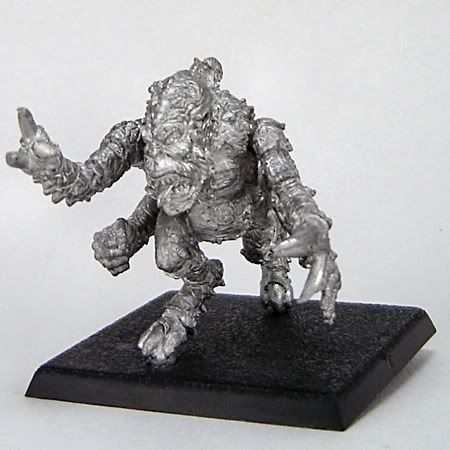
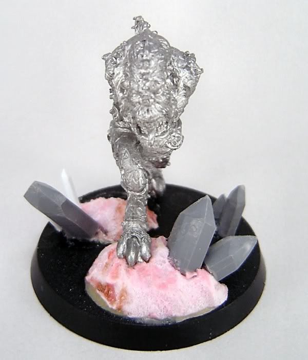
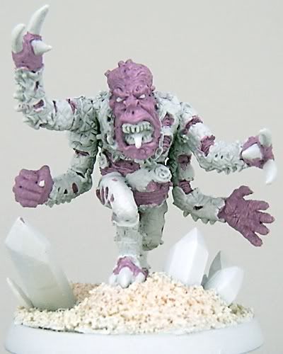
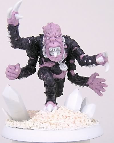
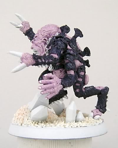
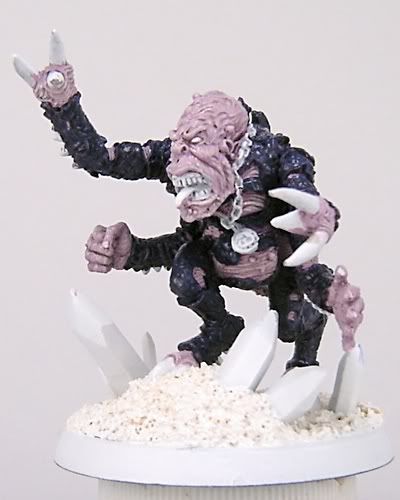
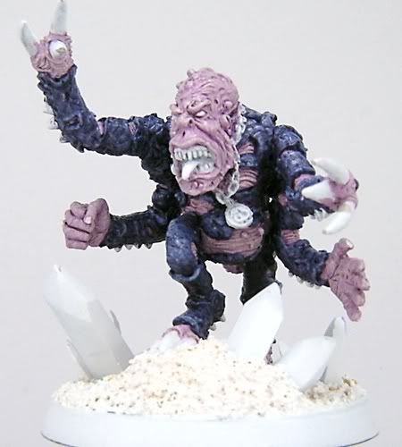
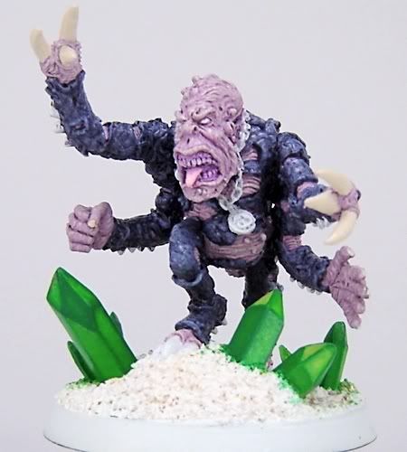
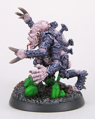
 Frankly, I'm shocked I never got off my butt and wrote up a tutorial for this guy, since I essentially had the makings of one in a forum thread I started for him for a Relicnews Painting & Modeling Forum competition - but here's some stuff on a way, way "old school" Genestealer Patriarch I painted in 2007. After some additional work on him following the Relicnews P&M Forum competition, he was one of the figures I took to my first-ever Golden Demon Competition and he was fairly well received - I ended up getting a lot of nice compliments. I seem to recall being told he was an "Honorable Mention" along with all my other entries, but I'll admit I was a little stunned at the time by news that my Lord of the Rings entry had apparently won Silver - I had just come down to the main hall after attending a very well-presented painting seminar by Jérémie Bonamant-Teboul, and someone else from the West Oaks Hobby Center group I rode with to Chicago came up and told me about my Gandalf LotR entry.

 I was more or less like a deer caught in the headlights from about that point until the bus ride back towards home. My Patriarch did actually make First Cut but never got pictures taken of him by GW staff as far as I know, and likewise never made it onto the US GW website or into the White Dwarf magazine issue later that year. While seeing this guy in print would've been nice, I do realize it's a very old, very ugly figure (which I personally think is part of the charm) and there's also the fact that the Brood Lord had just come out in the Tyranid Codex released that year - they essentially fulfill a similar role in the "fluff," and of course Games Workshop would choose to play up a newly-released figure with new rules as opposed to a pure lead casting out-of-production relic from the late 80's.


Without further ado, here's something like a work-in-progress thread but without all the excess verbiage:


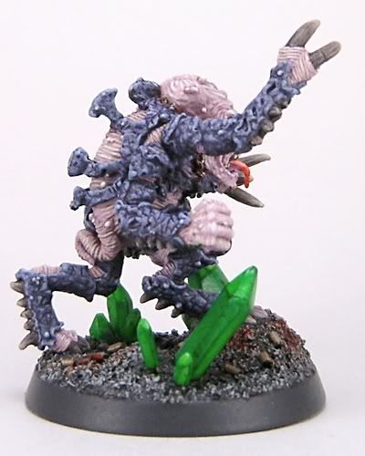
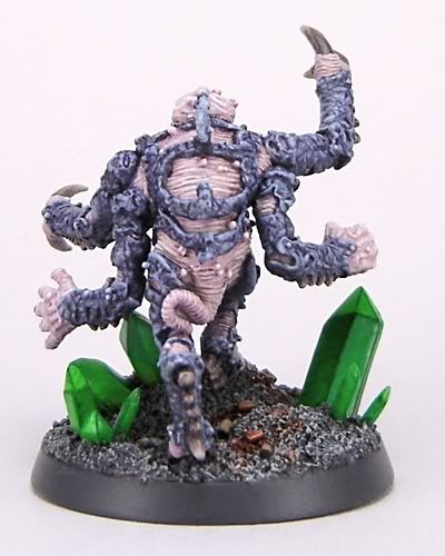
Here's the final version of my Genestealer Patriarch that ended up going to the 2007 Chicago Golden Demon Competition:


And for anyone who's curious, here's most of the color recipes I used in painting him up:

Patriarch Skin:
  • Basecoat 2:1:1 Vallejo Model Color Deck Tan/Games Workshop Skull White/Games Workshop Purple Ink
  • Layer 4:2:1 Deck Tan/Skull White/Purple Ink
  • Layer 2:1 Deck Tan/Skull White +1 drop Purple Ink @ 1:10 ink/thinner consistency
  • Layer 2:2 Deck Tan/Skull White + 1 drop Purple Ink @ 1:10 ink/thinner concentration
  • Wash with 1:1 GW Codex Grey/VMC Russian Uniform @ 1:20 paint/thinner consistency
  • Wash with 1:20 Vallejo Game Color Hexed Lichen @ 1:20 paint/thinner consistency
  • Highlight 2:2 Deck Tan/Skull White + 1 drop Hexed Lichen @ 1:10 paint/thinner consistency
  • Add + 1 drop of VMC White to above mixture and highlight
  • Extreme highlight with 2 drops VMC White + 1 drop Hexed Lichen at 1:10 paint/thinner consistency

Carapace:
  • Basecoat 2:2:1 GW Black/VGC Hexed Lichen/GW Ultramarine Blue
  • Layer 2:1:1 Ultramarine Blue/Black/Hexed Lichen
  • Layer 2:1 Ultramarine Blue/Hexed Lichen
  • Add + 2 drops of Deck Tan to above mixture and highlight carapace edges
  • Highlight edges 1:2 Ultramarine Blue/Deck Tan
  • Add + 2 drops of VMC White to above mixture and extreme highlight carapace edges
  • Line in between carapace patterning with 2:1:1 Chaos Black/Ultramarine Blue/Hexed Lichen at 1:20 paint/thinner consistency
  • Repeat lining-in of extreme shaded areas with above mixture

Claws:
  • Basecoat with 1:1 GW Red Gore/Chaos Black
  • Paint initial striations with +1 drop of VMC Buff/Russian Uniform @ 1/10 paint//thinner consistency to above mixture
  • Layer additional striated highlights with + 1 drop of Deck Tan to the above mixture

Crystals:
  • Basecoat crystal sides with 1:1 GW Dark Angels Green/thinner
  • Layer side opposite light source with + 6 drops of GW Striking Scorpion Green added to above mixture
  • Add + 1 drop DA Green to above mixture and layer next adjacent crystal face
  • Add + 1 drop of DA Green to above mixture and layer opposite adjacent crystal face
  • Repeat above steps with + 1 drop of DA Green added until all crystal faces are painted
  • Darken interior of crystal faces depending on appearance with glaze of GW Green Ink at 1:20 ink/thinner consistency
  • Extreme highlight crystal edges with 3:1:10 DA Green/Green Ink/thinner

LinkWithin

Related Posts with Thumbnails

Followers: