Showing posts with label basing. Show all posts

1/19/2015

Ice Golem - Final Pictures!

 The snow effect used on the base was achieved with Secret Weapon Miniatures crushed glass, presumably designed just for snow and ice effects - it's the Crushed Glass Bundle, which comes with "Realistic Water" resin to apply the loose crushed glass and seal it in place. I can actually sculpt it and layer it the same way I use my other basing materials. Great stuff!

I motivated myself toward getting final pictures of the finished Ice Golem:


 One thing I really liked when laying down the snow effect was that it was translucent - a first layer I mixed with white paint to represent solid snow; the second layer I left as-is for fresher snow. The best thing about it, I think, is the seepage of the Realistic Water around the edges, which makes it look like meltwater esp. on the edges on the base and the low mound on the paving. I used a less "wet" mixture for the outward-exploding snow (mostly cemented clumps of the previous white paint mixture), and just gave it a light coat of paint-free mixture to even things out.

 He's by no means showcase quality - I could've spent lots of hours on the ice crystal effect, say, and straight painted him entirely instead of using washes, but I was aiming ideally for speed. The most involved part was the highlighting and general tidying up. I really like how the eyes show up on the side-view pictures, since I used light flesh tone instead of white.

Comments and criticisms appreciated!

1/10/2015

Translucent Pink Daydreams

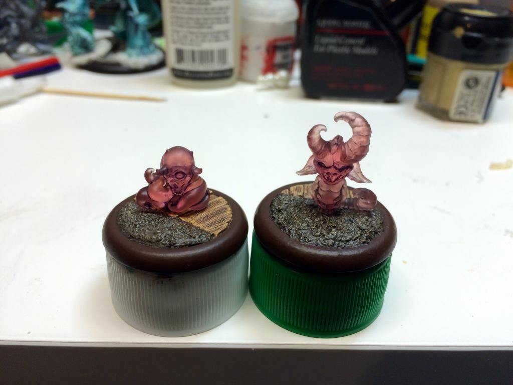
I just wanted to show off a work-in-progress picture of the two Translucent Pink Daydreams I've been working on for the past little while. I got the Translucent Pink "Hide and Seek" set during Wyrd Games' Black Friday sale.

The figures are shaded, the bases are painted, and everything's sealed in several coats of different sealants so as to be safe on the table. I still need to finish decorating the bases to represent woodlands and a 19th Century orphanage/nursery split between worlds, but this is straight from my iPhone to the world.


Critique and suggestions appreciated!

12/30/2014

#hobbytiptuesday - Priming Foam

 I tend to use a decent amount of foam in my basing, either to build up areas before I add texture, or EPS insulation for large scenery pieces - or in this case, using extra hard foam cuttings for making to-scale wood planks.

 In ay case, using any sort of aerosol or plastic cement will melt foam (I believe it's the xylene/toluene thinners in rattle can sprays that does that). This limits your options when priming foam and likewise limits your options when gluing plastic figures. As a planned workaround for future gluing, I inset cut sheet styrene pieces and built the rest of the base scenery around them - one problem solved!

 But what about priming? An easy fix is to either seal the foam prior to any rattle-can spraying with watered-down wood glue (in the case of larger pieces of scenery), to just directly paint it (craft paints plus large foam scenery are a cheap alternative), in this example: to use a brush-on primer on the foam areas to seal those prior to using my regular rattle-can primer on the rest of the base. Problem #2 solved!

11/26/2014

Children of December Based and Primed!

I've got my old DIY spray booth set up and now have the base for the Ice Golem as well as the rest of the Children of December crew primed and ready to paint! They're all mounted on Secret Weapon bases, and although it took some finicky pinning with 20 gauge beading wire (couldn't use my usual paperclip method due to the ultra-tiny feet), they're all reasonably securely fastened.

5/27/2014

GW Bad Moons Ork Nob

 Apparently I've never posted this figure directly on my blog. It's one that I'm actually very proud of, despite the fact that it's not necessarily painted to a display standard and I didn't go all-out with him in terms of difficulty of paint job or anything. This was one of the "free figures" that came with an issue of Games Workshop's White Dwarf magazine way back when as a promotion for an upcoming rulebook/figure combo boxed set - Orks versus Space Marines coupled with an intro to the Warhammer 40K 5th Ed. rules. I traded away all the Space Marines in return for a boatload of Orks - my plan is/was to have an Orky mob that was a throwback to Ork-related books and art that GW put out towards the end of the "Rogue Trader" era - several collections of Ork backstory, with awesome art by, well, just about all of the cool GW artists at the time.

 Anyhow, this Ork Nob figure was painted as a test to see if I could do homage to the "bright 'n' blingy" bright yellow armor and clothing of the Bad Moons Ork clan back in the day while: 1) making it grungy and rough looking, and 2) making it easy to paint and replicable across a whole Ork mob for the purposes of cranking a playable tabletop 40K Ork army out.

 I succeeded with my two aims for this figure... it was painted almost completely with washes of thinned paint over white primer. I started with the lightest color, and painted progressively darker wash layers into the shadows and then towards the deepest shaded crevices. I finished off with a layer of "grime" as a wash over the armor and clothing. The metals were painted with a solid basecoat of mixed metallic paint and dark regular paint, and then just bumped up a bit with a minimum of highlights. I tried some new materials (for me) for basing, essentially some innards from a cheap wind-up alarm clock, and cork - the base was painted with basecoats and washes as well, topped off with a few highlights.

 I think the figure turned out excellently for what it was intended to be - a test piece for an easy color scheme to use on cranking out a tabletop army. Unfortunately, when the time came to paint some more friends, I made decent progress on a batch of 5 with the same scheme... and then got sidetracked by some other "new and shiny" release. Ah well.


 You can vote for him here on CoolMiniOrNot!

12/31/2013

Call of Cthulhu - The "Mad" Doctor

Edit: Updated with color recipes used!

 It's been a little while since I finished the figure and got approval from the client to keep on trucking, but real life has intervened and thus a lagging blog post. I'd like to think it was worth the wait, though, as I've got hi-res pics and there's a few areas that I think turned out very well that I was to touch on.

 For starters, this figure is part of an investigators of the unknown set (exact product/part # unknown) released by RAFM specifically for Call of Cthulhu. He looks to me like a doctor with a kit bag and a vague air of professionalism - in reality, the figure struck me as extremely creepy and representative of the religious cult leader from Poltergeist II, so that's what I rolled with in the final presentation.


 I was aiming for a paler "realistic" skin tone than I've used in the past, and made specific effort to accentuate the shading in places like the hollows of the cheeks and around the eyes - in reality, some of this was a "trompe l'oeil" effect on my part, as the sculpting was a little misshapen and the left and right sides of his face actually don't match up well. Anyhow, from extreme shadow I went through 6-7 color progressions to almost a near white for the facial highlights on the bridge of his nose, his upper cheekbones, and the pate of his skull as I really wanted to accentuate a somewhat skeletal appearance.

 The blacks I used in the figure are two different shades, having used cool colors for his suit from a cold grey-black worked up to highlights of pure neutral grey and Vallejo Model Color Deck Tan worked in (I love this color!), with pure black shading; and for his hat and shoes, and wanting to make the hat somewhat of a warmer color to draw attention up to his face, I went from pure black straight to highlights with Games Workshop Graveyard Earth worked in and Graveyard Earth/Deck Tan for final highlights.

I really like the way the stone turned out, and despite the appearance in pictures, there's not a single element of grey at all!

Edit: Color recipes!

The "Mad" Doctor's Skin Tones
 As mentioned in my previous post, I approached skin tones on this figure differently than I have in the past, mostly for the sake of trying something new. I've had the Reaper Master Series Bright Skin triad set for some time, but never used them outright, so there's that. I also have had some untried recipes for flesh color progressions thanks to Keith Robertson of Forge World/Games Workshop fame and an old printed article from Mike McVey's painting site (Raven Priest Assembly and Painting - Pt. 2). I took the Reaper paint set, combined the two recipes with some tweaks for an older, paler-looking flesh tone, and went to work!
  1.  To start with, I painted all the skin areas using several thinned coats of Games Workshop Tallarn Flesh, although really any dark neutral tanned flesh color would do.

  2.  I applied shading with a mixture of Tallarn Flesh and Vallejo Model Air Dark Green, being careful to only apply this to areas where shadow would naturally fall - on the face I painted this color in the eye sockets, from the below the cheekbones down, under the nose and lips, and the entirety of his neck.

  3.  I added a deep blue to the shade mixture, in my case Vallejo Model Air Intermediate Blue (or an equivalent royal blue) and painted this onto any deeply recessed shade areas - on his face I worked this into the tops of his eye sockets, directly under the cheekbones, beneath where his hairline met skin, and the neck recessed within his collar.

  4.  I began the highlighting and defining process with slightly thinned Reaper Bright Skin color, essentially working over any skin areas untouched by shading and taking care to draw the color upward with my brush to the above-lit areas I was trying to represent.

  5.  For the next highlight step used thinned Reaper Bright Skin Highlight color, accentuating everything from roughly a 45° angle upwards, making sure coverage on his bald pate was good, as well as touching up his lower lip and eyelids slightly.

  6.  For the next highlight step, I added pure white to the Reaper Bright Skin Highlight paint previous and accentuated everything visible from roughly a 75° angle upwards, again making sure coverage on the upper surfaces of his bald pate were nicely transitioned, as well as focusing on areas like the bridge of his nose, his upper cheekbones, hints of color on his earlobes, and the sinews of his hands.

  7.  Finally, I went back with thinned pure white for the final highlights, applying them minimally to areas where I wanted to draw attention as well as play up his somewhat skeletal appearance - the vertical lines at both temples, the bridge of his nose, and the very top of his bare pate.

  8.  I did need to go back and smooth out some of the transition of the facial shading so for that I went back in with a 1:1 mixture of Vallejo Model Color Russian Uniform (great color, btw!) and the basic Reaper Master Series Bright Skin color thinned so as to more smoothly transition the lighter color of the jaw evenly on both side of his face into the shadow under his cheekbones (did I mention that the face seems unevenly sculpted on both sides? Oh well, that's why this one's a classic!)

The Stone Base
 This is actually one of my old color recipes that I tweaked slightly for this model, as I wanted the stone to be less"warm-looking" so as not to detract from the cooler palette of the rest of the figure.
  1.  To start, I applied a basecoat mixture I've had for ages (Games Workshop Chaos Black and Snakebite Leather mixed - only this is the Snakebite from the early 90's color range that was a dark brown) - you can use any neutral dark brown, but a good equivalent would be the P3 Battlefield Brown color - just make sure you have good coverage over any areas you want to look like stone.

  2.  Next, I heavily stippled slightly thinned Battlefield Brown all over the stones - the trick when I'm stippling or drybrushing is that I thin my paints about 1:4, so that when I wipe away most of the liquid out of my loaded brush, I never have to worry about it laying on too thick or dark, because it was already somewhat diluted at the outset - this makes for an excellent "dust" effect on figures using different colors, by the way.

  3.  Trying to avoid any warmer colors in the paving stone basing, I next lightly stippled thinned Vallejo Game Color Khaki over all the stone, but with greater attention paid to upper areas.

  4.  The first actual highlighting I did was with (again) a thinned color - this time Vallejo Model Color Deck Tan, which is an excellent light cool beige-grey. I drybrushed this color primarily on edges using a squared-off Filbert synthetic brush - I like the brush shape (think tongue-depressor roundness) as it allows me to drag mostly along sharp edges, and I like synthetic bristles for drybrushing as it chews up natural hair brushes like nobody's business.

  5.  The final highlighting on the base was more drybrushing with a thinned pure white color, being very careful to only apply it to edges and raised stone edges on the base with very careful dragging.

  6.  The very last step on the base was a wash of a mixture I've had for ages - 3 parts Brown (or Sepia) Ink, 1 part golden yellow paint, and 1 part mid-range green all mixed together and painted more or less once over all the stone and then primarily into the crevices to darken things down a bit.
That's basically it for the color recipes and painting of this figure - feel free to drop me a line or post any feedback!

8/04/2012

2012 Chicago Games Day and Golden Demon Stuff

  I went to the GW Chicago Games Day this year with some friends and entered 4 figures in the Golden Demon competition. I am happy to say that all four made First Cut and that I won a Silver Demon for my entry in the Lord of the Rings category, a Dead Marsh Spectre!

  I finally got a chance to sit down this morning and take and edit pictures of my entry, and am in the process of taking and editing pictures of my other Golden Demon entries. (I also managed to take a decent number of pics of other entries in the competition, most of which managed to turn out halfway decent - editing those now, as well.) I'm not even going to go into my opinion of the Demon area design this year versus when I last entered stuff back in '07 and '08, other than to say that the figure cases were much improved even if the area itself was horribly laid out for viewing and I think actively contributed to the perpetually long line present all day.

Without further ado, pictures of my Dead Marsh Spectre LotR entry:

  For what it's worth, here's my "new" photo editing process: I took single pictures of the figure from all sides under 3 100-watt Reveal bulbs (a little closer in the front, also doubled image size for all pics), used the automagic Color Balance (didn't bother with cutting back on the red shift a little like I used to do), duplicated the image in 3 layers, adjusted the Histogram settings for the upper two layers (the first with adjusted high and low value range, 1.0 Gamma and -2 Midtone Compression - the second with the same high and low value ranges, 1.2 Gamma and -2 Midtone Compression), middle layer transparency of 70%, upper layer transparency of 60%, merging of all layers, editing Sharpness (Radius 0.6, Strength 100, Clipping 10), and auto image Clarification. Suggestions appreciated from anyone who has more experience with editing or color balancing photos!

  I'll be posting pictures of the rest of my entries as I can, also work-in-progress photos of a commission I'm currently working on for 5 very cool 101 Schwere SS-Panzerabteiling Tiger I tanks from the Flames of War game.

5/22/2012

Last WFB Empire Amethyst Wizard WIP

 At this point, I think I can safely say that I've put as much work as I'd like into this Empire Amethyst Wizard without going too over the top, being totally nitpicky and fiddling with things to the point that I've done with previous competition painting figures.

 The base is finished with texture added, now painted, and a "spot color" element to tie the green areas together in a "triad" of sorts so the color looks balanced with the majority purple/violet in the rest of the figure's coloring. With input from Brandt over at Toadkiller Miniatures and my wife, the back of the figure now looks much less bland and "boring" that in previous postings.

 I think the liquid appearance effect I attempted in the flask turned out nicely, and while I'm not completely sold on the glass appearance effect I tried on the upper part of the flask (mostly due to the wonky bottle shape, or at least that's the official reason), I think that turned out reasonably well also.

Here's a pic of the wizard prior to spray sealing (a little fuzzy due to the image being taken on my iPhone):

Feedback, suggestions and comments would all be greatly appreciated. As per my intent with this guy to paint him up specifically for sale (as opposed to "for keeps"), I'll post details of the auction and such when I get that aspect of things together - haven't sold any painted figures of mine online yet (outside of commissions) so I'm looking forward to this!

8/11/2010

Slaanesh Chaos Lord, leading the Disciples of the Four

Here's pictures of my finished GW Chaos Lord w/ Mark of Slaanesh and "Blissgiver" Daemon Weapon:
 For starters, I'm glad I was able to repair damage from my first attempt at using waterslide decals on a figure - his hood, specifically. It turned out a little wonky texture-wise from all the stripped paint, but I painted up the rough patches to look like more warts and scarring along the lines of the rest of the figure. (Guess this means I can now go and finish up a way-old tutorial on making custom decals/insignia, yay!)

 I painted the Daemon Weapon with a slight purple tinge, with the metal going up to a white metallic color - same as the round decorative insignia pieces on his torso. I figgered since it's supposed to be a "Blissgiver," some exotic coloration was called for (outside of the grip, which I tried to paint up as being made from tanned human leather).

 With the hood I had a hard time settling on a color scheme - I was originally going to paint it white/pale, but that was just too heavy with negative connotations in my mind (think Southeastern US white supremacist group-esque) and so I ended going with pale pink. That later changed with washes and such to more of an appropriate (in my mind) fleshy color, so I'm going with fluff that the hood is made also out of tanned human leather.

 I painted the grip of his scourge and the holster of the bolter to look like tanned human leather as well, since the orangey-reddish base balances out the other colors in theory. I'm curious to hear how folks think they turned out.

 I've been painting this guy up in fits and starts for a long while now in trying to drag my way out of a depression and a whole lot of being overwhelmed with life in general. I'm not quite there yet, but at least I've got a finished figure to show for it!

 Overall, I'd say I put the most difference in contrast in this figure compared to anything else I've yet painted - a lot of areas go from near-white (or even pure white) for highlights to near-black colors for shading. Again, I'm curious as to how folks think that turned out. He's going to be the (current) centerpiece of my tabletop CSM army-in-progress, so I figgered I'd give him some extra attention over the rank 'n' file - probably make him one big shooting magnet, but c'est la vie! (Props to Secret Weapon Miniatures, too, since I think the converted base from the older Urban Streets line turned out nicely.)

Feedback - the more detailed the better - would be appreciated!

8/10/2010

Hobby Tip - "Making" Basing Material, Pt. 3

 Here's the figure with extra basing material added - at this point the join between the resin casting and the slottabase is seamless, where previously there were gaps. The texture itself is a match for to-scale dirt/rough ground, and provides a good contrast with the existing open areas of broken concrete that were on the original resin pre-cast base top.

 So far as any rough areas around the slottabase where there were inadvertent extra patches of texture from all the poking and prodding into final position, if you want a smooth finish to the sides of your bases (which I generally do, just for appearance's sake), then a quick touch up with an emery board or finishing stick (800+ grit wet-dry sandpaper would be a quick substitute) around the perimeter is all that's needed.

 Here are some examples of the basing material used on figures, both the fine grit "ant dirt" and the to-scale rocks and gravel. Some of these painted figures are newer and some are (literally) almost 20 years old. (See if you can guess which are which - hee hee!):

 Outside of the converted Secret Weapon Miniatures base and GW slotta beneath the figure, larger chunks of broken resin, a GW Rhino vehicle roof hatch door, the remainder of the base was textured with "ant dirt" glued to an underlying structure of cotton batting.


 This Infinity figure is mounted on a converted Secret Weapon Miniatures base (and Infinity slotta) with "ant dirt" added as texture and gap-filling in much the same way as the example throughout the rest of the tutorial.


 The base is essentially made of a cut wood block, small decorative driveway stones, and "ant dirt."


 The figure base is made from a piece of cork notice board glued to a GW slottabase, a metal bracket from the frame of the cork notice board, and a few paperclip ends stuck into the cork. The rest was textured with both fine grit "ant dirt" and small rocks mixed.

[Edit] I'll add the finished figure and base used as an example in the rest of the tutorial to the photo group when it's finished in a day or so. [/Edit]

 You can find the first part of this Hobby Tip here: Hobby Tip - "Making" Basing Material, Pt. 1

8/05/2010

Hobby Tip - "Making" Basing Material, Pt. 2

 Here we have the application of the texture to the figure's base. He's mounted on a converted resin pre-cast base from Secret Weapon Miniatures' original Urban Streets line and I opted not to cover up any of the broken concrete details with larger to-scale rocks and gravel. In this picture, I'm essentially applying the separated fine grit with a synthetic brush (don't want natural bristles to absorb my adhesive liquid!) in the areas where I want to blend the trimmed-off resin top with the default GW slottabase the figure came with. I've also worked in some texture around the figure's feet to have them blend in properly and look natural, as well as putting a little bit of added gritty texture here and there on the top of the base just for appearance's sake.

 The liquid I'm using is watered-down Future Floor Finish. I prefer this for applying texture to bases because it lets me play around with the positioning for a longer time than what glue does, but still dries to a rock-hard finish. My mixture is more or less 1:1, but I also added some flow improver to make sure that it seeps into all the crevices in the basing material that I'm brushing on. A good alternative is watered-down PVA glue, which I would otherwise use if not for the very fine texture of the "ant dirt" - your mileage may vary.

 If I were using any added fine scale rocks and gravel on the figure's base, what I'd probably do is set those down first using CA glue and a pair of fine tweezers for positioning, and then blend in the edges once dry with some additional brushed-on basing material around them - it really depends on the appearance you're after, and in this case I want to play up the cracked concrete underneath the feet of the Chaos Lord.

 If you're wanting to use the finer grit of "ant dirt" strictly as texture material, for rust or dust effects on base debris, say, then I would suggest likewise applying the fine grit after you're assembled and put everything else down on your base - you get maximum "realism" that way and can push and prod the soaked texture material into crevices and depressions where things like rust and dust would naturally settle. (Again, I prefer thinned-down Future Floor Finish over PVA glue just because of the longer drying time that allows me to keep moving the basing material around with a brush until I'm satisfied with the appearance.)

 You can find the third part of this Hobby Tip here: Hobby Tip - "Making" Basing Material, Pt. 3

8/03/2010

Hobby Tip - "Making" Basing Material, Pt. 1

 I may have referenced this before in past posting of my work and such, but there's really only a very few materials I use for basing my figures - one reason being is that that the materials I use are generally inexpensive, and another is that the stuff I use covers a lot of (ahem) ground in terms of potential flexibility in appearance for basing figures. Here we have the collected contents of several large ant mounds, mostly separated out - a material I like to call "ant dirt."

 The above picture is the first step in the process of "making" custom basing material - or texture material, if you prefer that name. It might actually be the second step or so, but I don't think the prior processes (read: me scraping up ant mounds from the gaps in my driveway and picking out bits of vegetation) rate a picture. What you see on the paper plate in the image is a loose pile of collected dirt and gravel from an ant mound.

 Using the mesh sifter in the above picture, I essentially folded the paper plate into a "funnel" of sorts and sifted the dirt and gravel through the mesh. I found the best results were to pour a thin stream of the dirt and gravel from the plate down through the angled sides of the sifter, which generally allowed the finer grit to pour right through and shifted the larger pieces towards the middle. Keeping the mesh over the larger container and lightly shaking, I finished separating out all the fine grit; I can later use it for a variety of effects - rust texture, moss, fine grit, loose rubble/sand, and 28mm scale dirt. What ended up left in the mesh filter were the larger (reasonably speaking) rocks and gravel, which I dumped into a separate container for later use as, well... fine scale rocks and gravel.

 You can find the second part of this Hobby Tip here: Hobby Tip - "Making" Basing Material, Pt. 2

6/01/2010

Material Reference Photos

 Whenever I've embarked on most of my painting or modeling projects in the past few years, if the subject is something that has reference to anything in the real world or if there's materials or patterns or any other specifics that I'm not outright familiar with, I've generally done research or image searching online to get a bit more comfortable with things before I start the actual work. This was especially true when I modeled and painted my 2007 Chicago GW Golden Demon Painting Competition entry, Gandalf at the Bridge of Khazad-Dûm. I must've watched The Fellowship of the Ring film itself about 10 times for general inspiration, the combat sequence between Gandalf and the Balrog alone at least twice that many times for details on posing and atmosphere, and looked up a ton of reference images online in preparation. I covered a lot of relevant subject material in researching online, even down to the particular weaving of Gandalf's robes; granted, the movie watching was much more enjoyable than the apparel writeups, but it's all good. (I must have done something right, because the finished figure went over much better than I expected at the Golden Demons!)

 At any rate, one of the things that I think helped me win an award was the specific attention to detail - this isn't anything that I was told by the judges, or anything that I've read or referenced elsewhere, simply personal opinion. Things like the particular color of the robes illuminated in the scene, or the angle of his arm holding the staff, or the color of the rocklight in the background of the scene; details that if they weren't there, the scene would've still been complete, but would've been missing out on its authenticity or "realism". It's with this same idea in mind that I've since been researching particulars about different materials that I might paint or model up in fine scale on a miniature figure or display base, things like aged brass or chipping paint, the colors and plants found in a generic near-tropical swamp or the ground texture of a washed-out ash wasteland at the edges of a desert - places or things I might not necessarily have been to or seen firsthand, or have readily available for reference, but am trying to replicate on a small scale through paint or modeled appearance.

 Now some of these materials and images might be a little more disturbing or graphic than the pictures of weathering I posted some time ago, so if anyone is sensitive or squeamish, consider yourself warned (I've left the somewhat more unsettling subject matter until towards the end):


Expanse of ash waste, with the ocean in the background - taken from the Internet, used without permission

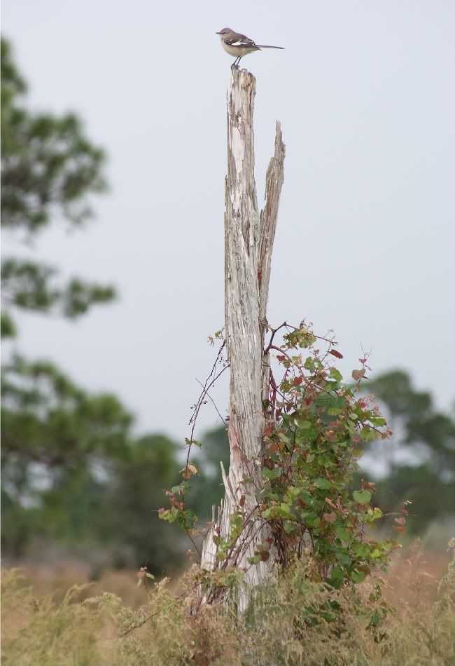
Weathered and sunbleached tree - taken from the Internet, used without permission
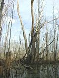

Waterlogged dead willow tree - taken from the Internet, used without permission
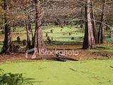

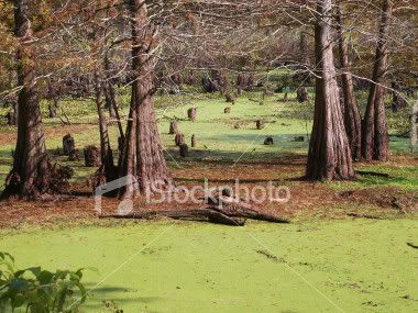
Generic swamp with brackish water, presumably southeastern United States - image originally from iStockphoto.com, used without permission
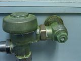

Brass pipes and fittings with patina - unnamed southeastern Michigan restaurant
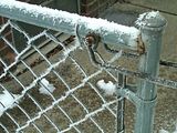

Interestingly shaped new-fallen snow "spikes" on a stainless steel gate - casa Tinweasel, Feb. 2010
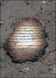

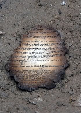
Fire-charred paper - World Trade Center Ground Zero, taken from the Internet, used without permission
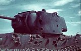

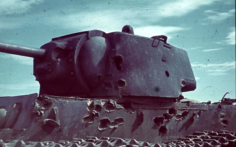
Tank with battle damage - taken from the Internet, used without permission
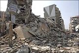

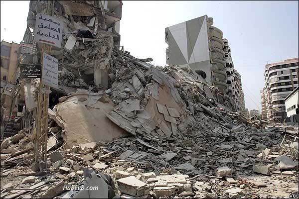
Destroyed apartment buildings in downtown Beiruit - taken from the Internet, used without permission


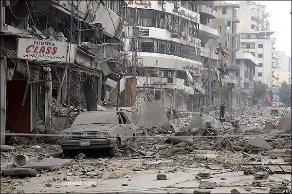
Destroyed city street in downtown Beiruit - taken from the Internet, used without permission


 This would be the point where the pictures start to get a little unsettling in subject matter so, again, consider yourself warned.
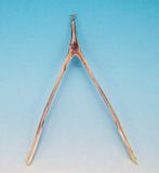

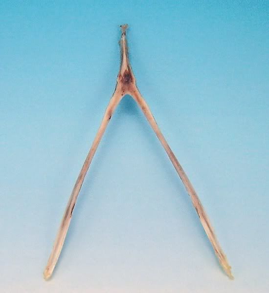
A cooked turkey wishbone with dried blood - casa Tinweasel
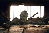

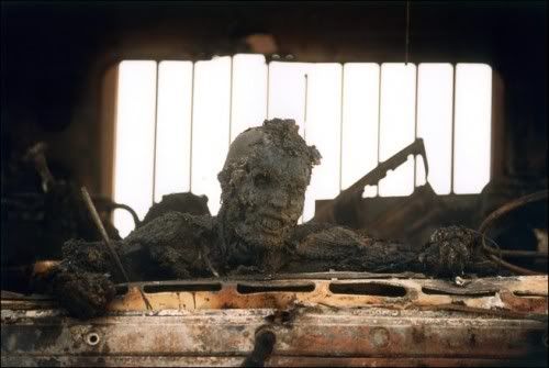
A burned corpse in a military vehicle - taken from the Internet, used without permission
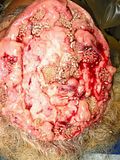

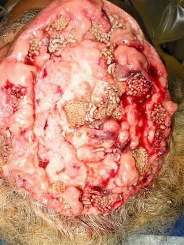
A live human brain infested with housefly maggots - taken from Snopes.com, used without permission

 If the owners/original photographers of any of these "material reference" images would prefer me not to have a particular picture posted, let me know and I will certainly take it down.

5/17/2010

Revenge of the Lonely Khorne Berzerker!

 Well, I'm essentially done with the painting of the figure - I'm still considering what to do for basing, other than that it will likely comprise some sort of urban debris theme - and all that's left is a few touchups of the darkest pueple of my Warband color on the shoulder pads where I got a little slap-happy with the brass color.

For what it's worth, I jotted down his color scheme for reference on all the other figures, so I thought I might post it here if anyone's interested in a darker, blood-colored Berzerker appearance:

Armor:
  • Basecoat 1:2:1 GW Mechrite Red/GW Red Gore/GW Scorched Brown at a 1:1 paint/thinner consistency
  • Wash in crevices and shading with 1:1 Red Gore/Glack at a 1:6 paint/thinner consistency
  • Highlight with 1:4 Red Gore/thinner
  • Edge highlight with 1:1 P3 Khador Red Highlight/Red Gore at 1:4 paint/thinner consistency
  • Extreme edge highlight with 1:1 Khador Red Highlight/GW Blood Red at a 1:4 paint/thinner consistency

Ribbed Armor Jointing/Black Areas:
  • Basecoat 1:1 GW Adeptus Battlegrey/VGC Black Ink at a 1:1 paint/thinner consistency
Brass Trim/Metal:
  • Basecoat 1:1:1 P3 Brass Balls/GW Scorched Brown/VGC Sepia Ink at a 1:1 paint/thinner consistency
  • Highlight with 1:4 Brass Balls/thinner
  • Extreme edge highlight 1:4 GW Shining Gold/thinner
Green Glowing Eyes:
  • Over a pure white undercoat, basecoat 1:1 VGC Livery Green/VMC White at a 1:1 paint/thinner consistency
  • Wash with 1:8 GW Green Ink/thinner brushed toward depressions and shade areas
Dark Metal:
  • Basecoat 1:1:1 P3 Pig Iron/GW Scorched Brown/VGC Sepia Ink at a 1:1 paint/thinner consistency
  • Highlight with 1:1 Pig Iron/Scorched Brown at a 1:4 paint/thinner consistency
  • Extreme edge highlight 1:4 GW Chainmail/thinner

Is the darker scheme decent-looking, as compared to the typical GW Blood Red-painted Berzerker?

5/14/2010

Infinity Speculo Killer Commission, AKA Giveaway Contest Winner [Completed 5/13/2010]

 Well, I got word back from doom_of_the_people on the last set of "inches away from finished" pics I passed along to him regarding his Commission Giveaway Contest figure, and I got the "thumb's up" to go ahead and call her done. She is now sealed in several layers of spray acrylic varnish and fully dry, essentially ready to wing her way towards wherever she'll be winging her way towards - as soon as I can figure out a way to box her for mailing in a manner that won't bend the "flimsy" monofilament blade or cause her wrist to snap off at the glued join (yet again). I think I have an idea, though, involving epoxy glue, a small hex nut and bolt, and a small box-end-sized square of MDF hardboard. It might set off metal detectors at the USPS, but it should have enough airspace inside the box to avoid nasty bumps and jarring impacts.

Here's the final set of pictures (post-varnish):


 In making the sludge/ooze on the base, I snuck in a few bubbles(?) and some extra rust on the outpouring pipe, too. Hopefully they're easily visible in the last few pictures, since I took those especially for the guy running Secret Weapon Miniatures, figgering he might be able to use them for posterity so as to show off his handiwork. The majority of the decorative stuff that the Speculo Killer is posed on is one of Secret Weapon's resin bases that I hacked up and converted in order to offset it on the Infinity slottabase that the figure came with - who knew cast resin bases were so versatile?

LinkWithin

Related Posts with Thumbnails

Followers: